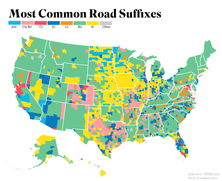
Plotting cul-de-sacs using the US Census’ TIGER/Line geographical data was such fun (how often is that sentence uttered?) I wanted to keep going. I decided to make a fun little map showing the distribution of road suffixes (e.g. Road, Street, Lane) across the country.
It took me a lot of Googling to first start to be able to map geographical data, and even more Googling after that to figure out how to include Alaska and Hawaii in my maps. I’m going to include my code here in the hopes it’ll be useful for someone in the future.
Note: this is all done in R
Prerequisite Data
Download all these guys and save them somewhere handy.
- Data on road suffixes. I’ve extracted this from TIGER/Line and cleaned it up to make it easier to use
- County boundary shapefile
- State boundary shapefile
Load Necessary Libraries
Am I the only one that loads in a bunch of random libraries when working and then loses track of which ones are actually used? Is there a way to automatically check which are unused? I have no idea, so here’s a dump of stuff.
library(rgeos)
library(rgdal)
library(ggplot2)
library(plyr)
library(maptools)
library(cowplot)
library(raster)
library(sf)
Load and Organize Shapefiles
Here, we load in our state and county shapefiles, separate out Alaska and Hawaii, and set everything to a reasonable projection. Obviously, you’ll need to change the filepath to wherever your files are actually stored.
'%ni%' <- Negate('%in%')

#get state borders. Exclude AK and HI as they don't really need borders
borders <- readOGR("DataViz/StateBoundaries", "cb_2017_us_state_500k")
borders <-spTransform(borders, CRS("+proj=aea +lat_1=29.5 +lat_2=45.5 +lon_0=97.2w +ellps=WGS84"))
borders <- subset(borders, STATEFP %ni% c("02", "15", "60", "66", "69", "72", "78"))

#Get county data and separate out AK/HI
counties<-readOGR("DataViz/Counties", "cb_2017_us_county_500k")
counties <-spTransform(counties, CRS("+proj=aea +lat_1=29.5 +lat_2=45.5 +lon_0=97.2w"))

counties_AK <- subset(counties, (STATEFP == "02"))
counties_AK <-spTransform(counties_AK, CRS("+proj=aea +lat_1=55.0 +lat_2=65.0 +lon_0=154w"))

counties_HI <- subset(counties, (STATEFP == "15"))
counties_HI <-spTransform(counties_HI, CRS("+proj=aea +lat_1=18.0 +lat_2=22.0 +lon_0=157w"))

counties <- subset(counties, STATEFP %ni% c("02", "15", "60", "66", "69", "72", "78"))
Load in Suffix Data
Easy peasy, lemon squeezy – just change the filepath to suit you.
suff <- read.csv("suffixdetails.csv", stringsAsFactors = FALSE,
                 colClasses=c("character", "character", "character", "character", "numeric" , "numeric", "numeric", "numeric", "numeric", "numeric", "numeric", "numeric", "numeric", "numeric", "numeric", "numeric"))

#Decide on the suffixes we want to plot and mark all the rest as Other
plotsuffix <- c('Rd','St','Dr','Co Rd','Ln','Ave','Ct')
suff$final <- suff$MostCommon
suff$final[suff$final %ni% plotsuffix] <- "Other"
Merge County and Suffix Data
This here is the crux of the matter, and what took me the most Googling. We need to merge our road data with our shapefiles, and then to convert our shapefiles into dataframes in order to plot them in ggplot2.
This website gives a great explanation of how this code works.
#merge data with shapefiles
countystats <- merge(counties, suff)
countystats@data$id = rownames(countystats@data)
countystats.points = fortify(countystats, region="id")
cDF = join(countystats.points, countystats@data, by="id")

countystats_AK <- merge(counties_AK, suff)
countystats_AK@data$id = rownames(countystats_AK@data)
countystats_AK.points = fortify(countystats_AK, region="id")
cDF_AK = join(countystats_AK.points, countystats_AK@data, by="id")

countystats_HI <- merge(counties_HI, suff)
countystats_HI@data$id = rownames(countystats_HI@data)
countystats_HI.points = fortify(countystats_HI, region="id")
cDF_HI = join(countystats_HI.points, countystats_HI@data, by="id")
Prepare to Plot!
Define your color palette. I shamelessly stole mine from here. It’s useful to explicitly define which color goes with which value. If you don’t do this, different colors might be used for the same values in Alaska and Hawaii, which would definitely be misleading.
plotcolors <- c('Ave' = '#07bae8', 'Co Rd' = '#fe9ea5', 'Ct'= '#fe4d64',
                'Dr' = '#0a7abf', 'Ln' = '#ff9223', 'Rd' = '#69c692',
                'St' = '#ffe019', 'Other' = '#cccccc')

blankbg <-theme(axis.line=element_blank(),axis.text.x=element_blank(),
                axis.text.y=element_blank(),axis.ticks=element_blank(),
                axis.title.x=element_blank(), axis.title.y=element_blank(),
                panel.background=element_blank(),panel.border=element_blank(),panel.grid.major=element_blank(),
                panel.grid.minor=element_blank(),plot.background=element_blank())
Create plots for AK, HI, and the US
You’ll notice I entered a bounding box for Hawaii but no other state. The shapefile includes some outlying islands that I wanted to trim out. To get this bounding box, I plotted Hawaii (without blankbg) and eyeballed the x and y limits on the graph.
You’ll also notice that the Lower 48 has an extra geom_polygon included. This is what is plotting the state borders on top of the county-level data. I like the look of including state borders but not county borders. It’s a nice, clean look that lets users orient themselves without cluttering the map.
Lower48 <- ggplot(cDF, aes(long, lat, group = group, fill = final)) +
  coord_equal()   +   blankbg +
  geom_polygon(color = NA) +
  scale_fill_manual(values = plotcolors, guide = 'legend')  +
  geom_polygon(data = borders, mapping = aes(long, lat, group = group),
               fill = NA, color = "#ffffff", size = .5)

Alaska <- ggplot(cDF_AK, aes(long, lat, group = group, fill = final)) +
  coord_equal()   +
  geom_polygon(color = NA) + blankbg +
  scale_fill_manual(values = plotcolors, guide = FALSE)

Hawaii <- ggplot(cDF_HI, aes(long, lat, group = group, fill = final)) +
  coord_equal(xlim = c(-400000, 300000),ylim = c(2000000, 2500000))   + #needs to be trimmed
  geom_polygon(color = NA) + blankbg +
  scale_fill_manual(values = plotcolors, guide = FALSE)
Combine your plots and save
I used this very helpful guide to learn how arrange Alaska and Hawaii in a plot with the Lower 48. This is kind of tricky to get right and I’m still playing around with the parameters to get them positioned how I like. As written, Alaska and Hawaii may appear to be on top of the Lower 48 when you plot, but if you export using my parameters they’ll drop into a more reasonable spot.
It was close, but not quite perfect, and I did end up moving them around in Photoshop to get what I wanted.
ratioAlaska <- (2500000 - 200000) / (1600000 - (-2400000))
ratioHawaii  <- (23 - 18) / (-154 - (-161))

ggdraw(Lower48) +
  draw_plot(Alaska, width = .35, height = .35 * 10/6 * ratioAlaska,
            x = 0.05, y = .125) +
  draw_plot(Hawaii, width = .2, height = .2 * 10/6 * ratioHawaii,
            x = 0.35, y = .125)

ggsave("suffix_finalplot.png", plot = last_plot(),
       scale = 1, width = 7, height = 9, units = "in",
       dpi = 500)
add in a little Photoshop for the header and legend, and here you are!
Plotting Most Popular Suffixes
Finally, I wrote a very similar procedure to generate many maps showing the relative popularity of a subset of road suffixes.

A Footnote
Technically, not all these are suffixes–“County Road” is really a prefix. When gathering the stats, though, I did want a way to include information about areas where there were few streets and avenues and many county roads, state highways, and so forth.
My solution was to take both suffixes and prefixes. If a road didn’t have a suffix available, I counted its prefix instead. If it had neither a suffix nor a prefix (and there are some roads that go the Cher route), I ignored it.
I counted distinct roads by county. If there were multiple roads in a county named the same thing, I counted them as only one road. This solves the problem of double counting discontinuous road segments, but it does raise the issue of counties with multiple towns that have separate roads bearing the same name. For the project of making a fun graph to put on the internet, though, this is an acceptable risk.

Hi Erin,
Great post. I’m wondering what your process was to get from the shapefile to the CSV file of the data. I’d like to do a similar project. Do you think it would be possible to produce a dataset of every address in the United States?
LikeLike
Thanks! I did the following:
– Download and unzip all feature names files from the FTP site here (this took several hours)
ftp://ftp2.census.gov/geo/tiger/TIGER2018/FEATNAMES/
For each .dbf file downloaded, I then…
– Imported into an Access database (I can give you code for that if you’re an Access user)
– Extracted the road suffixes and append the count data to a table
– Deleted the imported data to keep the database from bloating
LikeLike
It looks like TIGER/Line doesn’t store individual addresses but address ranges. I don’t know if you could get down to the level of 123 Main St, Nowhere, Kansas, but you could know that there exists a block of addresses between 100 and 300 on Main St.
LikeLike
Thank you! That’s what I thought might happen.
LikeLike
Cool stuff! Do you have a Twitter account or anything? Was interested in checking out other things you’ve done but I’m gonna put my name in the hat for email updates
LikeLiked by 1 person
Thank you! I’m just getting started, so everything I’ve done is on this site 🙂
LikeLike
[…] the results is easy using the same techniques discussed here. I kept the same color scheme that I used last time to make it easier to compare the two maps side […]
LikeLike