Well, here I am, after three months, finally posting again.
It’s been a while, but for good reason:
🎉 🥂 I finally have a job in data visualization! 🥂 🎉
It’s very like me to run a data viz blog for years, get paid actual dollars for freelance work, and still doubt whether or not I’m qualified enough to do viz as a full-time job. It took ages for me to get off my butt and try to leave my old career in finance behind. The job search took a lot out of me, but I’m super excited it worked out!
In other good news, Quartz published an article I wrote about the ecological cost of NFTs. It’s another collaboration with Liana Sposto, who did wonderful illustrations to explain how the blockchain works and why it’s so ecologically terrible. If you liked the Pudding article we did, you’ll definitely like this one too!
And now back to my not-so-regularly-scheduled data viz content.
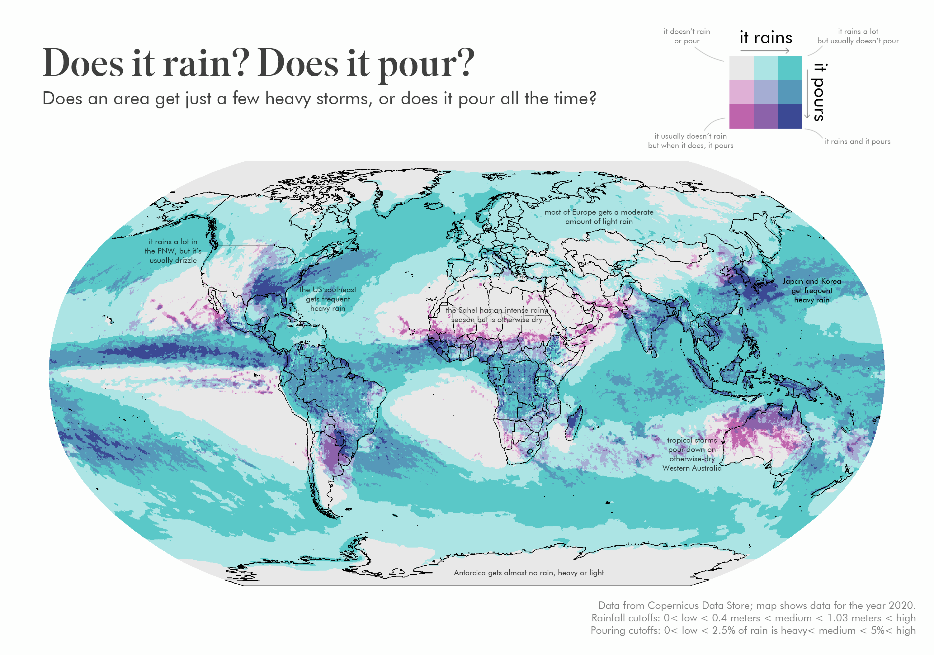
When it rains, does it pour?
Folk wisdom says that it does, but as people of science we demand hard DATA! We can no longer be shackled by the chains of metaphor, but must step into the light of taking things too literally.
So here we go–a lovely map that shows whether it really does pour when it rains.
I defined “pouring” as rainfall of at least 0.15 inches per hour. I set this cutoff by waiting until it was pouring (not a hard thing to do in Portland in winter) and then checking hourly accumulations.
Then I looked to see what percent of time it was pouring, given that it was already raining. (“When it rains, it pours”)
The data shown comes from the Copernicus Climate Data Store, which provides global hourly rainfall at a fairly detailed resolution. I only mapped data for the year 2020, when if ever it rained, it poured.

I did my best to research and annotate weather systems of interest. I am no meteorologist, though, so if one is reading and would like to update or correct me, please feel free!
Now what?
The next question I had was so what? Is this just a map of overall rainfall, or does “pouring” follow a different pattern than “raining”?
To answer that, I turned to something I’ve never used before–a bivariate choropleth. These are maps that attempt to show two variables at once through two overlapping color schemes.
I’ve previously found them confusing and difficult to read; I’m always jumping back and forth between the map and the legend to see what a particular color actually means. To hopefully alleviate this, I included annotations to highlight areas to pay attention to. Again, not a meteorologist, just someone with Google.
In essence, this map shows that areas that receive heavy rain don’t necessarily receive a lot of it. And areas that receive a lot of rain don’t necessarily receive heavy rain.
If that’s confusing, please simply enjoy this map’s “Dixie Cup energy” (per Liana).
So now what?
IDK! I start my new job soon, and I have a few last freelance projects to wrap up this spring/summer.
I want to continue to make data viz for myself, but I’m not going to push myself to cram it in while working multiple jobs. Hopefully it won’t take three months for me to find the time, though!

You definitely deserve a data viz job! Happy for you and no pressure to keep posting. I keep an eye out for the emails and enjoy your posts but doesn’t matter if it’s months between them.
LikeLike
That’s so kind of you, thank you!
LikeLike
Holy shoot, I didn’t realize you didn’t already have a data viz job! Congrats!!!
LikeLike
Thank you!
LikeLike
As a native Houstonian, I can confirm the truth of at least the Houston area’s representation on this map!
Congratulations on the new job AND on the job leap from one industry to another! That’s a lot of bravery and a huge amount of work, too.
LikeLike
Interesting map, but looking at Brazil and the DRC, it appears as if there’s some sort raster/grid visible in your overlay. I suspect this to be caused by sampling or aliasing artifacts coming from the 2.5°x2.5° resolution of the monthly average data from Copernicus.
LikeLike
[…] When it rains, does it pour? – Data Stuff. Well, here I am, after three months, finally posting again. It’s been a while, but for good reason: I finally have a job in data visualization! It’s very like me to run a data viz blog for years, get paid actual dollars for freelance work, and still doubt whether or not I’m qualified enough to do viz as a full-time job. It took ages for me to get off my butt and try to leave my old career in finance behind. […]
LikeLike
[…] is extremely variable depending on location, happens to be one of these cases. In a map created by Erin Davis, the frequency and intensity of rainfall is visualized across the globe, not only revealing areas […]
LikeLike
This map is great, but the second version has some serious accessibility issues. You say it uses two color schemes, but those aren’t at all apparent to people with color blindness (about 10% of all men; fewer women). The color schemes look nearly identical. I’d recommend reading up on color accessibility as it is so important in data viz (and frequently leaves me scratching my head when I can’t read or interpret the color-based data). Thanks!
LikeLike