I wrote that I wanted to expand creatively beyond maps in 2021, but here we are, halfway in, and half my posts are maps.
In my defense, I made these last year and just haven’t gotten around to posting them yet! They’ve been sitting in a folder since December, mocking me. It’s time to get these guys off my computer and out into the world so I can move on to other things.
Since it’s been so long, I really don’t remember what inspired me to make these. I’m sure memories of this amazing NYT Upshot article were involved. The difference here is I didn’t even try to tell a story with these maps… I just made em for something pretty to look at 🙂
Average colors of the USA
A question: do you think it’s best practice to label US states? I usually haven’t in my personal work, but I do in my day job… the labeled look might be growing on me.


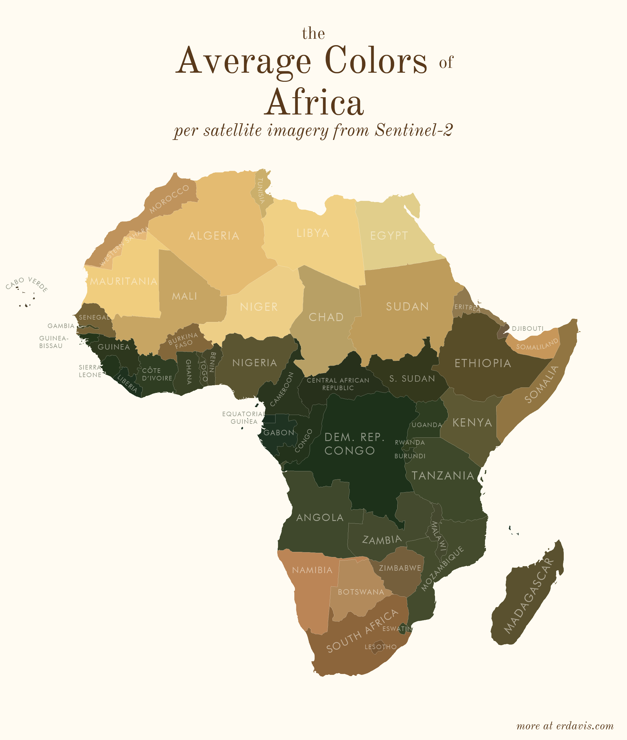
Average colors of the world


How I did it
To do this, you’ll need a few things:
- A shapefile of the areas you want the colors for
- QGIS installed (or GDAL/Python, but installing QGIS will set it all up for you)
- R and RStudio installed
In short, my process was the following:
- Wrote a script (in R) to find the bounding boxes of all the areas I was interested in
- In R, downloaded pictures of those areas from Sentinel-2
- In R, wrote a script that created a series of GDAL commands to:
- Georeference the downloaded image to create a geotiff
- Crop the geotiff to the borders of the area
- Re-project the geotiff to a sensible projection
- Ran that GDAL script
- In R, converted the geotiffs back to pngs, and found the average color of the png
Basically, I did everything in R, including creating the GDAL script. I just briefly stepped outside of R to run that script then jumped back in to finish the project. What the GDAL script does is possible within R using the qgisprocess package, but I’m pretty sure (based on 0 testing tbh) that GDAL is faster.
Side note: I feel really embarrassed lifting the curtain and showing my wacky processes to get viz done. I’ve often avoided sharing, especially in professional situations, for fear that better-informed people will laugh at me. But I think it’s good to have more people sharing their code so we can all improve. All my GIS knowledge (and quite a lot of my general coding knowledge) is self-taught, and I owe a huge debt to people online who bothered to explain how they did things. My point? I don’t know… I guess if you know of a better way to do this, please let me know! But also I was really proud I figured out this much on my own 🙂
#install the necessary packages. only need to run this once
#install.packages(c('sf', 'magick', 'dplyr'))

#load in the packages. you need to do this every time you open a fresh R session
library(magick)
library(sf)
library(dplyr)
Get your shapefile loaded and prepped:
#set your working directory, the folder where all your files will live
setwd("C:/Users/Erin/Documents/DataViz/AvgColor/Temp/")

#create the subfolders that you'll need
dir.create(file.path(getwd(), "satellite"), showWarnings = FALSE)
dir.create(file.path(getwd(), "shapes"), showWarnings = FALSE)

#load in your shapefile. I'm using the US states one from here:
#https://www.census.gov/geographies/mapping-files/time-series/geo/carto-boundary-file.html
shapes <- read_sf("cb_2018_us_state_20m.shp")

#we need to separate out the shapefile into individual files, one per shape
for (i in 1:nrow(shapes)) {
  shape <- shapes[i, ]
  write_sf(shape, paste0("./shapes/", shape$NAME, ".shp"), delete_datasource = TRUE)
}
Download the satellite imagery
#load in your shapefile. I'm using the US states one from here:
#https://www.census.gov/geographies/mapping-files/time-series/geo/carto-boundary-file.html
shapes <- read_sf("cb_2018_us_state_20m.shp")

#for each shape in the shapefile, download the covering satellite imagery
for (i in 1:nrow(shapes)) {
  shape <- shapes[i, ] %>% st_transform(4326)
  box <- st_bbox(shape)

  url <- paste0("https://tiles.maps.eox.at/wms?service=wms&request=getmap&version=1.1.1&layers=s2cloudless-2019&",
                "bbox=", box$xmin-.05, ",", box$ymin-.05, ",", box$xmax+.05, ",", box$ymax+.05,
                "&width=4096&height=4096&srs=epsg:4326")

  #note: this assumes your shapefile has a column called NAME. you'll need to change this to a
  #different col if it doesn't
  download.file(url, paste0("./satellite/", gsub("/", "", shape$NAME), ".jpg"), mode = "wb")
}
Create a GDAL script to transform those square satellite images into cropped, reprojected geotifs.
Note: for some reason, GDAL refuses to deal with any folders other than my temp directory. I couldn’t figure out how to get it to successfully write to my working directory, so I just did stuff in the temp one. Minor annoyance, but what can you do.
#time to create the GDAL script
if (file.exists("script.txt")) { file.remove("script.txt")}

#first, georeference the images - convert them from flat jpgs to tifs that know where on the #globe the image is
for (i in 1:nrow(shapes)) {
  shape <- shapes[i, ]
  box <- st_bbox(shape)

  file_origin <- paste0(getwd(), '/satellite/', shape$NAME, '.jpg')
  file_temp <- paste0(tempdir(), "/", shape$NAME, '.jpg')
  file_final <- paste0(tempdir(), "/", shape$NAME, '_ref.tif')

  cmd1 <- paste0("gdal_translate -of GTiff",
                 " -gcp ", 0, " ", 0, " ", box$xmin, " ", box$ymax,
                 " -gcp ", 4096, " ", 0, " ", box$xmax, " ", box$ymax,
                 " -gcp ", 0, " ", 4096, " ", box$xmin, " ", box$ymin,
                 " -gcp ", 4096, " ", 4096, " ", box$xmax, " ", box$ymin,
                 ' "', file_origin, '"',
                 ' "', file_temp, '"')

  cmd2 <- paste0("gdalwarp -r near -tps -co COMPRESS=NONE  -t_srs EPSG:4326",
                 ' "', file_temp, '"',
                 ' "', file_final, '"')

  write(cmd1,file="script.txt",append=TRUE)
  write(cmd2,file="script.txt",append=TRUE)
}

#next, crop the georeferenced tifs to the outlines in the individual shapefiles
for (i in  1:nrow(shapes)) {
  shape <- shapes[i, ]
  file_shp <- paste0(getwd(), '/shapes/', shape$NAME, '.shp')
  file_orig <-  paste0(tempdir(), "/", shape$NAME, '_ref.tif')
  file_crop <-  paste0(tempdir(), "/", shape$NAME, '_crop.tif')

  cmd <- paste0("gdalwarp -cutline",
                ' "', file_shp, '"',
                " -crop_to_cutline -of GTiff  -dstnodata 255",
                ' "', file_orig, '"',
                ' "', file_crop, '"',
                " -co COMPRESS=LZW -co TILED=YES --config GDAL_CACHEMAX 2048 -multi")

  write(cmd,file="script.txt",append=TRUE)
}

#reproject the shapes to a reasonable projection, so they're not as warped and stretched
for (i in  1:nrow(shapes)) {
  shape <- shapes[i, ]

  center <- st_centroid(shape) %>% st_coordinates
  utm <- as.character(floor((center[1] + 180) / 6) + 1)
  if (nchar(utm) == 1) {utm <- paste0("0", utm)}
  if (center[2] >=0) {
    epsg <- paste0("326", utm)
  } else {
    epsg <- paste0("327", utm)
  }

  file_orig <- paste0(tempdir(), "/", shape$NAME, '_crop.tif')
  file_mod <- paste0(tempdir(), "/", shape$NAME, '_reproj.tif')

  cmd <- paste0("gdalwarp -t_srs EPSG:", epsg,
                ' "', file_orig, '"',
                ' "', file_mod, '"')

  write(cmd,file="script.txt",append=TRUE)
}
Now’s the time to step out of R and into GDAL
- In the start menu, search for OSGeo4W Shell and open it. You should see a command-line style interface.
- In your working directory, find and open script.txt. It should have a bunch of commands in it.
- Copy all the commands in script.txt and paste them right into the OSGeo4W Shell. Press enter to run the commands.
- If you have many shapefiles, this might take a while. Wait until everything has finished running before moving to the next step.
Now, hop back into R.
Move the files we just created back into the working directory
#move the files from temp back to the wd
files <- list.files(tempdir(), pattern = "_reproj.tif")
for (i in 1:length(files)) {
  file.rename(from=paste0(tempdir(), "/", files[i]),to= paste0("./reproj/", files[i]))
}
Now get the average color of each image. Here I use a slightly different method than I did for the plots shown above. While writing up this code, I found a neat trick (resizing the image down to 1 px) that works faster than what I did before (averaging the R, G, and B values of each pixel)
#get the average color of each file
files <- list.files("./reproj/")
colors <- NULL

for (i in 1:length(files)) {
  #remove the white background of the image
  img <- image_read(paste0("./reproj/", files[i]))
  img <- image_transparent(img, "#ffffff", fuzz = 0)

  #convert to a 1x1 pixel as a trick to finding the avg color. ImageMagick will average the
  #colors out to just 1.
  img <- image_scale(img,"1x1!")

  #get the color of the pixel
  avgcolor <- image_data(img, channels = "rgba")[1:3] %>% paste0(collapse="")

  #save it in a running list
  colors <- bind_rows(colors, data.frame(name = gsub("_reproj.tif", "", files[i]), color = paste0("#", avgcolor)))
}

#save the color file if you need it later
write.csv(colors, "colors.csv", row.names = F)
Et voilà ! A lovely csv with the average color of each of your regions.
And if you’d like to plot it all pretty, here’s how I did it in R. For this example, I’m only going to plot the lower 48 states.
#install the necessary packages. only need to run this once
install.packages(c('sf', 'ggplot2', 'ggthemes', 'dplyr'))

#load in the packages. you need to do this every time you open a fresh R session
library(sf)
library(ggplot2)
library(ggthemes)
library(dplyr)

#set your wd
setwd("C:/Users/Erin/Documents/DataViz/AvgColor/Temp/")

#load the data
shapes <- read_sf("cb_2018_us_state_20m.shp")
colors <- read.csv("colors.csv")

#you'll need to change the join column names here if they're different than mine
shapes <- inner_join(shapes, colors, by = c("NAME" = "name"))

#transform the shapefile to a reasonable projection
#if you're unsure here, google "epsg code" + "your region name" to find a good code to use
shapes <- st_transform(shapes, 2163)

#for example purposes only, I'm removing Alaska, Hawaii, and PR
shapes <- subset(shapes, !(STUSPS %in% c("AK", "HI", "PR")))

#plot it
ggplot() + theme_map() +
  geom_sf(data = shapes, aes(fill = I(color)), color = alpha("#fffbf2", .1)) +
  theme(plot.background = element_rect(fill = '#fffbf2', colour = '#fffbf2'))

#save it
ggsave("avgcolors.png", width = 7, height = 9, units = "in", dpi = 500)

[…] ha fatto? Trovate le indicazioni sulla metodologia. Occorre scaricare le foto satellitari di Sentinel-2. Poi i shapefile dell’area che vi […]
LikeLike
Amazing blog
LikeLike
[…] Average colors, Erin Davis […]
LikeLike
I know you’re just sourcing the images from satellite imagery, but I wonder if it would be possible to indicate when the photos were taken, as in, I would think, but maybe I’m wrong, that the season has a huge effect on how green a region is…
LikeLike
Totally agree! I’m not sure when the Sentinel cloudless images were taken (probably varies by area, too). But I’d love to do one of these that shows seasonal differences in color
LikeLike
Thanks for the reply! I hit submit right before realizing I didn’t add this sentence: “This is awesome!”
LikeLike
[…] on satellite imagery, Erin Davis found the average color of places around the world. The above is by county in the United States, but Davis also made maps by country, which are a mix […]
LikeLike
Hi, nice work. What about North America, as in the North of the continent. There is no detail about México and Canada.
LikeLike
Haha, to be honest I got lazy and didn’t do it, since there’s only 3 countries
LikeLike
Caribean countries do not show in both S and N america so you are missing more than 3. Awesome work though.
LikeLike
This is really cool! That trick of resizing to 1×1 pixel is hilariously clever!
I work with satellite imagery professionally, so my first thought was, how many hours and terabytes did it take to download all that imagery!
Looking at the code (I don’t know R, but I think I get the gist), are you doing something like forcing resolution to be such that a 4096×4096 image covers your requested area?
You also mention that you’re using the cloudfree layer, another interesting visualization would be to try to show how often cloudfree images are captured. There are lots of areas where cloud cover is so common it is really hard to get satellite imagery.
Great job! Now I’m going to poke around and enjoy the rest of your site (and maybe end up using some of your examples/datasets for teaching CS students)
LikeLike
Thank you! It actually was very fast and easy to download, the only issue came from having thousands of geotiffs (maxed out my HD on the counties one, annoyingly). Sentinel has some sort of endpoint where you can specify your bounding box and image size to conveniently get imagery. EG this is the Portland area: https://tiles.maps.eox.at/wms?service=wms&request=getmap&version=1.1.1&layers=s2cloudless-2019&bbox=-123.0122,45.2758,-122.3794,45.7367&width=4096&height=4096&srs=epsg:4326
I’d love to do more satellite projects, but I found downloading images super frustrating, especially from NOAA. Any advice or hot tips on how to easily get imagery for specific time periods and bounding boxes?
LikeLike
Sorry but I don’t have any hot tips, in my experience/context I’m used to dealing with full-resolution imagery, say 33cm-per-pixel Worldview, maybe 10km wide and 100km long, so multiple GB per image.
I’ve been reading more though, and your whole blog is just amazing, it’s leading me down so many rabbit-holes (the good kind)! Thanks for sharing with all of us!
LikeLike
Incredible! Thank you for this.
LikeLike
[…] Average colors of the world […]
LikeLike
[…] showing the average colors of countries around the world based on Sentinel satellite imagery. The Average Colors of the World includes maps of each continent and a map of the world on which each country is colored based on […]
LikeLike
[…] on satellite imagery, Erin Davis found the average color of places around the world. The above is by county in the United States, but Davis also made maps by country, which are a mix […]
LikeLike
Love this! Your work is surely one of my favorites ever!
LikeLike
[…] Cool site about the average colours of the world: https://erdavis.com/2021/06/26/average-colors-of-the-world/ […]
LikeLike
[…] ha fatto? Trovate le indicazioni sulla metodologia. Occorre scaricare le foto satellitari di Sentinel-2. Poi i shapefile dell’area che vi […]
LikeLike
[…] 🌏 Maps of countries’ colors, based on satellite images. [Data […]
LikeLike
[…] Erin Davis estudió matemáticas e ingeniería en la universidad. Pero desde pequeño tuvo una vena artística que dice que conserva aplicando los conocimientos adquiridos en la universidad creando productos de visualización de datos que queden bonitos además de contar cosas. Como por ejemplo unos mapas que muestran de qué color es cada país según las imágenes de los satélites Sentinel-2. […]
LikeLike
Hi there.
Amazing work.
Be sure I’m going to try some tests based on your code for my local region.
So thanks for sharing your code. I’m also a self-learner, based on Google searches, so i really appreciate you for sharing it.
🙂
LikeLike
[…] Erin Davis estudió matemáticas e ingeniería en la universidad. Pero desde pequeño tuvo una vena artística que dice que conserva aplicando los conocimientos adquiridos en la universidad creando productos de visualización de datos que queden bonitos además de contar cosas. Como por ejemplo unos mapas que muestran de qué color es cada país según las imágenes de los satélites Sentinel-2. […]
LikeLike
[…] on satellite imagery, Erin Davis found the average color of places around the world. The above is by county in the United States, but Davis also made maps by country, which are a mix […]
LikeLike
Hi Erin, your blog posts are famous! I saw it in Josh Laurito’s newsletter. Great post!
LikeLike
Woohoo!!
LikeLike
Incredible, thanks for showing me my little unrecognized east African country “Somaliland”. I am a novice in spatial data with little experience in using SRTM data from USGS, and as we are not recognized self-proclaimed state, our national boundaries with the entire Somalia is dotted shown as shown by SRTM pixels. Hence, when I am trying to map my unrecognized nation I crop it from the dotted boundaries that we have with Somalia. I must check out about Sentinel 2 datasets.
LikeLike
[…] data visualizations to help bring the “big picture” into focus. Davis posted a project entitled Average Colors of the World, a series of maps which aggregate satellite data to find and display the average color of defined […]
LikeLike
PLEASE do Canada – you did it for the USA – show by region/province 😉
LikeLike
[…] you open the project, the first maps you see show the United States. They display the average color by county and then […]
LikeLike
Cool work and idea – I love the end result!
LikeLike
[…] a short blog post on her web site, Davis defined her course of as […]
LikeLike
[…] a short blog post on her website, Davis explained her process as […]
LikeLike
Great work. But how about Australia and New Zealand?
LikeLike
[…] a short blog post on her website, Davis explained her process as […]
LikeLike
[…] a short blog post on her website, Davis explained her process as […]
LikeLike
[…] a short blog post on her website, Davis explained her process as […]
LikeLike
[…] a quick weblog publish on her web site, Davis defined her course of as […]
LikeLike
Good idea
Thanks
LikeLike
[…] 07 2021 Average colours of countries. Scrapped storylines from Disney and Pixar films. Badly designed signs. Weird age things. […]
LikeLike
[…] Average colors, Erin Davis […]
LikeLike
[…] Davis has created maps showing the average colour of each country of the world (plus maps showing the average colour of each U.S. state and county). She derived the average […]
LikeLike
Nice job! And thank you for sharing your code. You said “I’ve often avoided sharing, especially in professional situations, for fear that better-informed people will laugh at me.” I definitely understand your hesitancy to share, but this is how we all learn. In the end, when you are doing something new, it almost always requires some amount of doing it in some “wacky” manner. Then, as more people follow in your path, you will help each other develop some better conventions.
Proud of you, nice work!
LikeLike
[…] visualization artist Erin Davis used satellite imagery from Sentinel-2 to illustrate the average color of the terrain in countries […]
LikeLike
[…] A partir de imágenes del satélite Sentinel 2, la analista y visualizadora de datos Erin publicó en su blog una serie de mapas donde promedia el color de cada país –de cada estado, en el caso de Estados Unidos– para pintar el mapa. Así queda el mundo y alguno de los continentes. Más data y, además, cosillas interesantes para programadores y dataviz, acá. […]
LikeLike
[…] last post, Average Colors of the World, leaked out of this blog and spread all over the internet! It was super neat, but a common piece of […]
LikeLike
Does the average color change (when summarized for an entire year) throughout the years of the available data?
LikeLike
[…] Average colors of the world […]
LikeLike
[…] Average colors of the world […]
LikeLike
Hi! I just wanna say that your work here is amazing!! Especially the illustrations, they’re so nice looking I would seriously consider using one of them as a wall poster 😀
One question, would the background color of the illustrations happen to be cosmic latte by any chance? 😉
LikeLike
[…] 你眼中的世界是長什麼樣子呢?最近拜讀了一篇關於特殊主題地圖繪製的文章Average colors of the world(註)覺得頗有創意,身為數據分析師的筆者Erin Davis用色塊的概念詮釋了這幅饒富藝術風格的世界地圖,國與國之間有如拼圖的效果般拼出一個完整的世界!從標題顧名思義,地圖的色塊顏色代表的就是區塊內的色彩平均值,實際上的做法是以國界圖資套疊了Sentinel-2衛星影像加以計算出的平均色作為每個國家的「代表色」,各位有沒有發現這跟我們幾年前發想的「印象派地圖」概念不謀而合呢! […]
LikeLike