I haven’t been working on personal dataviz in a long time due to a few things, mostly a lack of time, lack of inspiration, and general burnout. To try to work through some of that burnout, I decided to try something new: revisiting old visuals I created in the stone ages (ie, pre-COVID).
Back then I was brand new to the whole dataviz thing and teaching myself one project at a time. I cringe to see my older projects: they’re not bad but still not up to my current standards. That’s a good thing, of course–I’m getting better!–but it’s also a nagging annoyance.
Here, I’m going to walk through my second finished dataviz project, Uncommonly Common Initials, and describe what I’d do differently today.
The original project
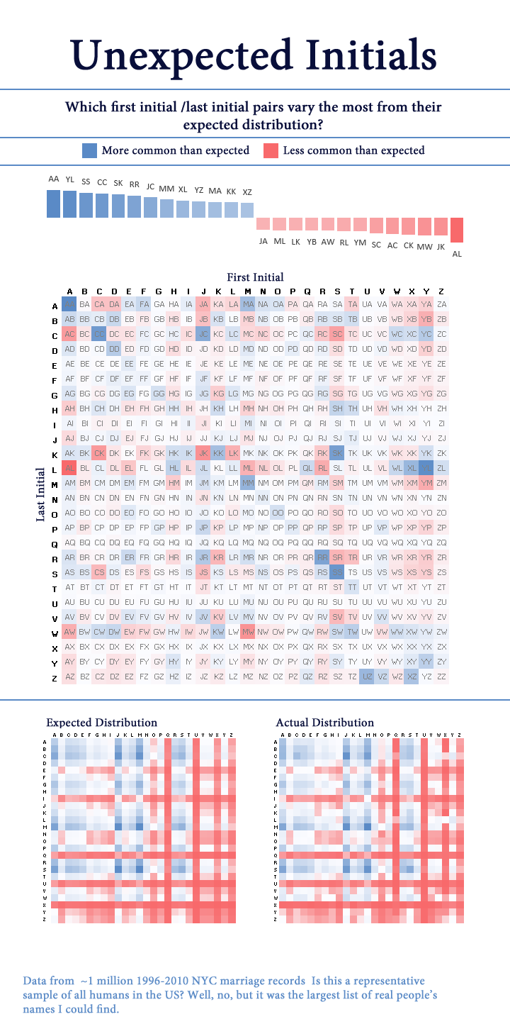
I’m pretty sure I made the visual in Excel. This is definitely before I was comfortable in R, so I probably did the analysis in Excel or MS Access (yikes).
Again, while there’s nothing objectively terrible about this, there’s a lot I’d change. In no particular order:
General graphic design
- Swap from red-blue to a different color palette. Although I doubt this would be mistaken for a political visual, working at Axios has beaten into me that red-blue is for politics only.
- Use a warm color for “more common than expected” and a cool color for “less common” instead of the opposite way around. The red really captures your attention, so I feel it should be used to indicate unusually common initials (the point of the visual)
- Add light grid lines every 5 letters to make finding a specific initial pairing a bit easier
- Remove visual clutter like the dividing lines
- Change the background from stark white to a soft off-white
- Choose more fun+friendly fonts. This one feels very generic
Dataviz design
- Add a legend for the colors!
- Also, bucket the values into groups so it’s easier to tell at a glance which color corresponds to which value
- Remove the top chart that has values for specific initials. It doesn’t tell you anything the main chart doesn’t already say.
- Remove the two frequency charts at the bottom. They’re kinda interesting but so similar they don’t make it easy to draw any conclusions
- Swap the positions of first and last initials
- In geometry, points are encoded as (X, Y), where the X position (column) is read before the Y position (row). Originally, I used that logic to encode the first initial on the columns and the last initial on the rows.
- I now think this is counterintuitive for this visual.
- In English, we read from left to right, so it makes more sense to have the first initial appear to the left of the second initial. In this case, that means having the first initials on the rows and the last initial on the columns
Data analysis
- Use a larger dataset! 1 million NYC marriages isn’t awful, but there’s better stuff out there. This time, I was able to download 38 million voter registration records, which gives a much broader view
- Use a different “deviation from expected” metric.
- The first time around, I used a simple formula:
(% who actually have these initials) - (% who were expected to have these initials)- So if 0.5% of people have the initials MA, but 0.45% of people were expected to have those initials, we’d get a value of +0.05pp.
- This is biased in favor of initials that are common to begin with, but I wanted to normalize for that.
- I chose Symmetric Mean Percentage Error instead of a straight percentage difference because it treats overestimates and underestimates equally.
- The first time around, I used a simple formula:
The new version
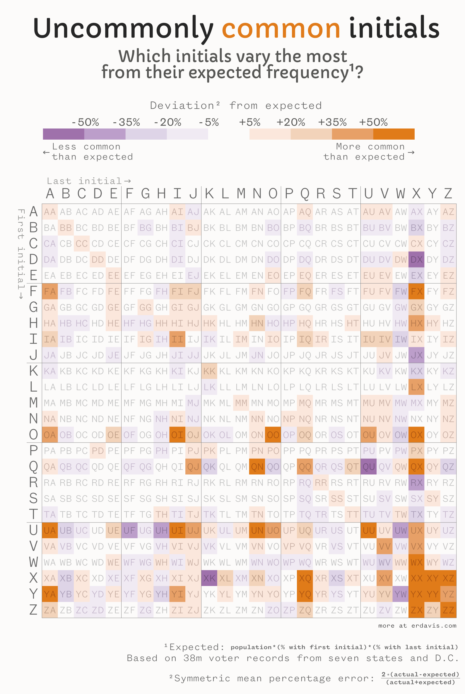
Is it perfect? Nah… but maybe I’ll revist this revist in a few years…?
Even more visuals
After making this, I had some doubts about my choice of symmetric mean percentage error for the values. People with the initials XX are indeed significantly more common than expected, BUT there are only 76 of them in my database of 38m records (compared to an expected 3).
Maybe by initial choice of (actual-expected) is the better version? When you only expect 1 in a million people to have those initials, just a few extra folks is enough to dramatically tip the balance. To be fair, I believe XX is inordinately common, but you’re still very unlikely to know anyone with those initials!
I charted frequency versus deviation from expected and found a very clear pattern. The most variable initials are indeed quite rare:
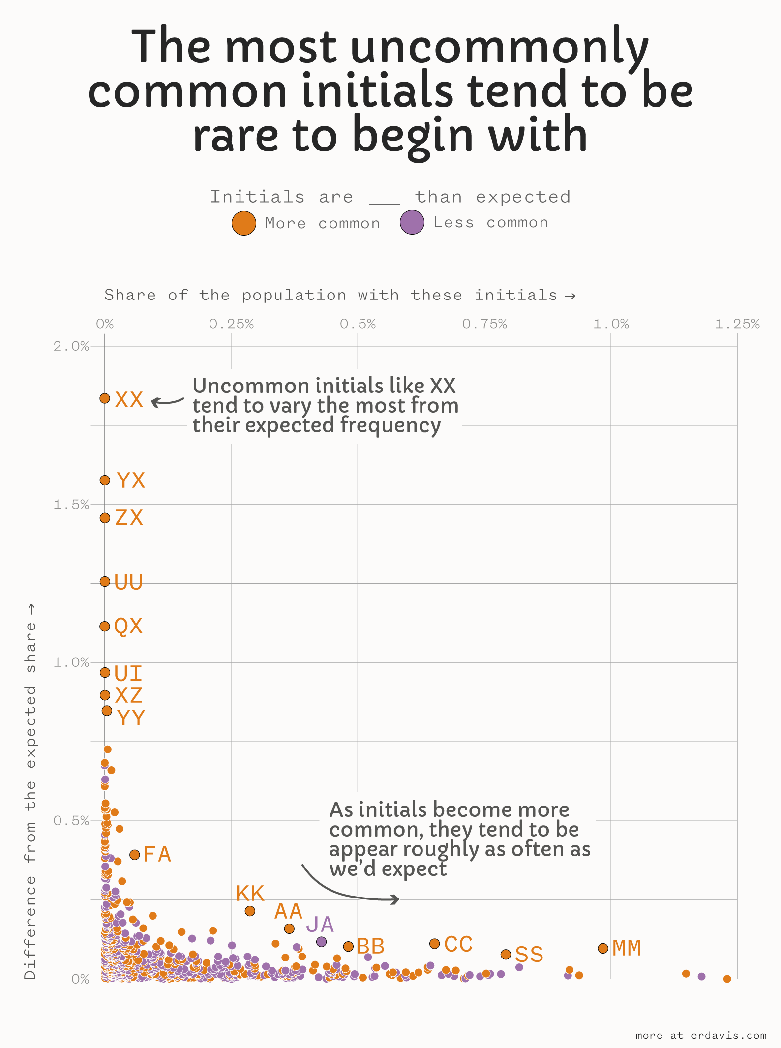
So, just for fun, let’s see what a version of my original chart looks like where I use (actual-expected) instead of the more complex symmetric mean percentage error.
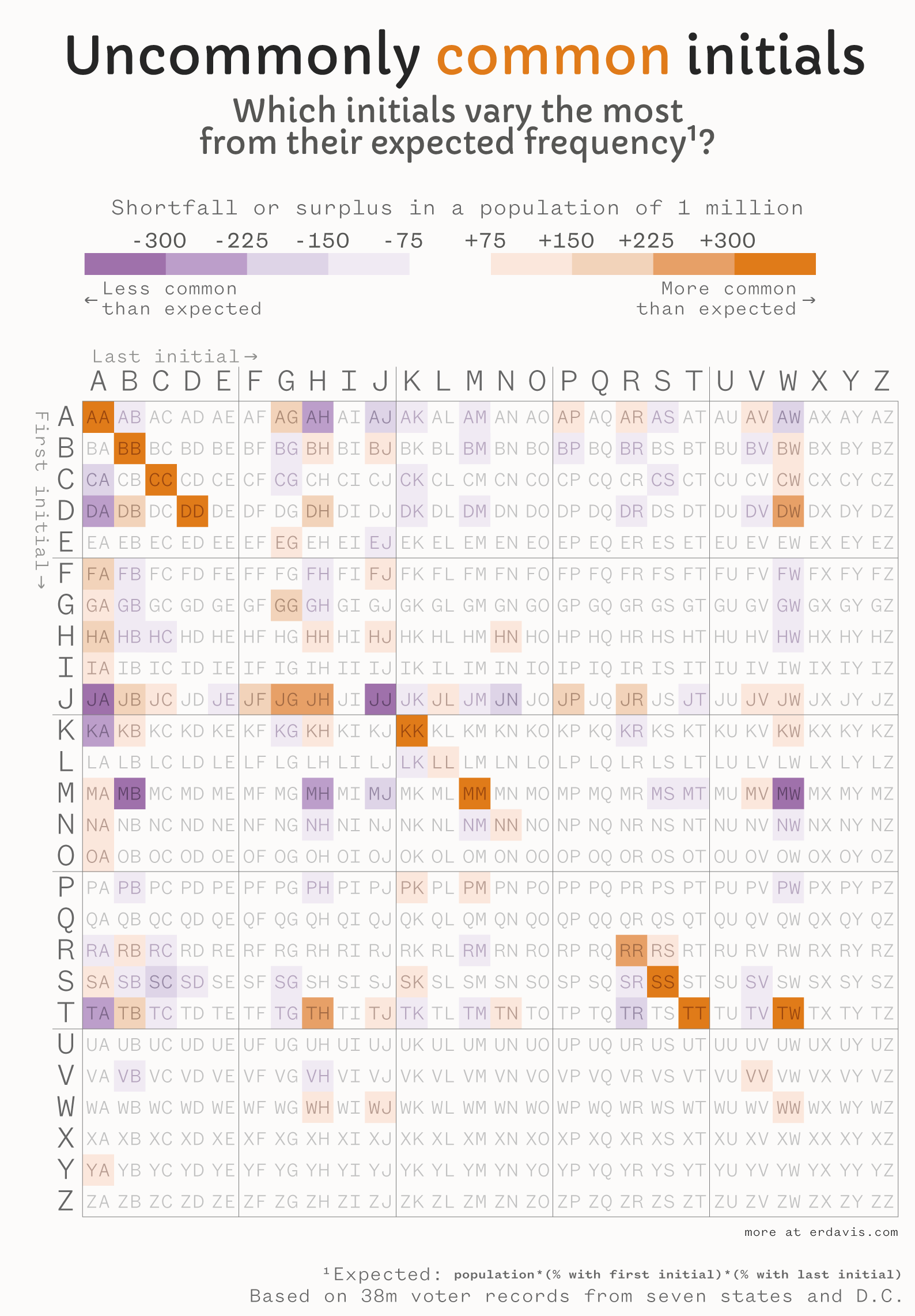
We see some of the same patterns here, most notably the diagonal line of same-letter initials. The most uncommonly common initial pairing here is MM, with 374k folks in the dataset having those initials versus an expected 342k (or 906 excess MMs per 1 million people).
Fun fact: many of those MMs are Michaels, Marys, Matthews and Marias with the surnames Miller, Moore, or Murphy.

Nice!
LikeLike