Usually I’d start a blog post with some blathering about what inspired me to do the project I’m writing up. In this case, I have to admit I’ve been sitting on this analysis for over half a year and have no memory of why I started it.
Essentially, I wanted to see if certain names were more likely to be used as middle names than as first names.
Please enjoy this reel in lieu of any further explanation:
Part 1: The data
Unfortunately, while the US Social Security Administration publishes annual baby name datasets, they’re really quite bare. Nothing besides year of birth, sex, name, and number of babies – no race/ethnicity data attached, and definitely no middle name or surname data either.
To get a gigantic dataset of real Americans’ middle names I turned to voter registration data. I found an incredibly helpful document on where to get data for as many states as possible.
It took a while, but eventually I ended up with the files for D.C., Florida, Michigan, North Carolina, New York, Ohio, Oklahoma, and Washington. All those states had minimal fees and were able to provide the data quickly. Other states supposedly provided the data for cheap or free, but I quickly got bogged down in unhelpful websites and form submissions to the void.
Although those states provided roughly 60m voter records in total (roughly one third of all U.S. voters), many of the records didn’t have middle names. New York, in particular, doesn’t seem to require anything more than the first initial of your middle name when registering. Once I filtered only for records with full middle names, I ended up with 38m rows. Still not bad!
I make this sound pretty straightforward, but managing this many records in memory was a giant pain in the ass. I’m stubborn and lazy, so I was fine with letting the data slowly process while I worked on other things. In the future, though, I’d probably take the time to set up a database to handle it and avoid loading all that data directly in R.
Part 2: Cleaning the data
It was easy to calculate the first-to-middle ratio for each specific name. I naively figured this’d show me the most “middle” names, but the results were messy and I had to work out… what even is a middle name?
I decided a middle name, for the purposes of this analysis, is a name selected for a child by their parents that comes after the first name. Notably, I decided to exclude:
- Surnames as middle names
- These mostly seemed to be women who took their maiden name as their middle name when they got married
- I filtered the dataset to exclude names more often used as surnames than first or middle names:
count(last) <= count(first) + count(middle)
- Patronymics
- I excluded these on the basis that they’re pre-determined for all of a man’s children, not selected for each child
- I removed them entirely by filtering out names ending in ovna, evna, evitch, ovich, and evich
- Singh and Kaur
- The Sikh names Singh and Kaur aren’t uniquely chosen for a child by their parents–they’re religious names that (as I understand) most or all Sikhs have
- They sometimes end up in the “middle name” position in American paperwork, but aren’t middle names by my chosen definition
- Junior
- There were a ton of men with “Junior” listed as their middle name.
- I wasn’t sure if it actually was their middle name, or if they incorrectly filled out their voter registration forms — which could be an easy mistake when the fields are ordered as Last, First, Middle
- I chose to remove these as well
Finally, I filtered the names to just those occurring 250+ times for a given birth year or 2000+ times in total (either as a first or middle name).
Part 2b: But wait, there’s more cleaning
It felt important to group names pronounced the same way together. For example, Christie, Christy, Kristie, and Kristi may be spelled differently, but they are (to me) the same name.
Once upon a time, this might have been a herculean task. Common pronounciation algorithms available via the phonics package in R weren’t particularly helpful, regularly outputting different encodings for names that should be pronounced the same way.
For better or for worse, though, we now have quite good, cheaply available LLMs that can process this sort of data in a much more sophisticated way. For the price of a burrito, I could tell ChatGPT it was a helpful assistant that returns names spelled phonetically in American English using the IPA alphabet and get quite good results for the 3000-ish names in my list.
It wasn’t 100% accurate, but cleaning its output was a much more doable task than the results of traditional pronounciation algorithms. Mostly, I just checked common name groupings and found patterns of inconsistencies it seemed to have (r-colored vowels, for one). I removed syllabic breaks and stress markers to further homogenize the pronunciations.
Aside: the name with the most spellings that I found is Kaitlyn, at 12. Potential future viz idea?
The last step was to combine all names pronounced the same way into one big group. I did include typical name gender in the grouping algorithm, so names like Ray (typically male) and Rae (typically female) were kept separate. The most common spelling was then used to represent the entire group (e.g. Kaitlyn over Catelyn, Katelynn, etc)
Part 3: Finally, some visuals
My first thought was to plot middle versus first name prevalence:
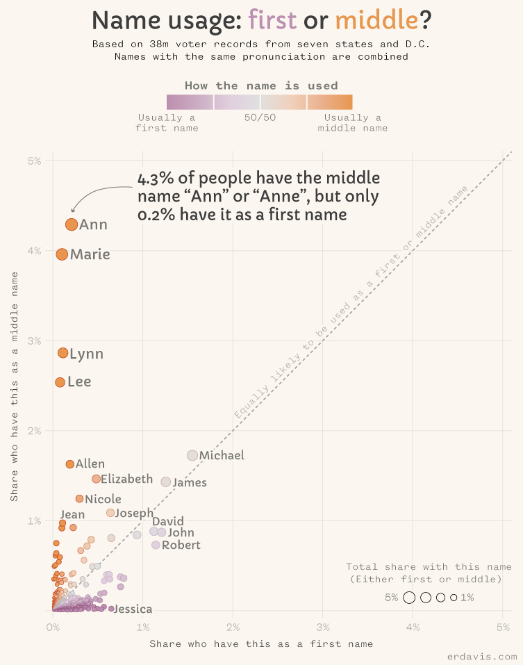
By this methodology, Ann is far away the most “middle” name. Good job, Ann!
Marie is a solid runner up, vindicating the creator of the real I led the post with. This commenter was also pretty spot-on:

A different visual direction…
The scatterplot is fun, but it’s kind of a lot to take in. So many dots! And words! And axes to understand!
Let’s do a simpler chart type that slaps you in the face with some answers.
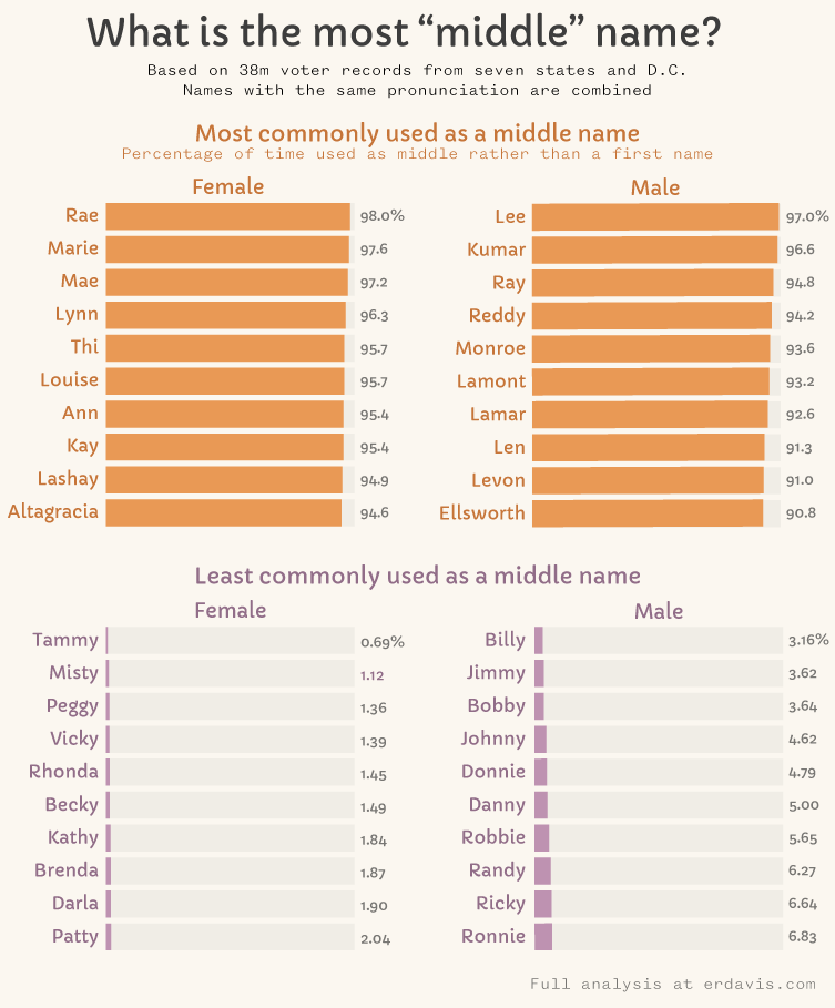
What stood out to me in this chart wasn’t the most “middle” names, but the most “first” ones. Almost all of them are dimunitives of other names, like Tammy for Tamara.
I kind of freaked out, wondering if people were filling out their voter registrations with their nicknames instead of their legal names. Would I need to totally scrap the whole analysis?
Before giving in to utter despair, I decided to check the ratio of dimunitives to full names in the voter registration data as well as baby name data. Ideally, they’d be around the same.
For example, in the voter registration data, there are about 2.5 Tammys for every Tamara. In the baby name data, that ratio is 1.9. Not a 100% match, but close enough for my anxiety. The numbers weren’t too bad for other names–I don’t doubt some people are registering with a nickname, but not the the point where I think this is invalid.
Just I case, I removed all the dimunitives from the “most first” side to end up with this chart…

What about MY name?
I deeply regret making this a wordpress.com site, where I can’t embed interactive visuals. Sadly, if you’d like to look up your own name, you’ll need to do it in this big ol’ csv file instead of a neat interactive widget.
Wrapping it up
Part of the reason it’s taken me a million years to publish this is that there’s just so much more I could do with this data! Some further questions I dug into, but never fully conceptualized or visualized…
- Are there any commonalities in “middle” names? For example, are they often short, or do they have particular vowls or consonants?
- Do people tend to have middle names that were popular as first names in the prior generation? In other words, are middle names likely to be a relative’s name?
- Are there particular combos of first and middle names that are more common than expected?
- How have middle names changed over time? Have names shifted from being middle names to first names or vice versa?
Ultimately, though, I needed to publish something and not spend ten million years in a data analysis black hole.
So here ya are, hope you enjoyed it!

Neat! Not surprised by Lynn or Lee
Sent from the all new AOL app for iOS
LikeLike