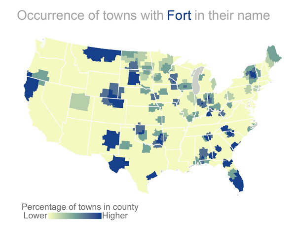
I created this visualization using US Census Bureau data. I crunched the data in MS Access and mapped it out in R. (Sorry AK and HI, I’m too new at R to manage mapping you yet). The values you see are the percent of cities in a given county that have the stated word in their name, smoothed a bit for aesthetics.
What you see here are some of the more interesting maps I found; I ran through a ton of ideas that ended up not being very engaging. What I found is that many of my ideas (see: names of various plants, names of historical figures) are probably more fitted to mapping street names than town names; folks seem pretty conservative when deciding to name an entire town.
That said, I am pleased with many of these maps: perhaps most interestingly, towns with “New” in their name peter out right at the 97th meridian. I’m no historian, but western progress did stall out right about there for many years (especially in Texas and Oklahoma) due to the aggressive plains tribes. Maybe during that wait people finally had enough time to come up with more original town names!
Future items I’d like to work on include getting Alaska and Hawaii into the map in an aesthetically pleasing way and cutting my continuous color gradient into discrete buckets.
Discover more from Data Stuff
Subscribe to get the latest posts sent to your email.