Here’s something that’ll date me: the first metal album I bought (at a Circuit City, no less) was Killswitch Engage’s 2002 opus Alive or Just Breathing.
While my musical taste has moved on from that particular band, I am still fond of the genre. Not enough, though, to really understand the sub-genres out there: how exactly is black metal different from death metal? Is metalcore metal? What even is metalcore? Etcetera.
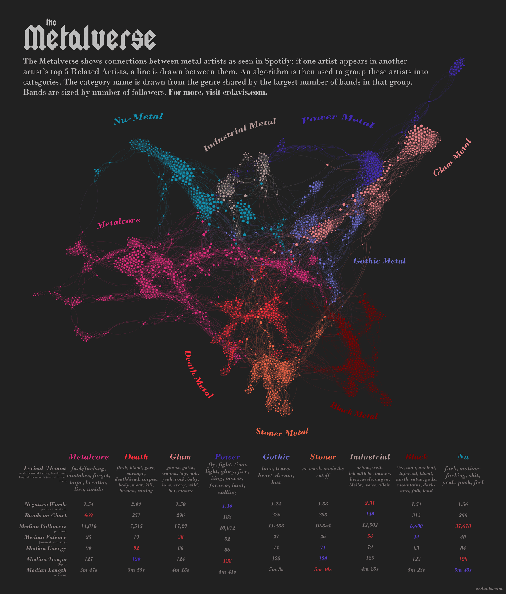
This seemed like fertile ground for some data visualization. I decided to start by looking at how different metal bands are related. By my definition, Band A is “related” to Band B if they appear in Band B’s top 5 Related Artists on Spotify. I took advantage of the great SpotifyR package to pull this data.
To get the full network of related bands, I:
- Created a “seed” list of 60 bands pulled from random sub-genres I thought up.
- Found the top 5 related artists of each of those original seeds
- Selected all distinct artists who hadn’t already had their related artists found
- Found the top 5 related artists for each of the artists in step 4
- Paused the process after a few iterations and discarded any bands that weren’t metal. I didn’t want to wander too far down adjacent genres, as it would be a waste of time.
- Rinsed and repeated steps 3-5
This process returned a final list of 2627 artists and how they were related. I popped that into Gephi to find communities (i.e., genres) of related artists.
I went back and forth on the granularity needed for these communities. Originally, I had wanted to display 20-odd communities, as metalheads are sure to be picky about classification. However, finding that many colors that read cleanly and distinctly on the page is what tipped me towards showing only 9 major communities–it’s simply more readable.
I gave each community a name based off the genre shared by the most members of that community. This is not to say that every band in the, say, metalcore community is actually a metalcore band. Rather, they’re connected through Spotify recommendations to a group of artists that includes a lot of metalcore bands. They’re more closely connected to this group than to any of the other sub-genres.
Similarly, the dataset includes many artists I suspect people will not consider metal bands at all–for example, the Foo Fighters. I did indeed remove any artists that definitely weren’t metal. However, Spotify classes a lot of bands as alternative metal that others might just think are rock, and I decided to leave these in. With nearly 3,000 artists, I just don’t have the time or interest to individually vet each one. If Spotify declared it some flavor of metal, that was good enough for me.
Next, I gathered a ton of data about each of these communities. I did a ton of work to get this information, and only about half of it actually ended up in the final visualization. This, by far, was the most involved personal viz project I’ve done to date.
- Scraped lyrics to do some text analysis
- Log Likelihood to find common lyrical themes
- Sentiment analysis to find ratio of positive to negative words
- Sentiment analysis to find common moods (turned out all genres are sad, angry, and fearful)
- Used SpotifyR to get attributes for every song by every artist on my list. This let me find patterns in:
- Valence (musical positivity) and energy (among other attributes I didn’t end up including)
- Song lengths and tempo
- Artist popularity and followers
- Major/minor (about a 50/50 split across all communities)
- Musical key (lots of G major and D major)
And, finally, here it all is together. Click here for full size.
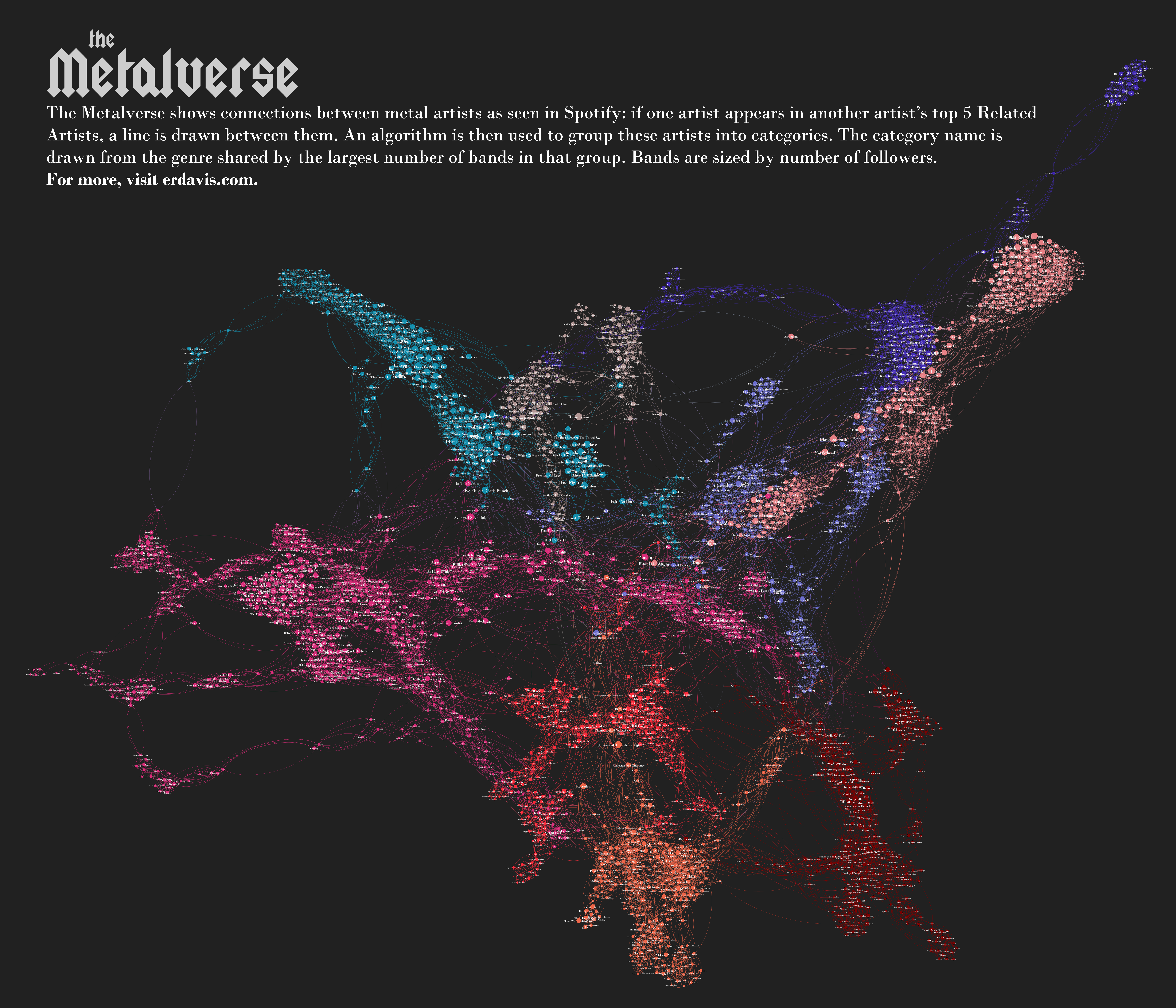
Gephi, via the Sigma Exporter plugin, is able to export beautiful interactive graphs for the web. Sadly, I’ve only sprung for the cheapest WordPress hosting available, which limits the types of files I can load. As an alternative, I created an enormous PNG to show individual band names. Click here for full size.
Discover more from Data Stuff
Subscribe to get the latest posts sent to your email.