Introduction
How do you define an emoji?
It can be hard to describe them with words.
Some are pretty simple: 🙂 and ☹️. Others have meanings not obvious on the surface, but fairly easy to understand once you’re in the know: 🍑 or 🍆. But others still seem to express some ineffable figment of the human condition that I personally struggle to articulate.
I think this Tumblr screenshot captures what I mean pretty well:

Let’s leave emojis for a second and turn to the analogy of words. How do you describe something like, say, contentment?
One approach that I might take is to start listing off words that are used similarly. Contentment is akin to satisfaction, happiness, security, ease, and comfort. Contentment can contain elements of smugness or complacency. Contentment is an ineffable human state hard to describe without resorting to lists of synonyms.
I think this idea applies to emojis as well. What is 😩? Well, it’s used like 😥, 😢, and 🙁, and has elements of 💔.
In this post, I want to see how I can carry this idea further with data to create a map of emoji meaning.
What is similarity?
I’m going to keep this a bit light on the technical details–down below I’ll have a more in-depth discussion and code.
What does it mean for one emoji to be used similarly to another? I decided that emoji A is used similarly to emoji B if they often appear with the same emojis in tweets. Let’s say emoji A is often tweeted with emojis C, D, and E. If emoji B is also frequently tweeted with C, D, and E, then A and B are used similarly. This isn’t to say that A and B are often tweeted together, but chances are good that they will be.
I like this method of determining similarity because it allows for a bit more subtlety than just going with A is similar to B if they are often tweeted together.
Going back to the analogy of words, consider gymnasium and chalkboard. I doubt there are many English sentences using both words. However, they both probably frequently appear in sentences with words like class, students, school, and test. This commonality bridges the two words and marks them as “similar” on a more conceptual than literal level. I applied this same concept to emojis, just substituting tweets for sentences.
The Map
With that basis set, let’s see what the data looks like!
The map below shows 435 emojis arranged to be as close as possible to the ones they’re most similar to, as determined by their usage on Twitter.
Don’t take this graph too literally–arranging this many items, even algorithmically, is imperfect. I also manually tweaked the layout to avoid overlaps. However, the broader groups that appear are pretty interesting.
Click for big and zoom around to discover them yourself!
This graphic immediately passed my smell check: the emoji do seem to be grouped in logical clusters. The data is actually reflecting life, and I probably don’t have any massive code fuckups!
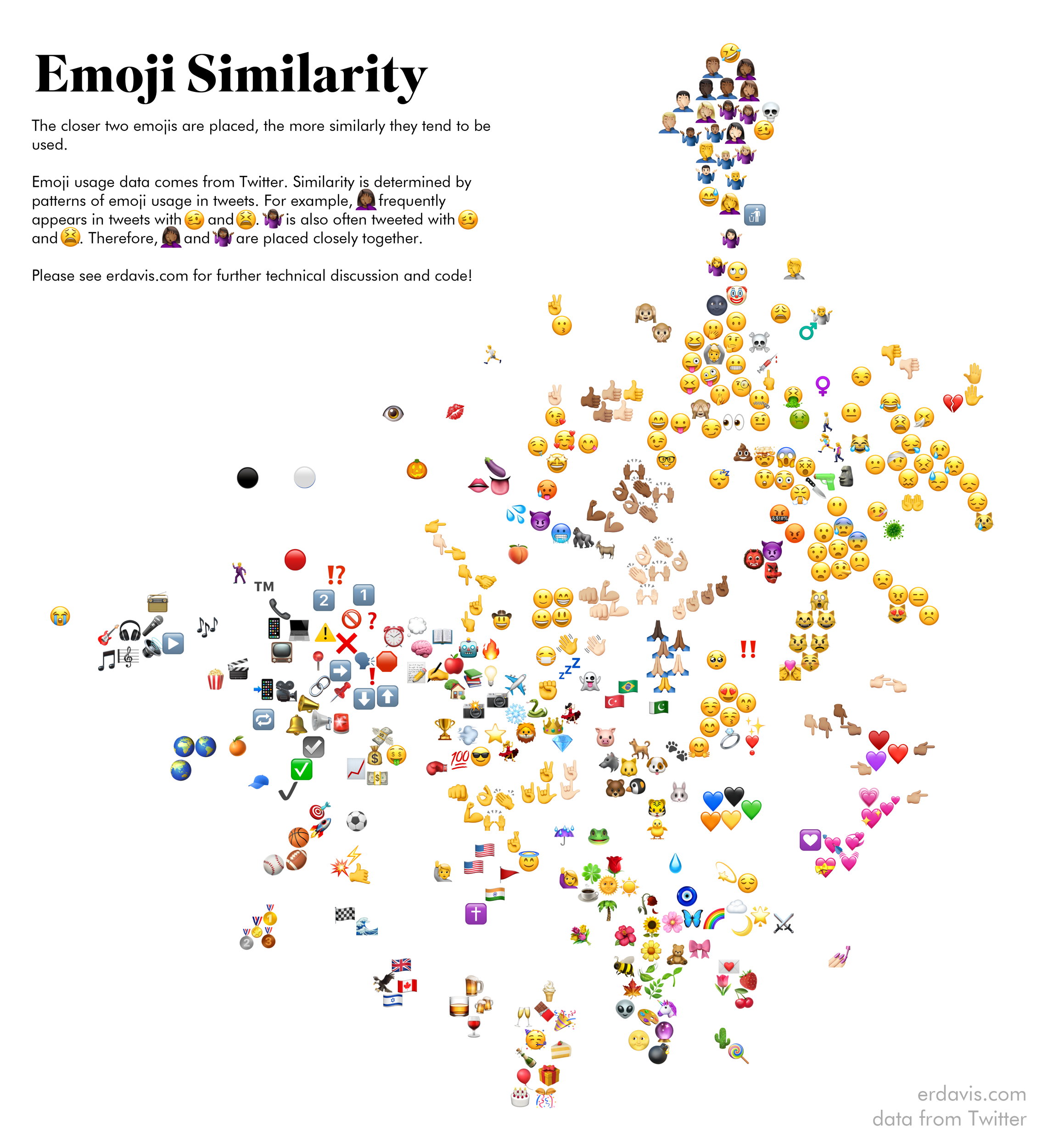
Some of the clusters are really sweet, and make total sense. I love that the lovey faces are right next to both the cute animals and the wedding ring.
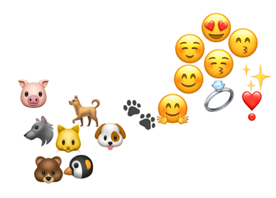
Another cluster that immediately stood out to me was this one near the top.
I’ve never seen 🌚 or 🤡 before, but my data seems to say they’re used akin to 🙄 or 😆.
Some Googling later and I found 🌚 and🤡 are often used to express a sort of ironic silliness or teasing, e.g.:
I feel so old. Kids these days and their ironic moon faces… But it is pretty neat that I actually learned something from doing this! It’s pretty gratifying when something actually turns out as well as I’m hoping 🙃 (see what I did there?)
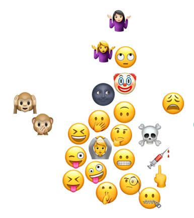
One more oddity is the inclusion of the alien and bomb in the peaceful nature section.
I think it’s coming up because of this trending meme-y quiz thing. (Is there a word for this? I’m so out of touch 😢)
Technical Discussion
For those who’re interested in this sort of thing, let’s get into the code! As usual, I did everything in R.
You’ll need to install a few packages and set up a Twitter developer account. This post is a great guide on how to make that developer account.
install.packages(c('tidyverse', 'rtweet', 'devtools', 'Rtsne', 'tidyr'))
devtools::install_github("hadley/emo")

library(tidyverse)
library(rtweet)
library(emo)
library(Rtsne)
library(tidyr)

twitter_token <- create_token(
  app = 'YOUR APP NAME',
  consumer_key = 'YOUR KEY',
  consumer_secret = 'YOUR SECRET',
  access_token = 'YOUR TOKEN',
  access_secret = 'YOUR ACCESS SECRET')
To start out with, I used the Twitter streaming API to collect tweets until I amassed about a million that included emojis. From there, I counted up the uses to get a list of emojis from most to least popular. I didn’t want my map to be cluttered with infrequently used emojis, so this is how I filtered them out.
In the future, I wouldn’t bother doing this again–I’d probably just grab a list off the EmojiTracker and be done with it.
At any rate, set up a dataframe that lists out your emojis from most to least used. My data is here if you want to download it and follow along. Alternatively, you can skip this step if you don’t care to filter or sort emojis by usage.
emojicounts <- read.csv("emojicounts.csv")
emojis <- jis
emojis <- inner_join(emojicounts, emojis, by = "emoji")
emojis <- emojis[order(-emojis$n), ]
Now we can request blocks of 18,000 tweets from Twitter for each emoji. Hadley Wickam’s awesome emo package makes it a cakewalk to collect emojis from individual tweets. Here, I remove duplicate emojis from tweets so that “😊😊😊😁😁😁” is treated the same as “😊😁”
After each block of 18,000 tweets we have a mandatory 15 minute wait period before we can query the Twitter API again. Collecting data for 400-odd emojis will take about 4 days. Since my computer has the horrible habit of randomly shutting off, I ran this code in an AWS EC2 instance so I wouldn’t be limited by my own hardware. I just let it chug along in the background until I felt I’d collected enough data.
usedwith <- NULL

for (i in 1:nrow(emojis)) {
  tweets <- search_tweets(q = emojis$emoji[i], n=100,
                          include_rts = FALSE,
                          `-filter` = "replies",
                          retryonratelimit = TRUE,
                          lang = "en")
  if (nrow(tweets) > 0) {
    tweets <- tweets %>% select(status_id, text)

    temp <- tweets %>%
      mutate(emoji = ji_extract_all(text)) %>%
      unnest(cols = c(emoji))
    temp$orig <- emojis$emoji[i]
    temp <- subset(temp, emoji != orig) %>% unique() %>% group_by(emoji, orig) %>% tally()

    usedwith <- bind_rows(usedwith, temp)
  }
}
My final output can be found here.
Now we have data on which emojis are used with which. I want to normalize this data so instead of raw counts we have percentages. For example, instead of saying 😜is used with 🍆 265 times, we say 🍆 makes up 1.2% of the emojis used with 😜.
usedwith <- read.csv('usedwith.csv')
emojicounts <- read.csv("emojicounts.csv")

#filter the list of emojis down to just those top N we're interested in.
emojis <- jis
emojis <- inner_join(emojicounts, emojis, by = "emoji")
emojis <- emojis[order(-emojis$n), ]
emojis$id <- seq.int(1:nrow(emojis))
emojis <- select(emojis, id, emoji, name) %>% subset(id <= length(unique(usedwith$orig)))

#normalize usedwith data from counts to percentages
usedwith <- inner_join(usedwith, emojis, by = c("emoji"))
usedwith <- inner_join(usedwith, emojis, by = c("orig" = "emoji"))
names(usedwith) <- c("origemoji", "termemoji","total", "docID", "doc", "termID", "term")

usedwith <- usedwith %>% group_by(docID) %>% mutate(pct=total/sum(total)) %>% ungroup
Next comes the tricky part. I want to take this data and convert it into a matrix. Each row and column represent an emoji. The value in each cell is the percentage of times emoji_column appears with emoji_row.
Another way to think about it is each row is a vector representing a particular emoji. The values in the vector represent the skew in direction towards another emoji. For example, 😊 appears a lot with 😀, so the 😊 vector will be skewed in the 😀 direction. The thing is there’s 400-odd emojis to potentially be skewed towards, so this vector is 400-dimensional.
Make sense? I hope! Stuff that makes perfect sense in my head often comes out all jumbled when I try to articulate it.
The good news is that while this sounds complicated, the tidyr package makes it a one-liner in code.
assoc <- select(usedwith, docID, termID, pct)
assoc <- assoc[order(assoc$termID), ]
assoc <- assoc %>% pivot_wider(names_from = termID, values_from = pct)
assoc[is.na(assoc)] <- 0
So now we have a 400ish x 400ish matrix showing how each emoji is skewed towards each other emoji. This is great, except there’s no way to visualize 400-dimensional space. 2 dimensions would be a lot nicer.
How can we collapse this giant matrix into something 2D?
Enter the T-SNE algorithm.
I’m not going to attempt to explain it because I don’t understand it! Hooray! But it does what I need it to do and it’s easy to use and that’s good enough for me.
tsne_out <- Rtsne(as.matrix(assoc[,2:ncol(assoc)]), initial_dims = ncol(assoc)-1, perplexity = 40, seed = 3095)

tsne <- tsne_out$Y %>% as.data.frame
names(tsne) <- c("x", "y")
tsne$docID <- assoc$docID
tsne <- inner_join(tsne, emojis, by = c("docID" = "id"))
This will collapse the 400-dimensional matrix into 2-dimensional points. Each emoji’s vector is compared to all the other emoji’s vectors. Vectors that generally “point” in the same “direction” (whatever that means in 400D space) will ideally end up as 2-d points placed close together.
There is an element of randomness to this algorithm. Above, I supplied the seed I used to get my final output, but if you supply a different seed you might get slightly different results.
| X | Y | Emoji |
|---|---|---|
| 1.62212341 | -2.33263402 | 😂 |
| 2.42065242 | -3.00226772 | 😭 |
| 6.15821243 | 1.21528349 | 🥺 |
| -1.27922029 | 0.038671 | ❤️ |
| 1.21590516 | -1.93153057 | 🤣 |
Phew, almost there! (I say that for me writing this as much as you following along!)
We’ve got all our emoji arranged next to those that tend to be used similarly. Now we just need to plot them all in ggplot and call it a day.
I’m not going to provide the code for this step because I pulled it directly from this awesome post by Emil Hvitfeldt. If you’ve stayed with me this far I think you’re good to follow along with that post, too 😉.
Man, that was a lot of words. I hope this code explanation was helpful!
Discover more from Data Stuff
Subscribe to get the latest posts sent to your email.
[…] nice thing you’ve seen is a (not particularly new, but you’ve only discovered it now) lovely visualization/article by Erin Davis on the use of emojis. Specifically, Erin Davis produced a map of what emojis are used in similar context. The entire […]
I’m really starting to enjoy your blog…
One oddity – is the any reason as to why the female sign (♀️) should be next to the vomiting emojis??
I couldn’t find any relationship between the two
Thank you so much for your kind comments 🙂
The placement algorithm does have to make compromises, so there isn’t necessarily a strong relationship between the female sign and the vomiting… hopefully it is just an artefact and not the reality on the ground!
Hi! Thanks for this fantastic article! The dropbox link seems to be broken though, it leads to a deleted items page.. Is there any way I can get my hands on the raw data? Ideally the normalized emoji similarity calculations. Thanks!
Hi! Thanks for this fantastic article! The dropbox link seems to be broken though, it leads to a deleted items page.. Is there any way I can get my hands on the raw data? Ideally the normalized emoji similarity calculations. Thanks!
Hey Erin thanks for this fantastic blog! The link for the dataset seems to be dead though. Is there any chance I can get access to this? Thanks!
Oh no, thanks for letting me know! I fixed the link.
The final TSNE output (just x and y coordinates for each emoji) is here: https://gist.github.com/erdavis1/862e0caf50efa515626f8d04960e3192
Thanks! Sorry about the repeat comments.
I’d like to play around with this data a bit, is there a License associated with it?
Nope, go wild!
[…] Previous By Erin Davis […]
The way I’ve most often seen the clown emoji deployed is in ill-mannered Facebook comments where the person doesn’t agree with a political standpoint displayed in the comment they’re replying to. It’s really quite rude. Otherwise, I’ve seen it used automatically whenever one mentions the Prime Minister.
[…] Erin created a map that shows the similarity of 435 emojis based on usage patterns on Twitter. The closer two emojis are placed, the more similar their usage patterns. This map provides insight into how people use emojis to convey similar emotions or concepts. […]
[…] 详情参考 […]