Sometimes the universe delivers you something even better than what you thought you wanted.
This doesn’t happen often when what you want are clean, detailed, easily accessible spatial datasets.
But it happened to me!
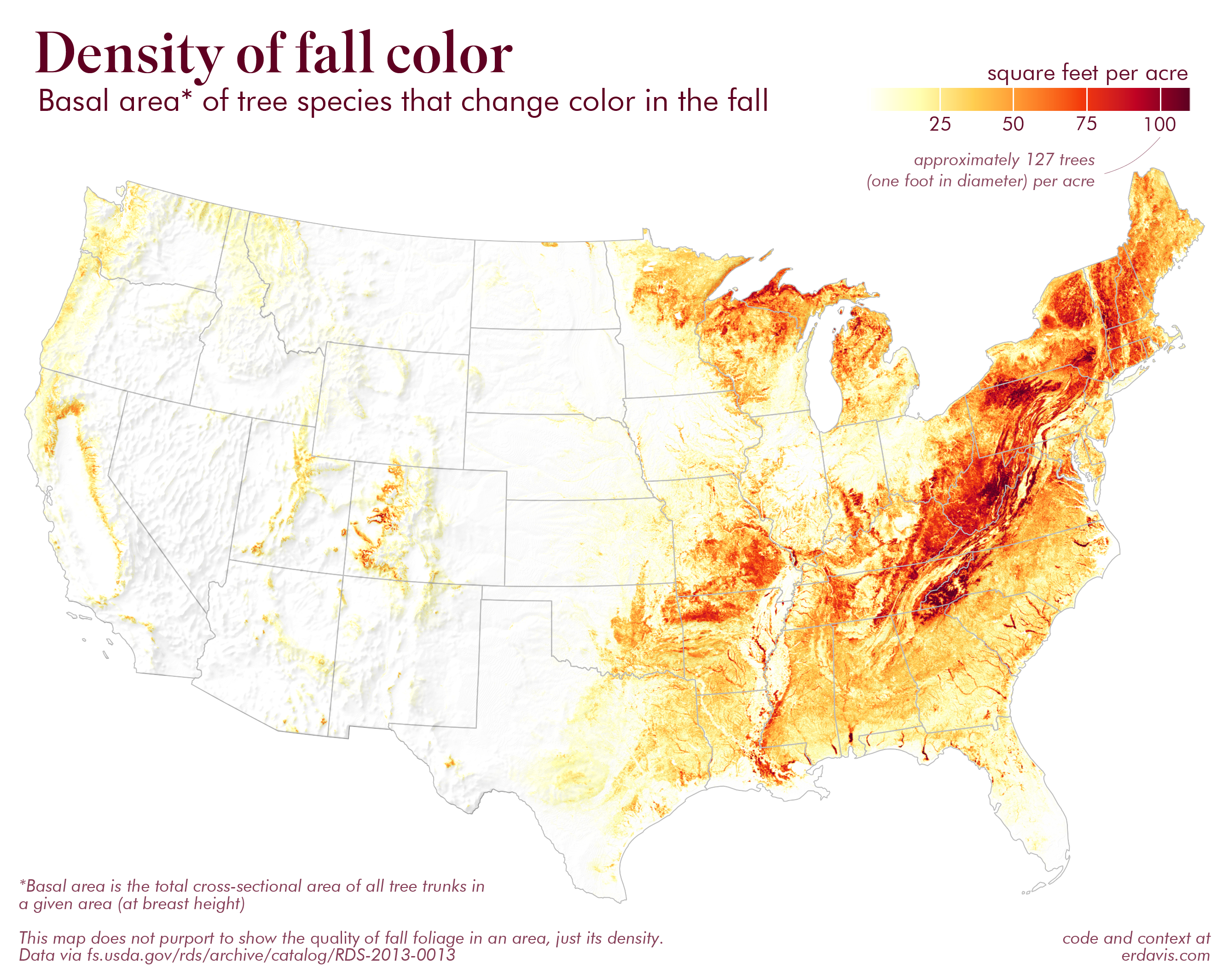
Behold, basal areas of more than 300 tree species at a 250 meter resolution
I stumbled upon this dataset while looking for something else, and I knew I had to use it for some 🍂🍁🍂seasonally appropriate 🍁🍂🍁 data viz.
Please enjoy:
How I did it
I first ran through the list of the 324 species and indicated whether or not they change color in the fall. I did this by Googling “tree name+fall color” and seeing what popped up. Of course, it’s important to know that some cultivars may not noticeably change color (e.g. a purple-leafed plum tree stays purple through the fall). Others may change color, but not in an aesthetically pleasing way (e.g. some oaks just turn brown). I didn’t attempt to control for this, and happily generalized to “not green in the fall” = “changes color”.
Now, to follow along, you’ll need to download and unzip all the RasterMap folders from the data source. Then take all the individual raster files and plop them into a single folder.
Then we can filter the raster files to just those for the trees that change color:
library(dplyr)
library(raster)
library(sf)

#set working directory to wherever this file is saved
setwd(dirname(rstudioapi::getSourceEditorContext()$path))

#list of trees I determined change color
trees <- read.csv('https://gist.githubusercontent.com/erdavis1/4d5fe65ed1e123528861c4ea2aad5fc6/raw/fbac43b753e2cf2d5bb87be383e5eea998af1831/foliage.csv')

#lists out all the rasters downloaded from here: https://www.fs.usda.gov/rds/archive/catalog/RDS-2013-0013
#change this path to where your rasters are actually saved
files <- list.files("./data/rasters/", full.names = T)
files <- files[grepl(paste0(trees$spp_code, collapse = "|"), files)]
Now, we’ll load all those rasters into a giant stack and sum up the total basal area in each grid cell. This will take a good long time to run–you may want to let it go overnight.
#load all the rasters into a giant stack
raster <- stack(files)

#sum up all the values in each cell to get the total area across all species
#this will take forever!
raster <- calc(raster, sum)

#downsample the data, we don't need it every 250meters
raster <- aggregate(raster, fact=10)
Setting up for plotting:
#put the data into tabular format for use in ggplot
data <- rasterToPoints(raster) %>%
  as.data.frame() %>%
  rename(value = 3) %>%
  subset(value != 0)

#basic info
epsg <- 5070
colors <- c('white', '#fffeb1', '#ffcd50',   '#fe8c2d',  '#f3380b',   '#c00223',  '#5e0021')

#us state outlines
states <- read_sf("https://gist.githubusercontent.com/erdavis1/99cd31888d7c717f6cae403f0a3b61d1/raw/0045160a24cbd3a064d8ffde5dd7bcd4cf17ca27/usa.geojson") %>%
  subset(!STUSPS %in% c('AK','HI','PR')) %>%
  st_transform(epsg)
And the plot itself.
ggplot() +
  coord_equal() +
  theme_void() +
  geom_tile(data=data, aes(x=x,y=y,fill=value), color = NA) +
  scale_fill_gradientn(colors =colors, na.value = 'white', limits = c(0, 110), oob=scales::squish)
The code above is a naive way of plotting the map. It simply takes the raster data and draws it as little individual squares.
But if you zoom in, you can see the squares leave a nasty jagged edge. This may not bother some, but it REALLY bothers me:
But I have a sneaksy little trick up my sleeve!
We can take the shapefile of the USA and use it to cut out a USA-shaped hole in a rectangle. Then, we can layer this rectangle on top of the raster, where it will sneakily smooth out the jagged edges.
Observe:
box <- st_bbox(states) %>% st_as_sfc() %>% st_buffer(5000)
cover <- st_difference(box, st_union(states))

ggplot() +
  coord_equal() +
  theme_void() +
  geom_tile(data=data, aes(x=x,y=y,fill=value), color = NA) +
  geom_sf(data = cover, fill  = 'white', color = NA) +
  scale_fill_gradientn(colors =colors, na.value = 'white', limits = c(0, 110), oob=scales::squish)
SO much better!
I’ll then add in the US state borders and save the plot.
ggplot() +
  coord_equal() +
  theme_void() +
  geom_tile(data=data, aes(x=x,y=y,fill=value), color = NA) +
  geom_sf(data = cover, fill  = 'white', color = NA) +
  geom_sf(data = states, color = '#bdbdbd', fill = NA, size = .25) +
  scale_fill_gradientn(colors =colors, na.value = 'white', limits = c(0, 110), oob=scales::squish)

ggsave("image.png", width = 10, height = 7, units = "in", bg = 'white')
Finally, I added in all the finishing touches in Photoshop. I’ve gotten asked why Photoshop and not Illustrator several times, and really the answer is just personal preference.
If a viz is going to be edited manually a lot over its development, if it has lots of fiddly elements that need to align, etc, I’d pick Illustrator.
For just slapping on some text and a hillshade, though, I don’t see much advantage. And while saving this particular map as an SVG would work, it would be a massive pain in the ass because each of those little raster squares would be its own object (and make a giant file).
About that hillshade, though–I felt that it provided some useful info, especially for seeing treelines in context. I just following Daniel Huffman’s classic Blender tutorial using DEMs from here, and layered it on in Photoshop.
One little trick I decided to use was not to show the hillshade anywhere above a certain density of trees. You can see when the hillshade is on it almost appears as if there are more trees than there actually are, while not adding much in the way of visible terrain.

And one last thought/question…
I’ve struggled to find a font combo I like better than Superior Title (hed) + Futura (dek). Anyone have other combos they like? Any thoughts on how this looks? It’s pretty much my lazy default, but I don’t wanna be lazy all the time!

Discover more from Data Stuff
Subscribe to get the latest posts sent to your email.