I live in the beautiful city of Portland, Oregon, which makes tons of city data readily available. Being a nosy jerk, I am particularly fond of PortlandMaps, which allows you to look at information for any property in the city. I decided to use their data to confirm/deny a hunch I’ve had for a while: that there are more female than male homeowners in Portland.
But how to go about this? I started by downloading all addresses and owners in city limits. I wasn’t interested in commercial properties, and I wasn’t able to find an indicator to exclude them, so it me took a few hours to clean up the data into my best possible guess of the set of private homeowners. This mostly meant excluding owners whose names weren’t formatted like a human’s, owners that had giveaways like LLC and INC, and so forth. I also had to clear away a lot of other junk–I have no idea how names get entered into this system, but it’s not done especially cleanly.
When I was done I was left with 200,000-odd addresses that appeared to be owned by one or several humans.
These I split into component owners so each individual got his or her own line item. This resulted in a ~320,000 owners (an average of 1.5 owners per home, which seems reasonable).
Identifying Genders
This is by far the wobbliest piece of the whole project. Portland does not track gender of homeowners, but gender is (imperfectly) encoded in our names. The SSA provides data on baby names. I used this to come up with the likelihood a person with a particular name is a particular gender. I didn’t do any fancy demography, just grabbed years 1928-1992 and went to town.
Then I could map each homeowner to his or her purported gender. I first joined on first name and then on middle name. I only took records where the name was at least 85% likely to be one gender or another (sorry Caseys).
Mappin’
Finally, I could dump my data into R and take a look: 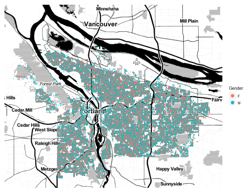
Well, that tells me a couple things, mostly that I didn’t screw up too badly. All the residential areas of the city appear to be filled in. But it’s ultimately not that useful.
How about looking at the density of homeowners? It looks pretty uniform above, but the dots are so big they overlap. Let’s try binning instead (hexagons for style):
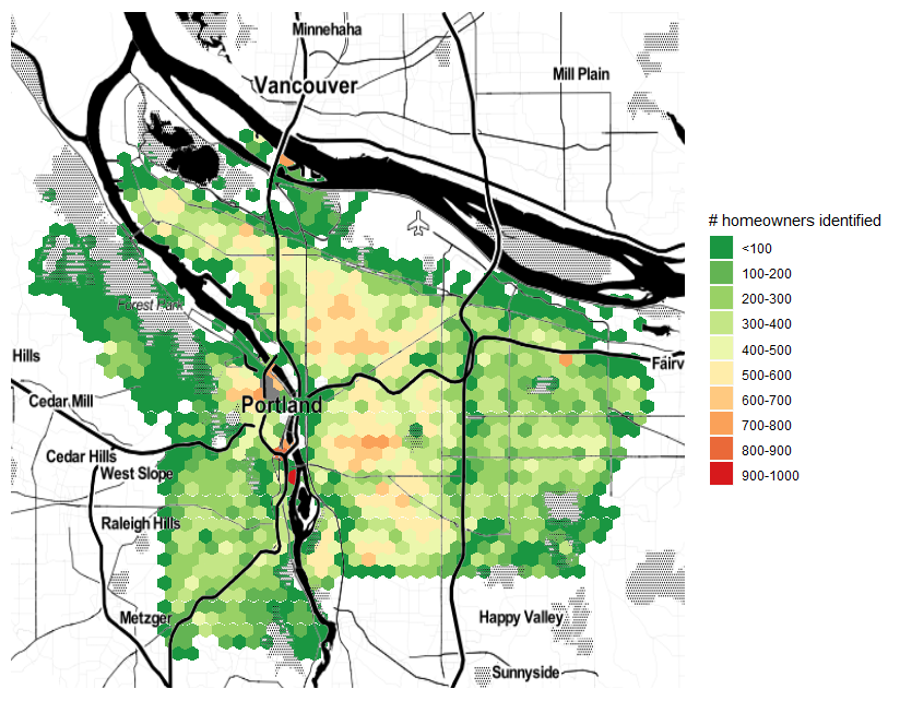
Snazzy! For those familiar with Portland, this feels about right. East of 205 (the right-most major north/south line in the image), density drops off noticeably (both in my chart and IRL).
But this is just homeowners with identified genders. Did I manage to identify genders uniformly across Portland, or are there pockets where I didn’t do so well?
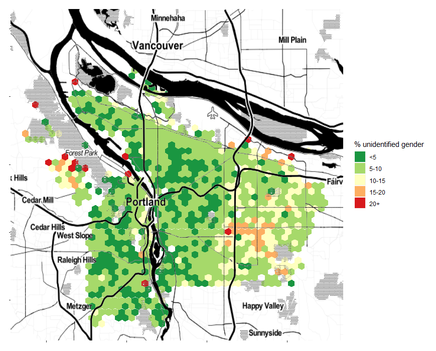
Unfortunately, yes. A lot of the uncertainty seems to be coming from Chinese and Vietnamese names–they’re being picked up, but not given a certain enough gender to make the cut. I decided to move forward knowing the data in these areas is shaky at best.
Now for the big reveal! 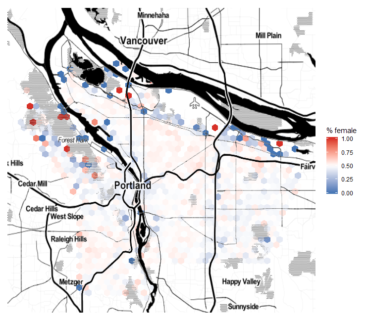
Uhhh…
So that’s not so interesting.
[and so I futzed for a few hours]
In the end, I bucketed the data to focus on the area from 45%-55% female. This map does exaggerate what are actually pretty small differences, but it gives the clearest view of the general trends:
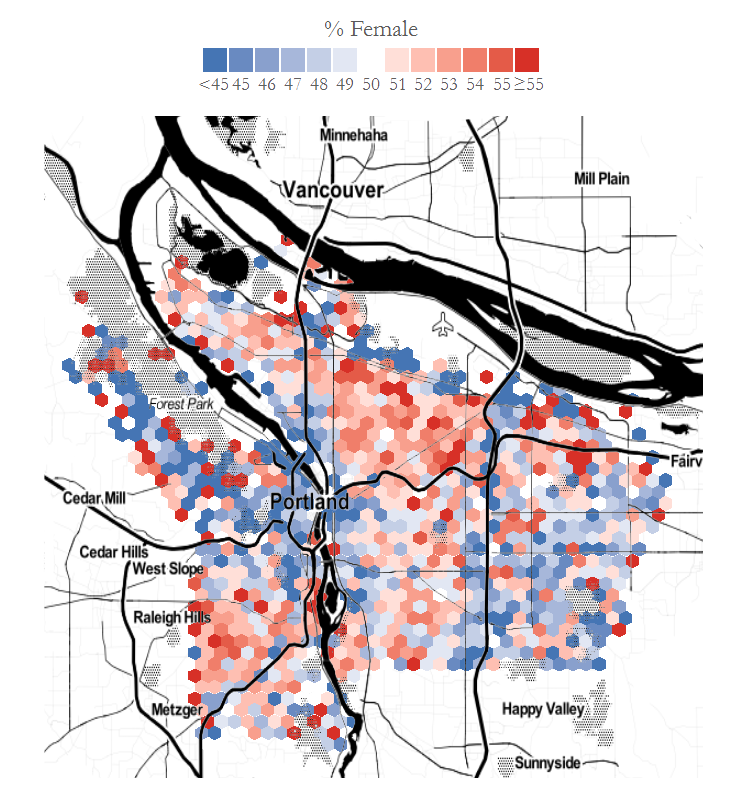
I want to be very clear that the un-genderfied names could swing this map in any ol’ direction. However, there does seem to be a distinct likelihood of three layers: a male city core, a female mid-city, and a male outer ring. I live in the female donut, and so my impression of a higher proportion of female homeowners might not be mistaken!
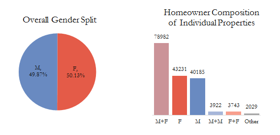
For fun, I graphed the overall split and the types of homeowner combinations. As expected, most homes are owned by a male/female pair, but there’s a lot of singletons as well.
And there you have it. Not the most scientific, but it sure was fun!
Discover more from Data Stuff
Subscribe to get the latest posts sent to your email.