Earlier this year, I published a map showing the most common road suffixes in each county, judged by the number of streets with that suffix.
I was surprised at how quickly it took off on Reddit, inspiring a boatload of messages asking for the data and disputing the results. I hadn’t really realized how intensely personal maps are–everyone in the US can look at it, identify where they live, and decide if it matches their perceptions or not. I’ve noticed this same pattern with all the other maps I’ve posted since.
One thing that did come out of the Reddit post, however, was the idea to map by miles of road, not by raw number of roads. I liked this idea, but didn’t know how to implement it for quite a while.
Recently, I’ve been getting more comfortable with the (amazing! useful! fast!) sf package in R, and realized it makes this problem almost trivial. I’m posting my code below in the hopes that it’ll be helpful to somebody, since it took me so long to realize how to do it.
Finally, the raw data is available here for your perusal/use.
Getting Started
To get started, you’ll need to download and unzip the roads and feature names shapefiles from TIGER/Line. This is honestly was the most difficult part of the project, since it took about forever.
I used 7Zip to mass-unzip the folders, and a bit of VBA to copy+paste everything into the same directory, but with a bit of code tweaking you wouldn’t need to do that.
Get a list of files
Next, load in the libraries you need and get a dataframe of all the files we’ll be importing.
library(sf)
library(foreign)
library(tidyverse)

options(stringsAsFactors = FALSE)
roadlen <- NULL

files <- list.files(path="./FeatNames/", pattern="*.dbf", full.names=TRUE, recursive=FALSE) %>% as.data.frame
names(files) <- c("path")
files$GEOID <- substr(files$path, 21, 25)
The meat of it
The main bit of the code is very simple. For each county, we import the Roads shapefile, which will allow us to calculate road lengths, and the Feature Names file, which has the suffix of each road. We can easily join the two datasets on LINEARID and sum up the road length for each suffix.
#loop through all shapefiles
for (i in 1:nrow(files)) {
  #read in the feature names file, which has road suffixes in it
  featname <- read.dbf(files$path[i],  as.is = TRUE)
  featname$SUFTYPABRV[is.na(featname$SUFTYPABRV)] <-
  featname$PRETYPABRV[is.na(featname$SUFTYPABRV)]
  featname <- featname %>% select(LINEARID, SUFTYPABRV) %>% unique

  #read in the roads shapefile as a simple features dataframe
  roads <- read_sf("./Roads", paste0("tl_2018_", files$GEOID[i], "_roads"))

  #here's why sf is so great: this is all that's needed to get the length of each road!
  roads$len <- st_length(roads)

  #join the two
  temp <- inner_join(roads, featname, by = "LINEARID")
  temp$geometry <- NULL

  #sum up the length of road for each suffix
  temp <- temp %>%
    group_by(SUFTYPABRV) %>%
    summarise(Len = sum(len))
    temp$GEOID <- files$GEOID[i]

  #save the results in a master dataframe
  roadlen <- rbind(roadlen, temp)
}
Last steps
Once the loop above runs (it will take a fair amount of time), we can get the suffix that has the most miles of road in each county.
#convert meters to mi
roadlen <- subset(roadlen, !is.na(SUFTYPABRV))
roadlen$Mi <-  as.numeric(roadlen$Len *0.000621371)
write.csv(roadlen, "roadlen.csv")

#get most common suffix for each county
plotsuff <- roadlen %>%
        arrange(desc(Mi)) %>%
        group_by(GEOID) %>% slice(1:1)
write.csv(plotsuff, "plotsuff.csv")
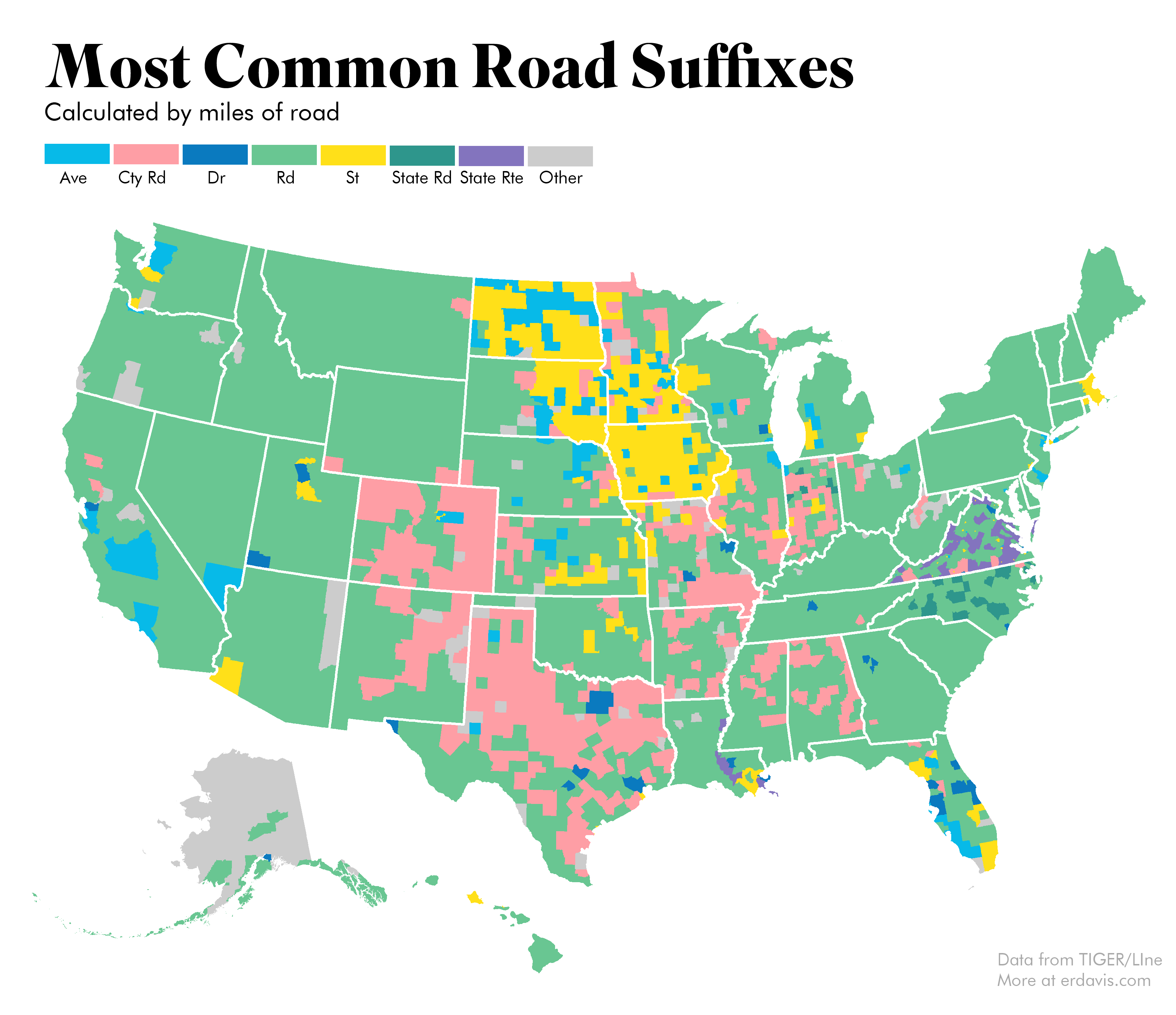
Final Results
Plotting the results is easy using the same techniques discussed here. I kept the same color scheme that I used last time to make it easier to compare the two maps side by side. The biggest surprise for me is how similar this is to the previous map: Road is really dominant throughout the country!
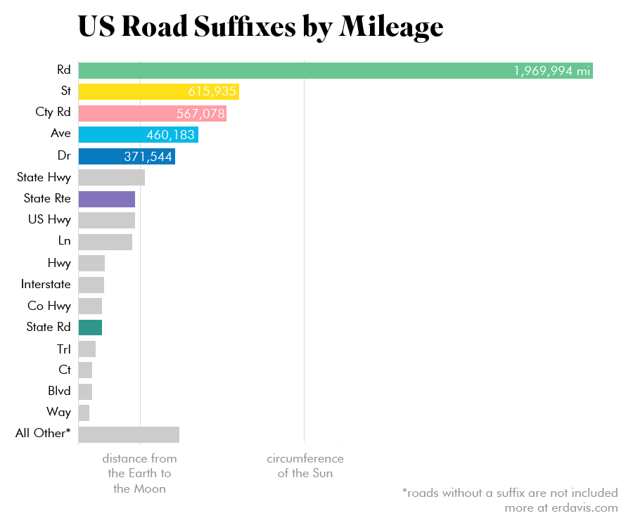
The real dominance of roads suffixed Road can be seen in this bar chart. One thing worth noting is the shapefiles seem to map highways twice: once for each traffic direction. I didn’t correct for this, so major roadways may be represented at about twice their actual mileage.
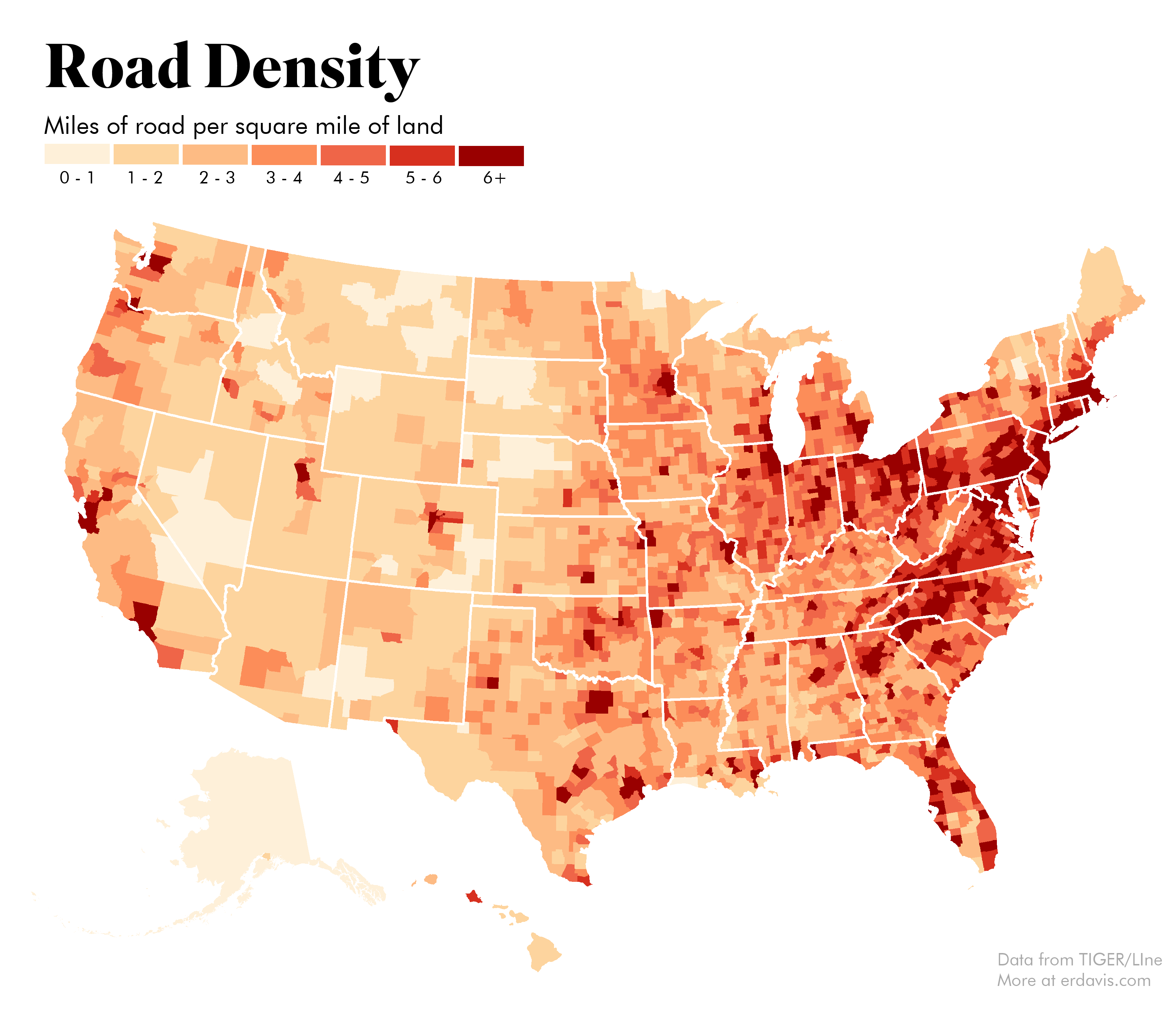
I also got curious to see road density across the country. It shouldn’t be surprising that this pretty much is a population density map, but it’s still cool to see.
Discover more from Data Stuff
Subscribe to get the latest posts sent to your email.
[…] finishing my map of the most common road suffixes by length, I realized I could also map each individual road, […]