Of the blogs I read, Daniel Huffman’s Something About Maps is one of my favorites. He posts his work as well as very helpful step-by-step tutorials on cartographic and cartographic-adjacent topics.
What appeals to me about Daniel’s work is how it’s a little wacky and unexpected–not necessarily what you’d find in the dictionary next to “map.”
This especially applies to his post about linearizing Lake Michigan. In essence, he unfolded the shores of Lake Michigan and mapped them they appear to be a straight line.
The idea appealed to me so much that set out to replicate it myself. I highly recommend you take a look at the original blog post, as everything below is just me rehashing his original idea!
Unfolding the San Francisco Bay
My initial plan was to straighten out the courses of rivers. For some reasons I’ll get into later, this didn’t quite work out as well as I had hoped.
Instead, I decided to hew more closely to the original project by unfolding the San Francisco Bay. Here’s schematic if it’s unclear what exactly I mean: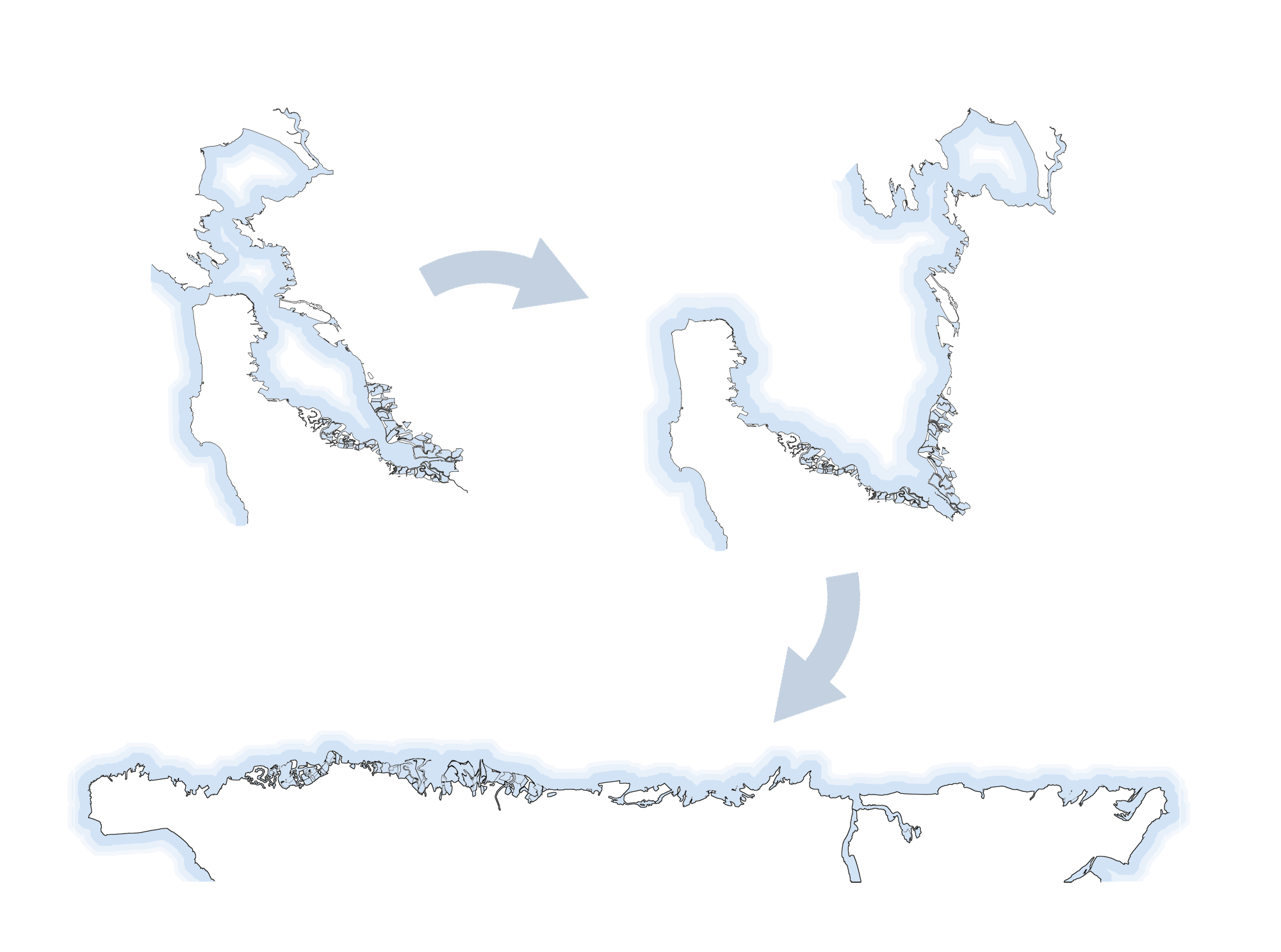
To do this, I had to learn about the power of SVGs.
I’d used SVGs before when I wanted scalable vector graphics (heh), but I had no idea how they actually worked. This is probably old news to most, but under the hood an SVG is pretty much just an XML document. Each element of the SVG–whether a line, a circle, a polygon–is stored in its own XML element.
Warping an SVG into a new shape is therefore pretty easy: you can apply whatever mathematical formula you want to each point in each element of the SVG. (This is assuming the SVG is saved with absolute coordinates and not relative coordinates, but that’s getting a bit detailed.)
So, to straighten out the Bay Area I could first divide it into slices:
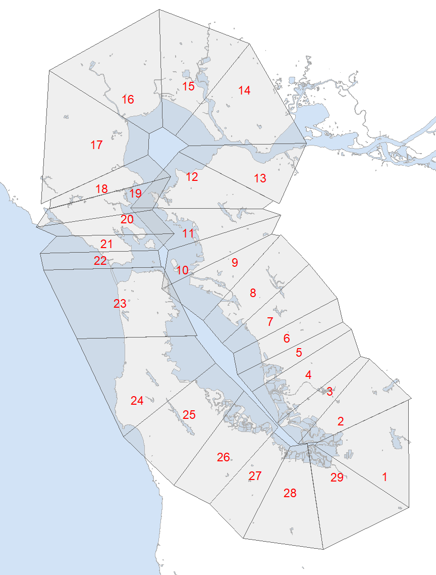
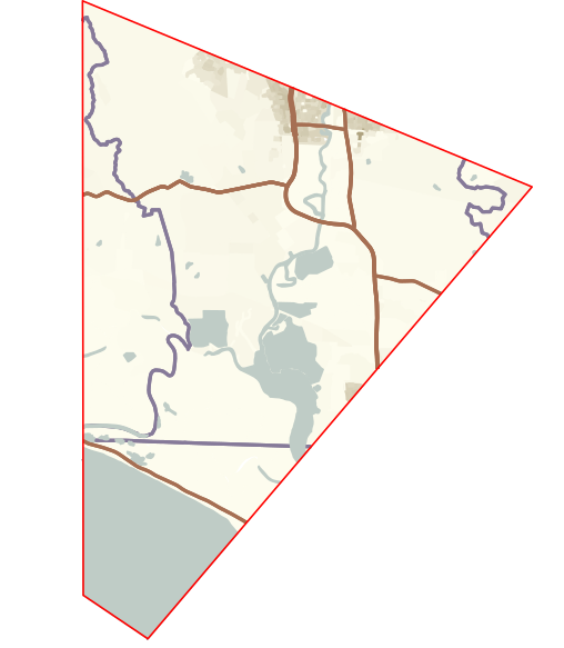
Then I could map out the geography of each slice and save it as an SVG. This is super easy to do in R using the sf package. I could just import whatever geographic data I wanted, clip it to the boundaries of each slice, plot it in ggplot, and export the plots as individual SVGs. For example, here’s the SVG output for slice #15:
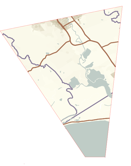
Next, I rotated the SVG (by applying a rotational transformation to each element) so one side was horizontal. This was necessary so the code in the next step would work correctly.
Using code Daniel provided, I could warp that slice into a square. The original warping code was in Python, but I rewrote it in R, the language I’m most comfortable with.
Finally, I transformed it from a square to a rectangle with about the same width:height ratio as the original slice.
Finally, all these nicely rectangle-ified segments can be stacked together: et violà, the bay is unfolded!
Here’s end result, using Daniel’s original color palette and styling.
I didn’t include a legend, mostly because of my own aesthetic preferences, but the light-dark gradient on the land areas represents population density. This may be obvious on larger maps with widely scattered cities, like Lake Michigan or Australia, but I’m afraid it loses a bit of meaning here. The Bay Area is so densely populated that individual cities don’t pop out of the background.
Handling the bridges was another challenge. Technically, they should probably make semi-circles and connect on both ends. I didn’t know how to do that in a visually appealing way, so I had them fade off as if into fog instead.
(click for big)
Unfolding Australia
I did Australia next–inverting the project by unfolding a landmass instead of a body of water seemed like fun.
Here I tried my own styling, going for something that felt more “Australian”, whatever that means.
What I really like about viewing Australia like this is that it really brings home how sparsely populated it is. You can give it quite a few good scrolls and still not pass by any population centers. (click for big)
What about the rivers?
At the beginning of this post I mentioned I’d started out wanting to straighten out rivers. I did actually put in a lot of work on that idea and even ended up with some completed maps. The catch I found was that most folks don’t have an internalized idea of how a river is shaped, whereas they do know what a landmass like Australia looks like.
This really took away from the impact of these maps–the reaction was pretty much always “so what?” If you don’t know what the river looked like to begin with, seeing it more straightened out doesn’t mean much.
All the same, here’s two I made.
River Tyne
LA River
In this map, I wanted a Thomas Guide type of feel. I don’t think I fully achieved it, but it was fun to look at old Thomas Guides online. Reminded me of a recurring situation in my childhood–my dad frantically paging through a falling-apart LA Thomas Guide while we sat parked on some unknown street.
Here, the freeways are much more prominent than the river. This was a bit intentional, as that’s just my experience of Los Angeles.

Discover more from Data Stuff
Subscribe to get the latest posts sent to your email.