I regularly post my work on Reddit’s DataisBeautiful, likely the largest dataviz community in the world. It’s brought me decent personal benefits–my post on coloring roads by suffix became popular and ended up escaping the Reddit orbit into the general internet, which was super neat. It’s also got drawbacks. When I post and my work goes largely ignored, it feels pretty awful. Some commenters nitpick, others outright insult. Even well intentioned criticism, ultimately helpful, can sting in the moment.
For better or for worse, though, Reddit is one of the most efficient ways to get eyes on my work, and I’ve become accustomed to the rhythms of posting my work there. Ideally, my piece will hit it off and I’ll get that rush of thousands of upvotes and hundreds of comments. They start slowly, peak, drop off, peak again when Europe comes online, and eventually cease. The average lifespan of a post is about 24 hours–after that, it’s subsumed by newer content. Worst case, my post sits static while another post surges past it and goes through the same cycle.
I was interested in making a visualization to show the rhythms of posts rising and falling, rising and falling.
Gathering Data
To properly visualize the rhythms of DataisBeautiful, I needed a solid several weeks of data. Frustratingly, my computer is prone to randomly shut off without warning (arggghh) and isn’t reliable for running code over multiple days.
To get around this, I dipped my toe in the waters of AWS. This post by Matt Strimas-Mackey is an extremely good guide to getting set up to run RStudio on AWS, and got me up and running in 30 minutes. A quick interjection: rarely do I find guides that lay things out as clearly as this, with screenshots showing you exactly what to click on and telling you why. It’s worth a read if you’re at all interested in AWS!
Once I got my AWS EC2 instance configured and running, I wrote some code to do the following every 15 minutes:
- Query DataisBeautiful for any new posts
- Add them to the master list
- For items on master list under 36 hours old, query the number of upvotes and comments
- For items on master list under 36 hours old, query the number and type of awards
- Save this data in a tracker list
- Write the master and tracker lists to my Dropbox
I managed to keep this code running continuously for more than 6 weeks before it errored out. By that point I was so complacent in its stability I’d ceased checking on it, and 3 days went by before I noticed the problem. D’oh!
6 weeks of data was plenty, though, and I set to visualizing it.
Visualizing
From the start, I had an image in my mind that this visualization would look like a sheet of music. After all, the rhythm of posts on Reddit can feel like music, if you squint.
This chart shows 36 hours in the life of each DataisBeautiful post between January 13 and February 23, 2020, as determined by the post score (upvotes – downvotes). Some posts quickly rise to the top and cruise along, whereas far more get muddled in the mix of unpopularity. Only about one post per day gets to break 10,000 while the vast majority get fewer than 100.
It’s not a flattering thing to admit, but I do want to make sure my posts on DataisBeautiful get as much attention as they can. Work has been done to establish 4-5am Pacific as the best time to post, but I also wanted to look at when users were most actively upvoting and commenting.
There is a definite increase in voting and commenting activity around 4am Pacific which spikes around 8-9am. Perhaps that coincides with Pacific time zone workers getting into the office and checking their phones and Eastern time zone workers taking lunch.
To get your post noticed, then, it seems wisest to take advantage of that upward morning trend in activity.
Awards are another (fun?) part of Reddit: users can “award” your post with various badges, some of which give you Reddit premium subscriptions (no ads) and “coins” you can spend on awarding other people’s posts.
Sadly, the 6 weeks of activity I monitored weren’t enough to establish much in the way of time-based trends in awarding activity. However, I can show that Silver awards (the cheapest option) are far and away the post popular to give.
Coronavirus
And finally, on to coronavirus. It’s obviously one of the most pressing concerns on the world’s mind, and that’s reflected in posting activity on DataisBeautiful. It truly feels that every single post is corona-related.
As a bit of a side project, I’ve plotted the percentage of posts on DataisBeautiful that are corona-related, as determined by their post titles.
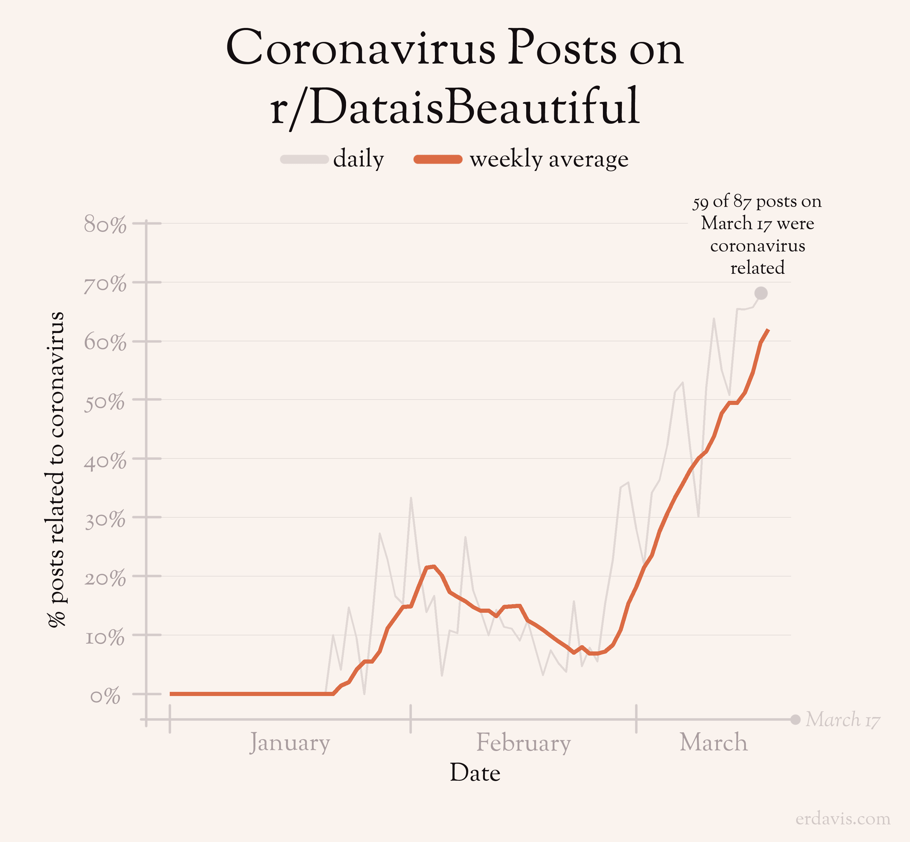
There is a clear, severe spike in the last several days, which neatly correlates with my own experiences out in the world. Everything seemed fine, if a bit on edge, until last weekend when all hell really broke loose.
I do feel that many of these posts aren’t showing the data that well–I do hope the moderators of the subreddit consider putting restrictions on these posts, whether that be designating specific days of the week for corona-content or creating more stringent quality requirements. Should that happen I’ll update this chart to see the effects!
Discover more from Data Stuff
Subscribe to get the latest posts sent to your email.