Every so often, a woman poses with a piece of her art, uploads it to Reddit, and the site loses its mind. Seemingly half the commenters claim her art is only getting popular because she posed with it, and the other half of commenters are defending her right to do so.
Just a few examples (and meta–commentary)
It’s commonly accepted in these arguments that if you’re a woman, posing with your work will lead to more upvotes.
There’s even a few casual analyses, usually in the form of lists of links, that attempt to prove this theory.
This seemed like a fun topic for me, with my skills in ~data analysis~ and ~caring way too much about the internet~, to investigate.
The data
I used the Pushshift API to gather all posts on r/Pics between January 2020 and May 2021. I filtered these down to 25,000 that were tagged Arts/Crafts. Of these, 698 had somebody posing with a work of art. (Tons more details below on how I actually gathered this data.)
I decided to only analyze r/Pics for a couple of reasons.
I wouldn’t need to take into consideration the relative popularity of different subreddits and the resulting impact on post score.
Other subreddits, like r/Art, ban photos that show objects other than the artwork and so wouldn’t be a great source of people posing with art.
Finally, some of the most controversial pictures (like the Geralt one), were actually posted on subreddits that don’t see a ton of original artwork posted. In these cases, it would be hard to tell if the post score had more to do with the fact that it was art, or the fact that somebody was posing with it.
You can view my data here.
Results
Do women get more upvotes?
The first question I wanted to answer: do women who pose with their art get more upvotes?
In short, yes. Lots more.
Men who pose with their art also get lots more upvotes than other arts/crafts related posts that don’t feature the artist.
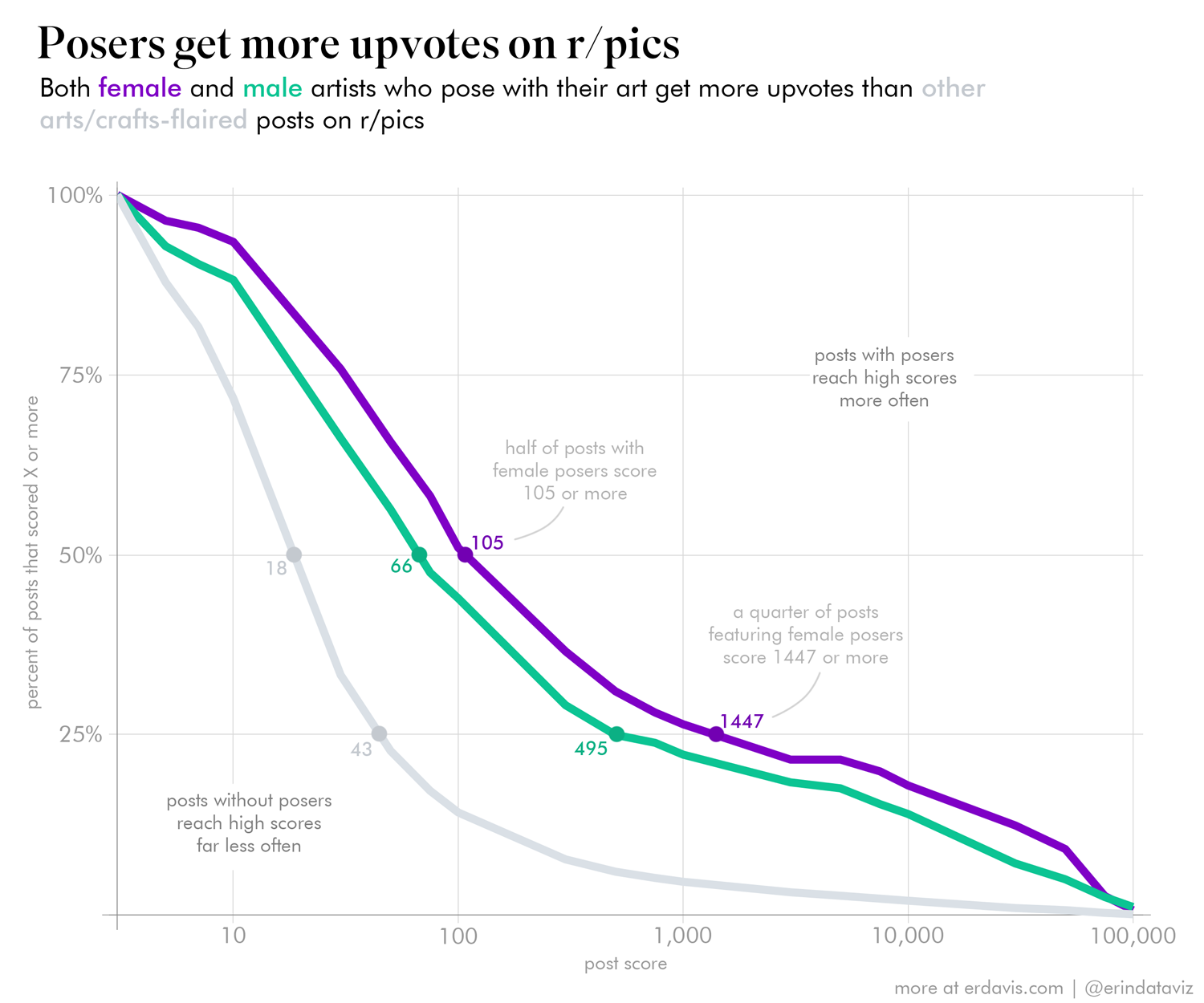
This chart shows the percentage of posts that reach various milestones in score.
You can see the female/purple line is above/to the right of the other two lines: this means that more posts featuring female artists reach higher upvote counts.
Why do people who pose with their art get more attention?
I’m not sure, but I have a couple of theories.
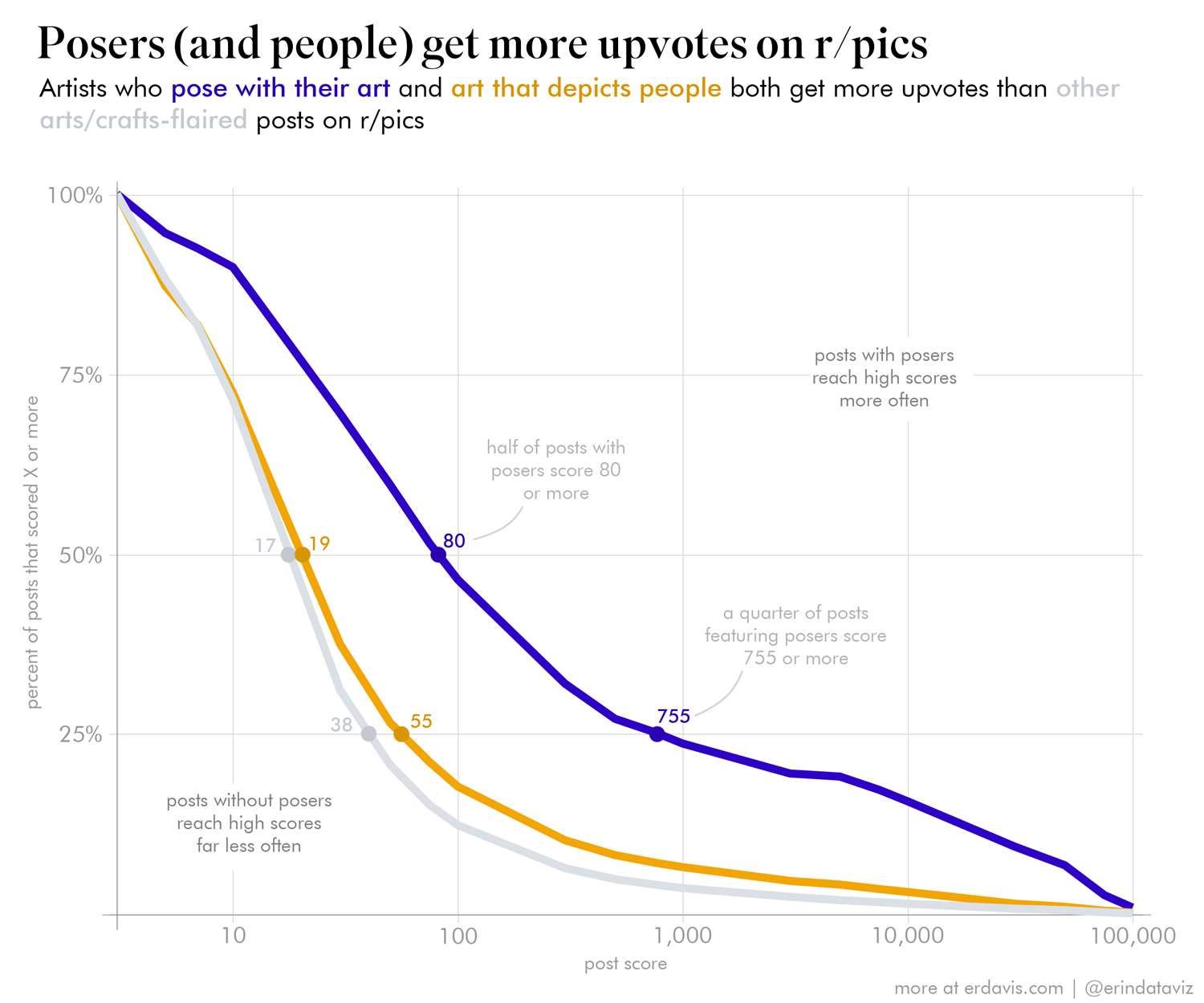
The first is that people are really attuned to other people. This chart is very similar to the chart above, but instead of showing men vs. women it shows posts with somebody posing vs. posts that depict a person (but don’t have an artist posing)
The posers clearly have the upvote advantage, but even just depicting a person in your artwork seems to lead to a modest upvote advantage over art that doesn’t show a person.
The second reason that comes to mind is quality. If you’re willing to attach your face to your art online, it’s possible that your art is higher quality and thus gets more attention.
Perhaps people who pose with their art do other things to ensure it gets lots of attention. I didn’t analyze this, but it’s possible they’re being careful about when they post and how they title their works to ensure a maximal reaction.
Are posts featuring women more controversial?
Reddit allows users to “upvote” or “downvote” a post. The overall post score is the number of upvotes minus the number of downvotes.
We can look at what percent of votes are upvotes to see how controversial a given post is. The closer the upvote ratio is to 50%, the more controversial–in other words, the community is divided on whether they like or dislike it.
In this chart, I’ve segmented posts by score and visualized the overall distribution upvote ratios.
What is immediately apparent to my eyes is how posts featuring male artists tend to be ~90% upvoted, regardless of the overall score of the post.
Posts featuring female artists are a different story. Their median upvote ratio is not only lower (~85%), but the distribution of upvote ratios is dramatically different. While some posts featuring female artists are highly upvoted, they are far more likely to have a low upvote ratio compared to posts by male artists.
We can also see that the highest scoring posts by female artists are also the most likely to have an upvote ratio around 70%. So the community in general likes these posts (thus the high score), but there’s a substantial minority of voters who dislike them (thus the poor upvote ratio)
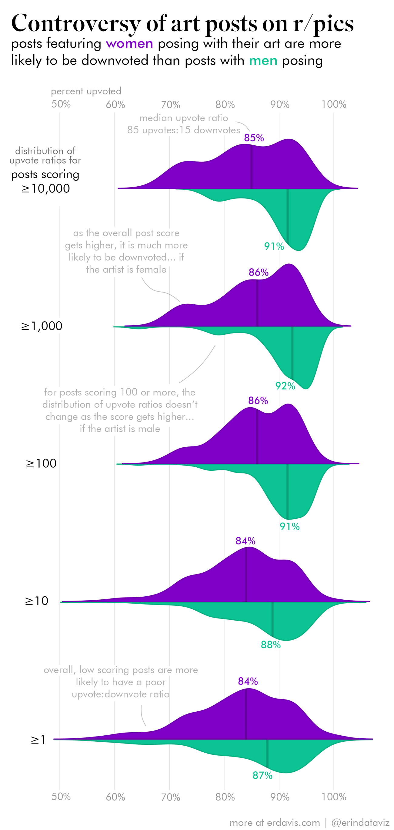
Granted, this chart might not be the clearest, but I wanted to segment out both upvote ratio and post score. I’d be interested to know if you think this visualization works, and if not, what other chart types you’d try!
How I did it
After speaking at the Data Science by Design conference a couple weeks ago, I was super happy to find out that others care about data analysis process write-ups as much as I do! I love reading data posts, but doubly love them if the analyst includes a behind the scenes look at how they did their analysis.
I’ll definitely be including these “how I did it” sections in my posts from now on 🙂
I won’t bother including my code for this one because this was more about process than programming, but I’m happy to provide it if you want it for some reason. (it’s all R)
Step 1: Get all Arts/Crafts tagged posts on r/pics
I used the Pushshift API to query for all posts on r/pics from January 2020 through May 2021. I broke up my requests into 15-minute increments. This was probably overkill, but asking for just 15 minutes worth of data at a time ensures I get absolutely everything Pushshift has. If I were to request longer time frames, I might hit Pushshift’s results limits and get only a subset of posts back.
Once I got back all the r/pics posts, I filtered them down to just those tagged “Arts/Crafts.” I’m not sure how those tags are applied, so it’s totally possible I missed tons of posts that nobody bothered to tag. That was a risk I was willing to take, though.
This led me to a result set of approximately 25,000 posts
Step 2: Make sure the posts are still up
Unfortunately, lots of Reddit posts are taken down pretty quickly. I ran through the URLs in my result set to make sure they were still active before moving on to the next step.
This filter left me with about 18,000 posts
Step 3: Get the correct post score and upvote ratio
Pushshift has stale upvote ratios and scores, so I ran those 18,000 posts through the official Reddit API to get the most up to date scores, numbers of comments, and upvote ratios.
I didn’t use the Reddit API for the initial data pull as Pushshift is much more user friendly.
Step 4: Check if a person is in the picture
This step is optional, but it makes the next step much more manageable.
I knew it would be very hard to automatically detect if a person was posing with their art. Instead, I decided to just run all the images through the Google Cloud Vision API to see if it detected any people. I could then go through this smaller set of images and manually ID those that had somebody posing with their art.
The Cloud Vision API ain’t free, but the final bill wasn’t too bad: $47.27 (which included some double-processing when I re-ran a bunch of requests because I thought I’d f’d up)
I could definitely have used a free image classifying library, but I’d rather pay $47 than unnecessarily use Python 😉 (Also, in my defense, Cloud Vision ID’s people even from partial body parts, whereas most other ones I’ve seen usually look for faces)
After this screen, I had 5700 images that were identified as showing one or more people.
Step 5: Check if a person is posing with art
This step is the most manual, and the most subjective.
First, I downloaded all the 5700 pictures I found in the previous step.
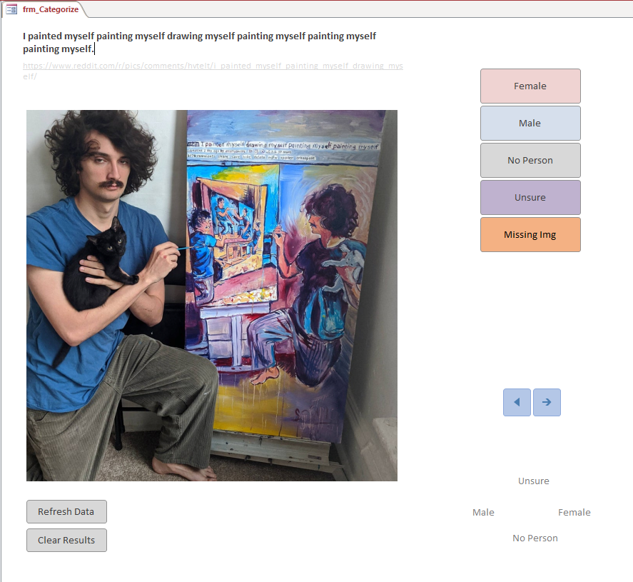
Then, I built myself an MS Access interface to quickly tag each image as containing a person posing with their art or not. I built it so that I could click buttons to ID the gender of the poser, or I could use hotkeys to do it. (I used the hotkeys almost exclusively). Once I pressed the hotkey to tag the image, the db automatically advanced to the next image for me to tag.
After tagging everything, I went through the ones I’d picked as having a person posing with their art and double checked that I agreed with my initial tags.
This took about four hours or so, split over several evenings.
I ended up with 698 works with a person posing: 306 women, 364 men, 21 with multiple people of different genders, and 7 where I was unsure.
It was pretty subjective to decide what counted as “posing with art” and what didn’t, but I came up with some general rules to follow:
- “Posing with art” means a human was prominently featured alongside a work of art
- The person posing didn’t need to be the actual creator of the work
- People posing with public murals or famous works of art didn’t count (unless they were the artist)
- Famous people didn’t count (e.g. Picasso posing with his art was excluded)
- Cosplay/costumes didn’t count
- Children posing with their art counted
- Gender was determined based on my own opinion of the person’s appearance, on the basis that that’s how someone scrolling by on Reddit would judge as well.
Step 6: Visualize away!
I used some unusual chart types here. Some random thoughts about that…The vast vast majority of Reddit posts die unnoticed. The distribution of post scores is heavily concentrated at the lower end of the scale, making histograms/beeswarm plots/violin plots hard to use.
I chose to plot the metric of “% of posts scoring more than X” because that provided a normalized value between 0-100. If I were to plot “# of posts”, I’d have huge values at the lower end of the scale that would make the higher end of the scale very hard to read.
I also chose the log-10 axis to keep the lower end of the scale visible. Because most posts score less than 100, it was important to me to be able to read those values. If I had a linear x-axis, the few posts around 100k upvotes would stretch the axis so far you couldn’t see what was happening.
I do think that this makes the chart take a little bit of though to read, as it’s not presenting the data in the way you’d expect, like in a histogram. But my hope is that for a bit extra effort in reading, you get lots more info than a super-squished histogram 🙂
Also, the mirrored half-violin plots for the upvote ratio plot might be a bit confusing. I wanted to show how posts got more controversial as the score went up AND the overall distribution of upvote ratios. I’m curious if anyone has a better way to do this… but I do think the half-violins look pretty rad!
Discover more from Data Stuff
Subscribe to get the latest posts sent to your email.
> I’d rather pay $47 than unnecessarily use Python
Oof, fighting words right there.
Anyway, I think pictures with people I in them are very intentional, since you have to have someone take it or setup a camera or take a selfie. People who appear next to their art are doing it because they think it’s worth the extra effort. So either they hope to get upvotes for being attractive or it otherwise plays into the art or the story they’re trying to tell. The guy painting himself painting himself is in the photo cause that’s the joke. Same with the woman in the hoodie whose self portrait is her own naked body. I would be interested to see a comparison of art where the person in the photo doesn’t add any particular value, i.e. they’re just standing next to their art rather than making a clever joke or portraying some kind of narrative. I’d bet that of the art with someone in the photo, the few without either A) an attractive woman B) a funny bit that requires them to be in the photo or C) an engaging story (wholesome, sobriety, etc) did far worse. That said, just being next to your art might still do better than art-only submissions because having someone in the photo is less common and people are inherently engaged by other people.
This is super interesting! Appreciate the process explanation.
I’m a female hobby artist and I occasionally post my stuff to Reddit (not r/pics, though.) I never put myself in the picture even though I know it might get the post more attention. I don’t want the feedback I get to be influenced by my appearance.
From an artist’s perspective, I really prefer to see just the artwork first when I’m scrolling. I actually instinctively scroll past art posts with a person in the picture. I think my brain classifies those pictures as selfies rather than art pictures.
Not surprising at all that women’s selfie art posts are more controversial than men’s. Although I have to admit the first example post linked was quite distracting to me because of the filter.
Just wanted to comment that I didn’t think the mirrored half violins were confusing actually thought they were quite intuitive and liked them! But I also work with/studied data so maybe am not the best opinion!
Love this post! Thanks for sharing the detailed process