It’s been a minute since I last posted some personal work. This feels great! Hello!
One thing I really didn’t expect about doing dataviz professionally is that it’s really put a damper on my motivation to work on personal viz projects. And, naturally, I also adopted a puppy. He chewed through my computer charger and it took ages to get a new one.
So! That’s why I’m here in November, posting a project I started during the hellish depths of heat we got this summer.
In Portland, we hit 116 in June and 105 in August. My un-airconditioned home got to 95 degrees indoors during the first heat wave. For the second, luckily, I snagged a portable AC unit. It made it much more bearable, but living confined to one room (puppy and all) is really not so fun.
I started wondering: how long can I reasonably expect these temperatures to last? How late into the year will we be getting these heat waves? And how early will they start?
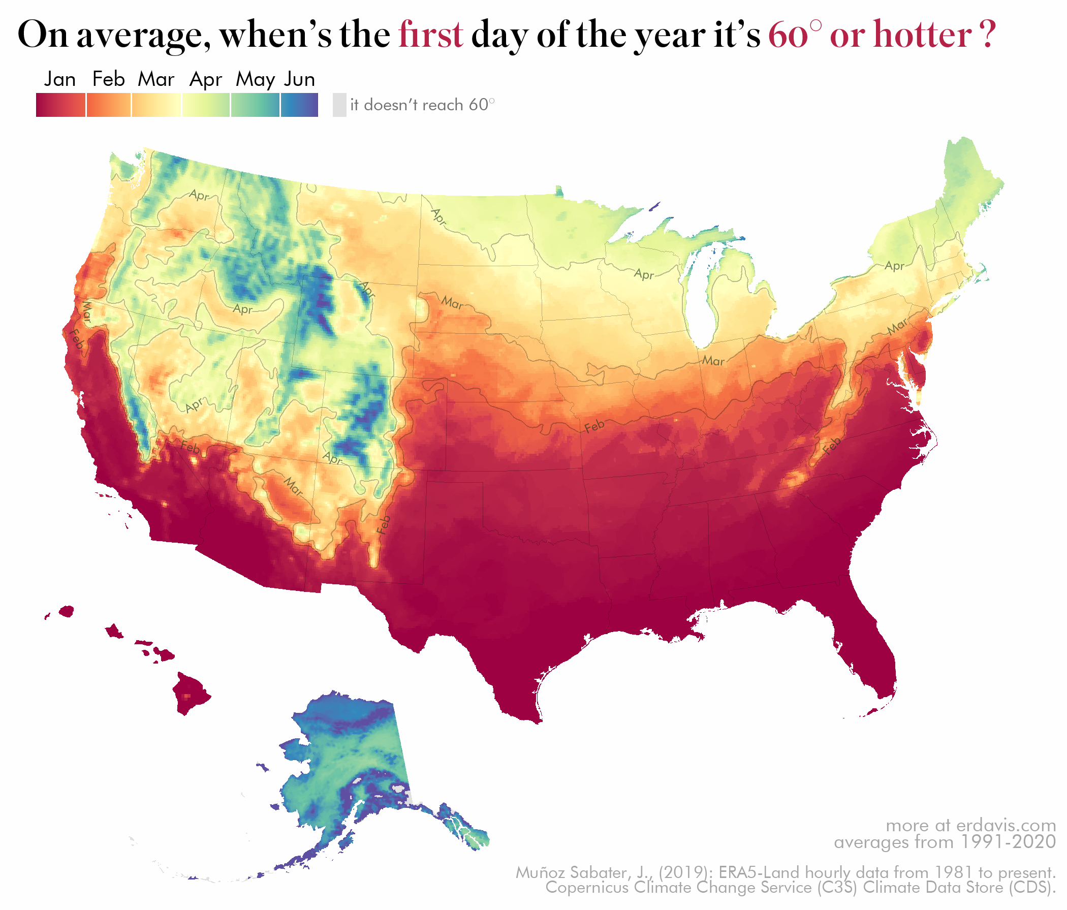
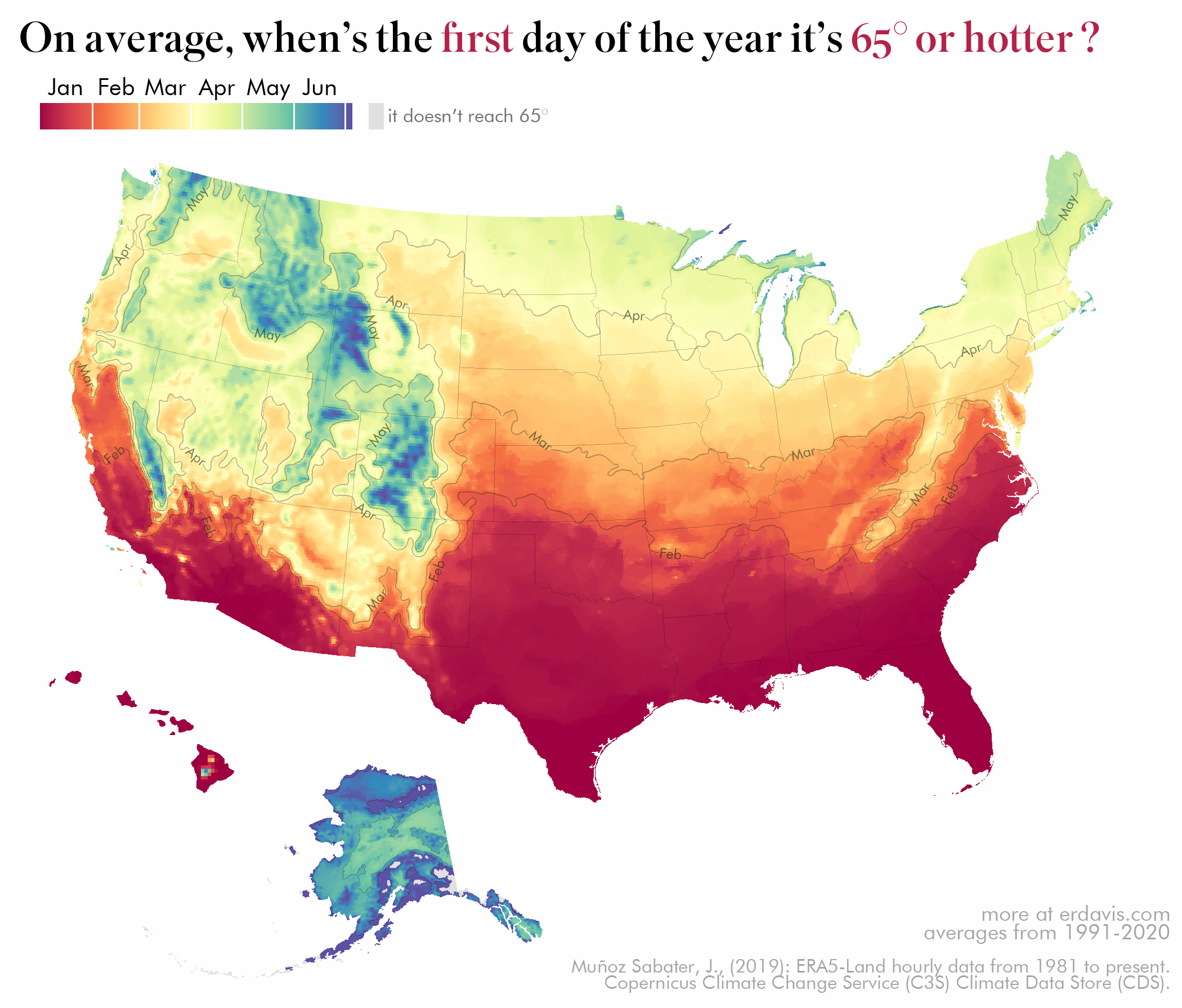
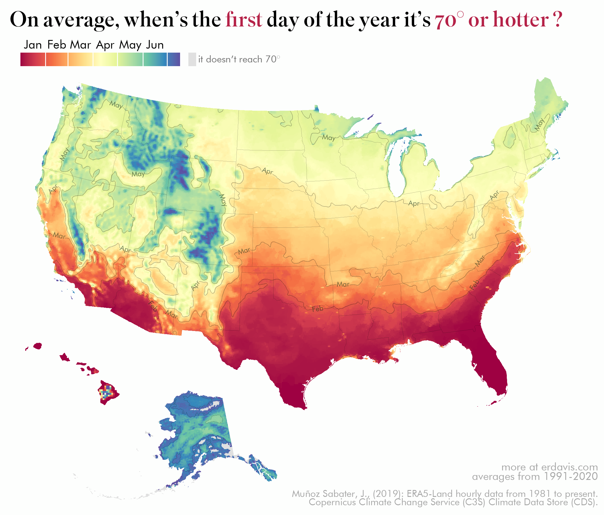
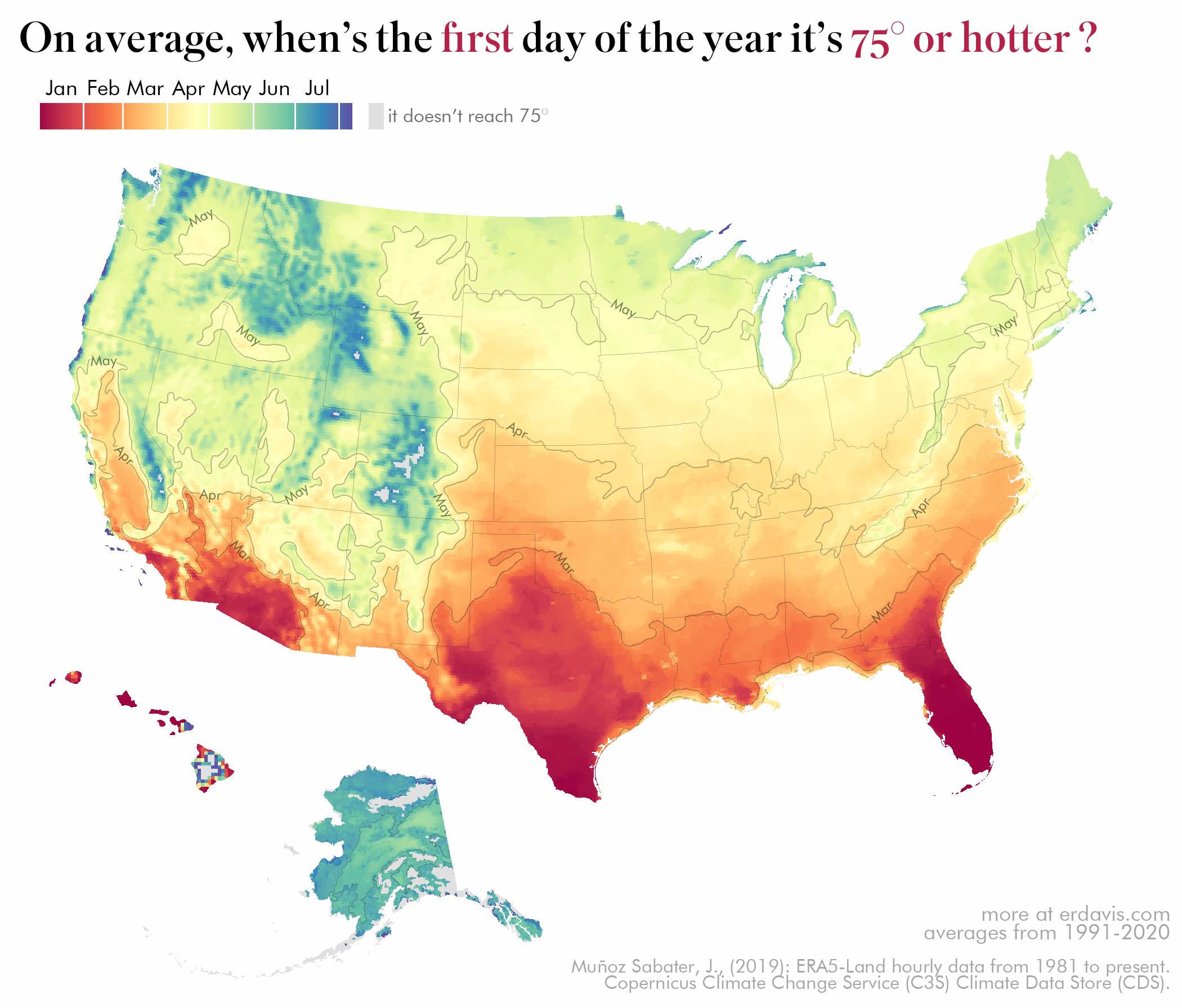
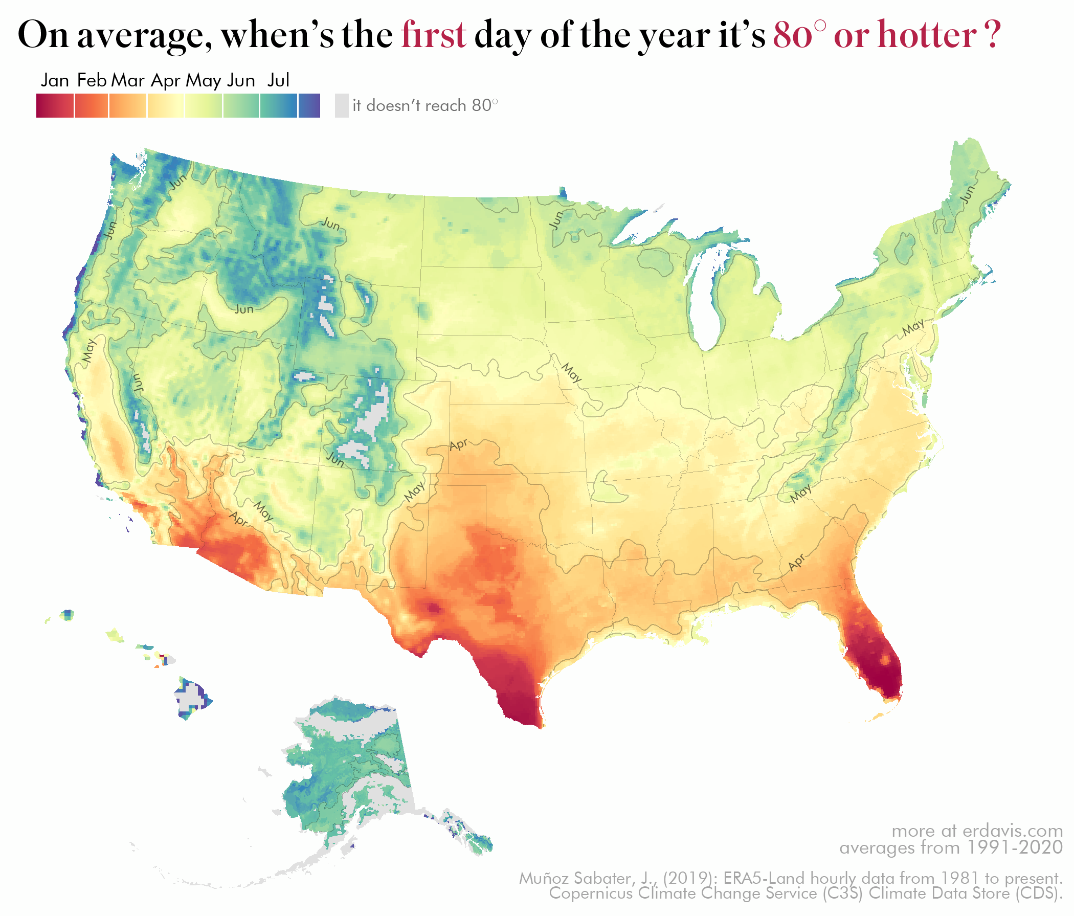
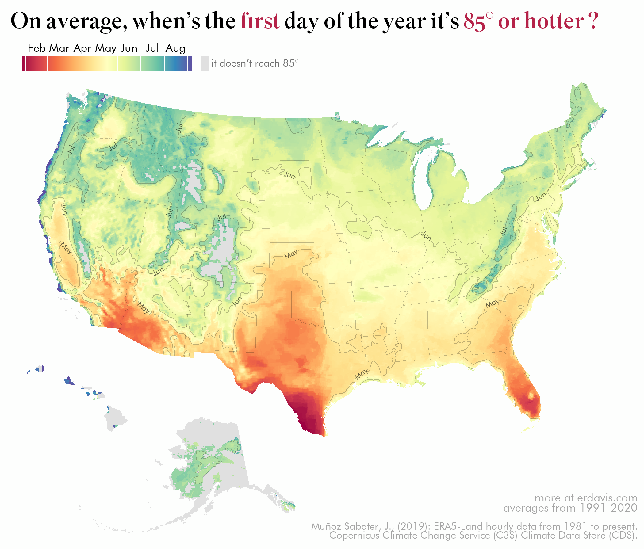
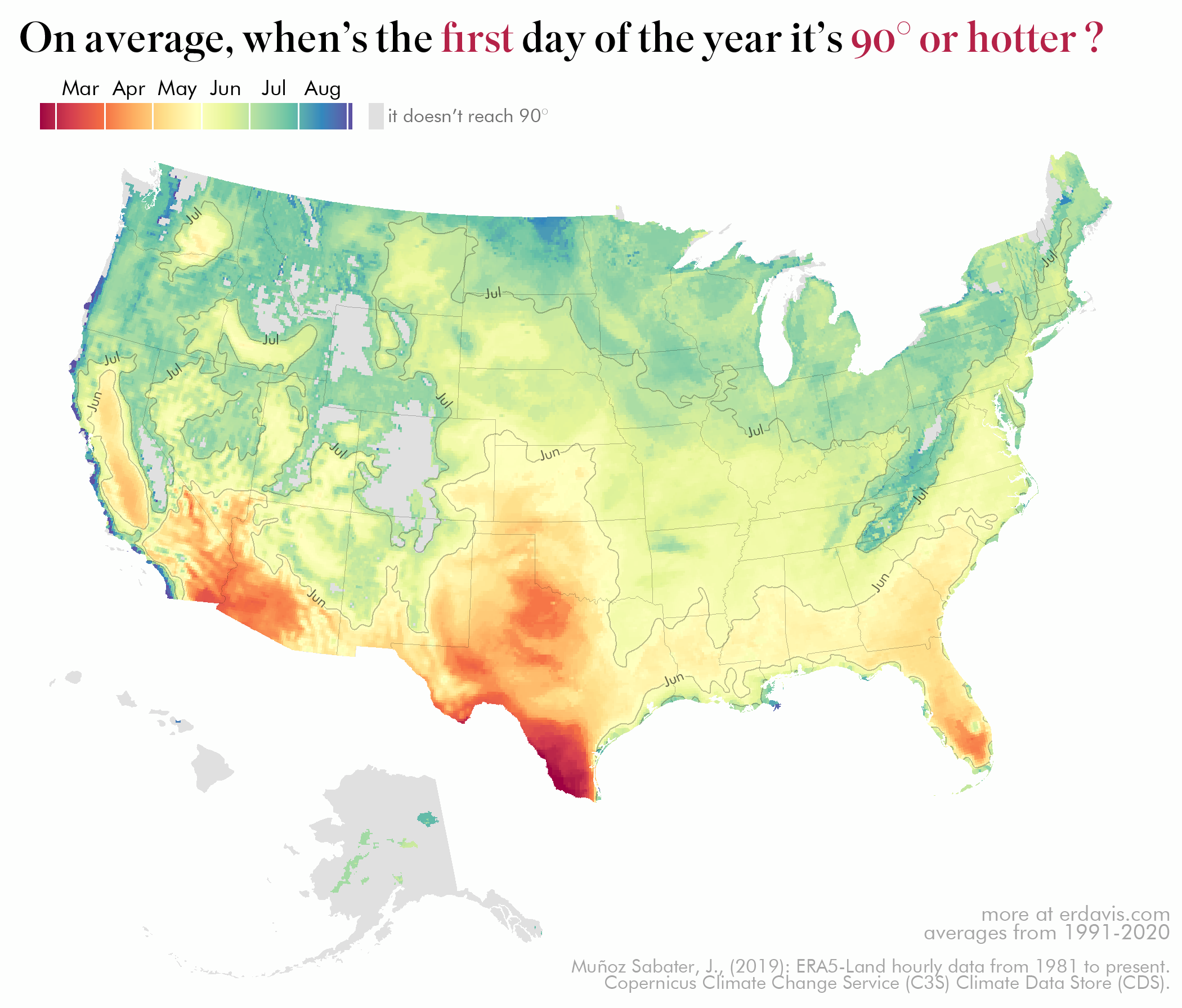
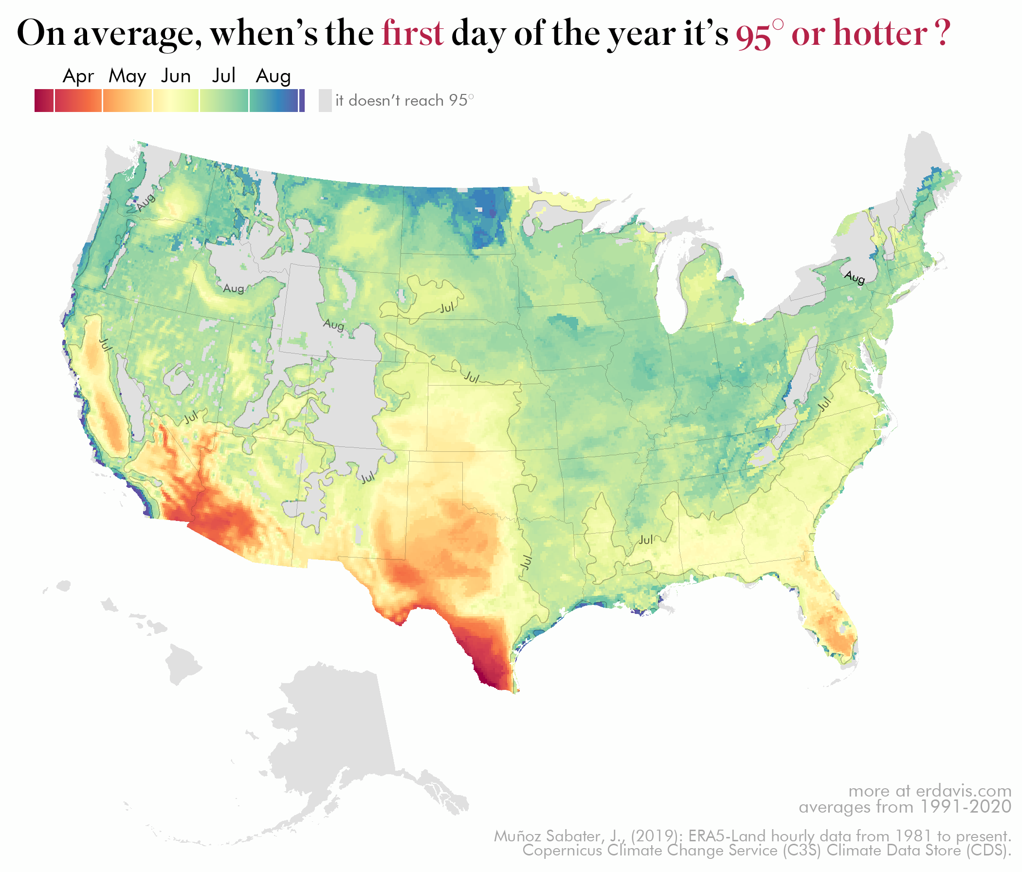
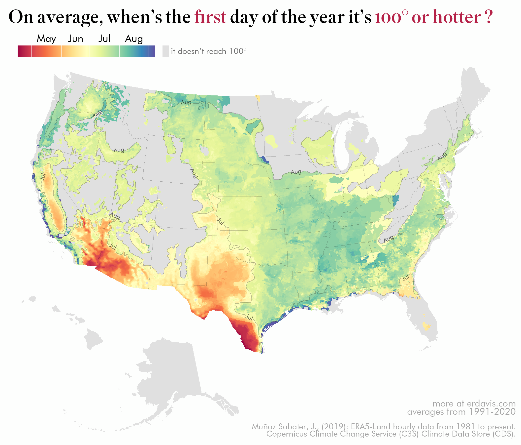
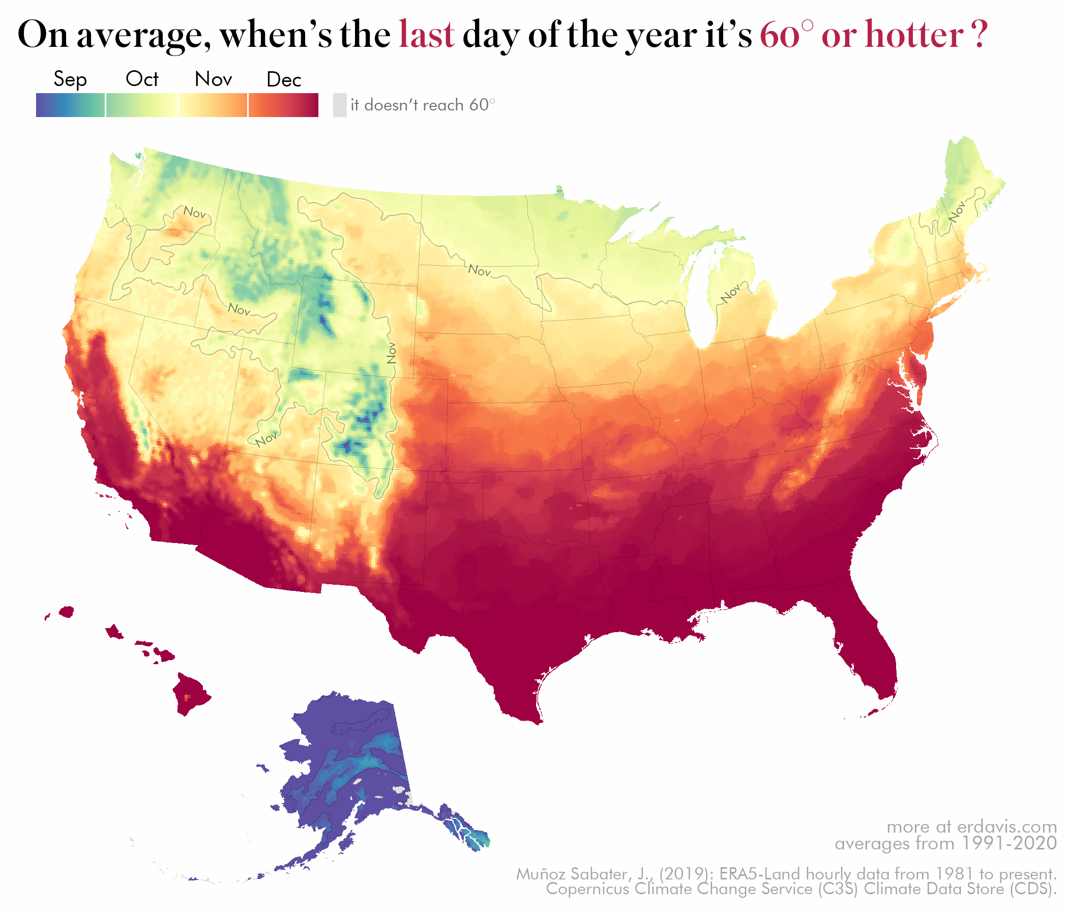
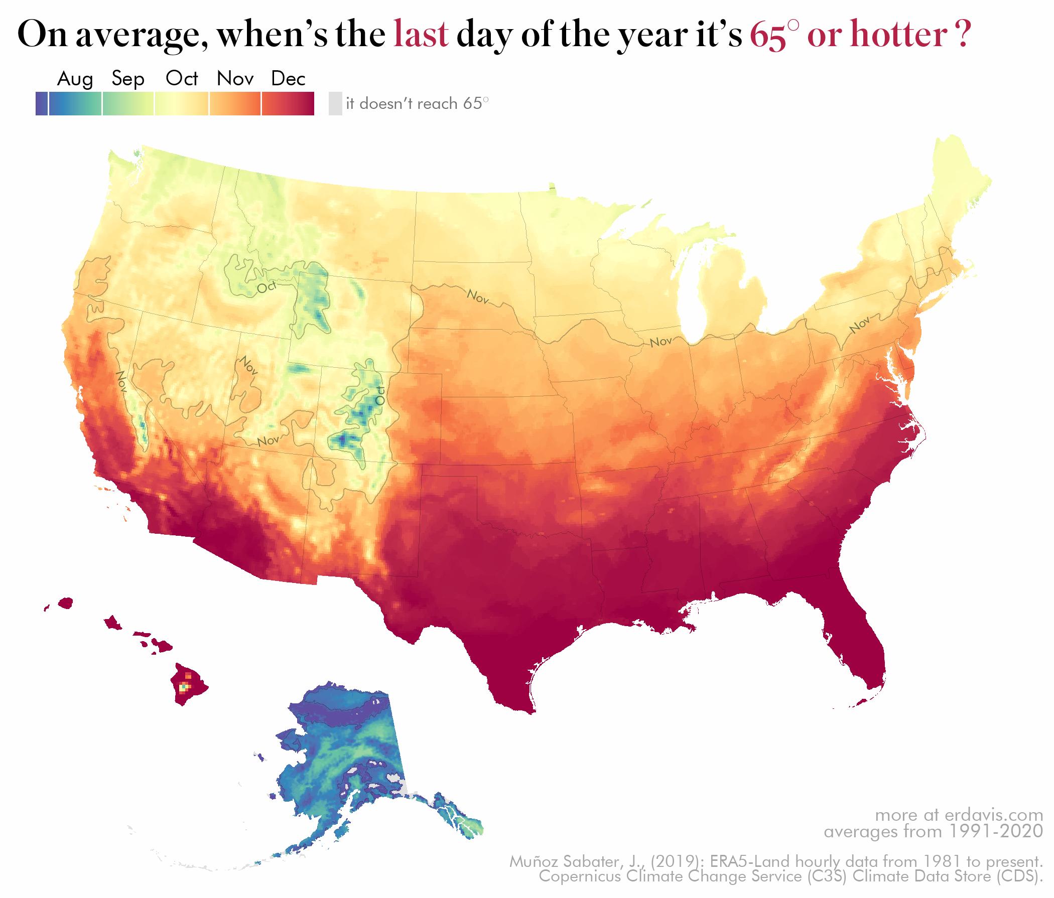
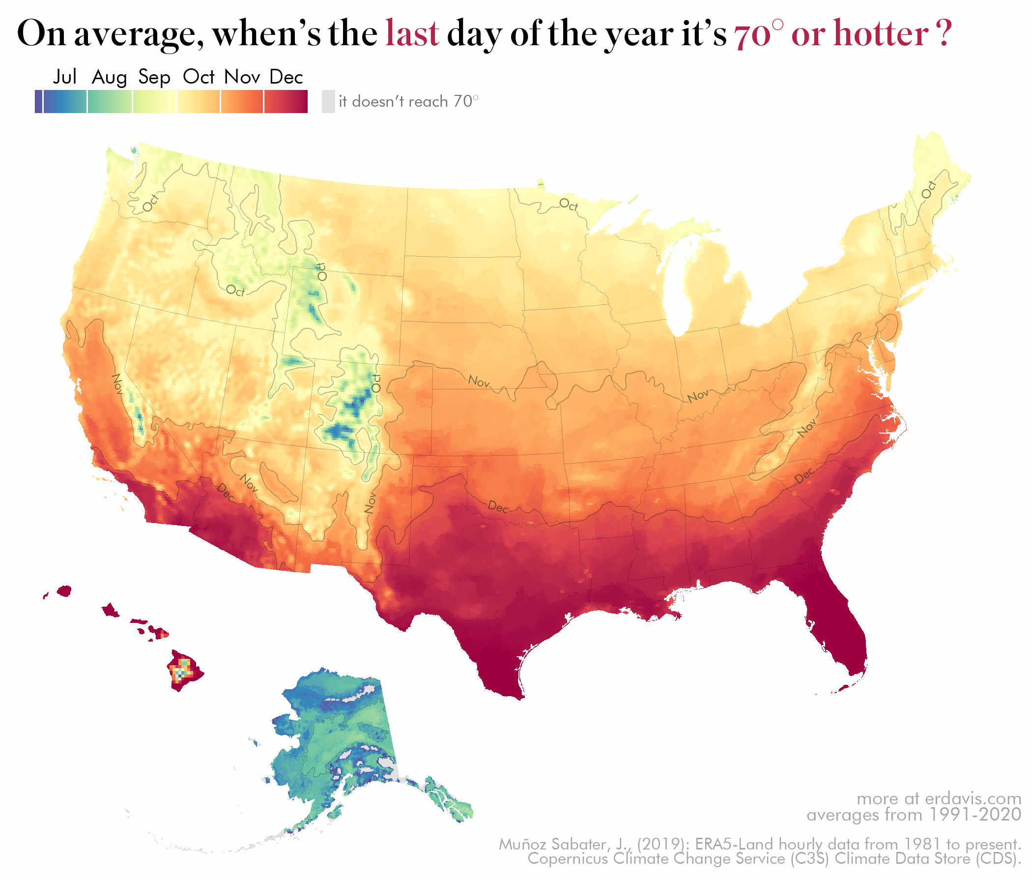
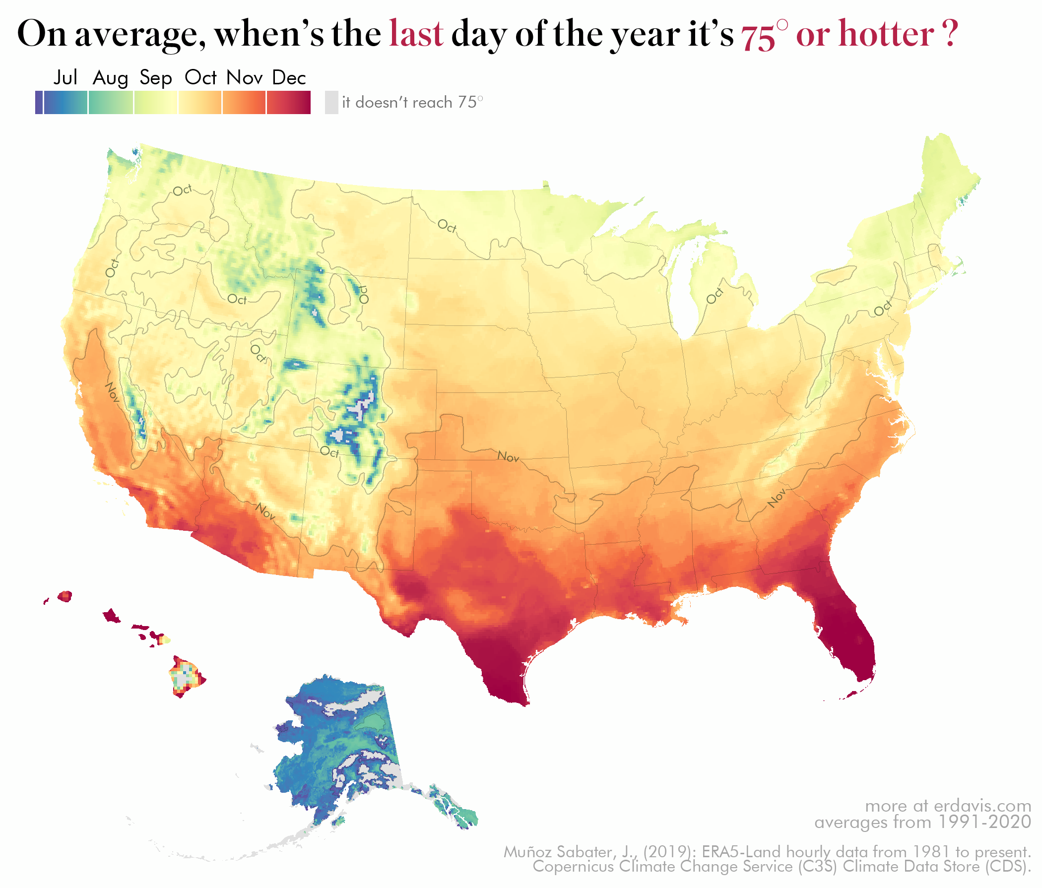
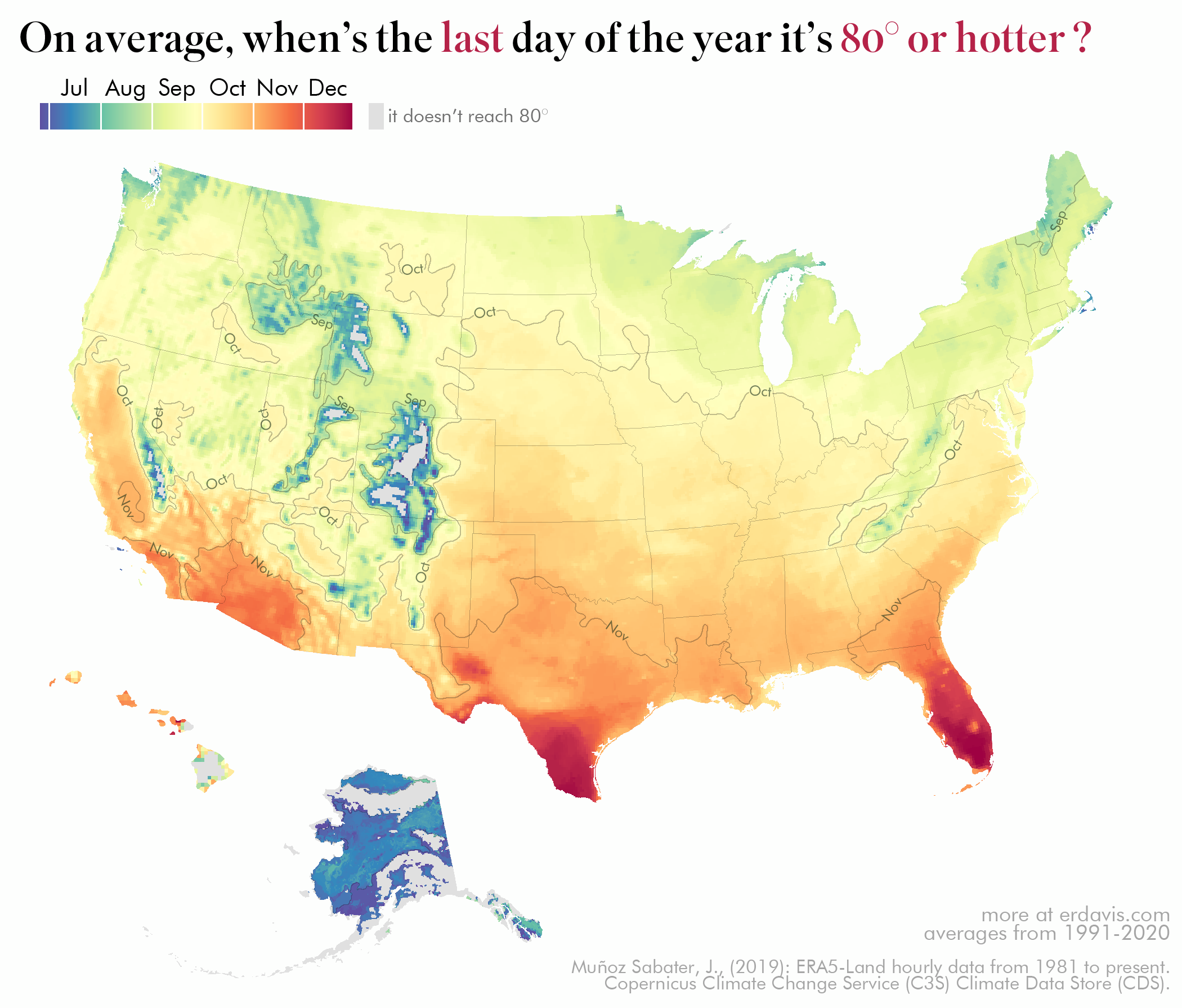
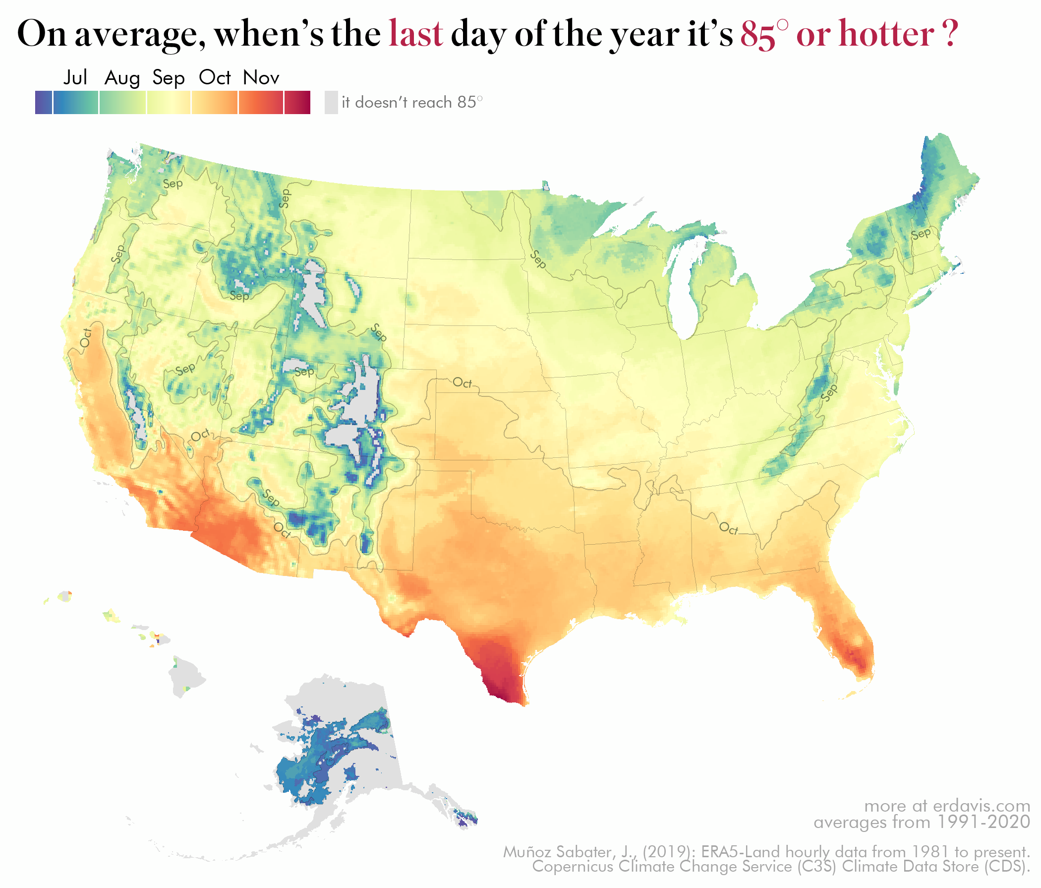
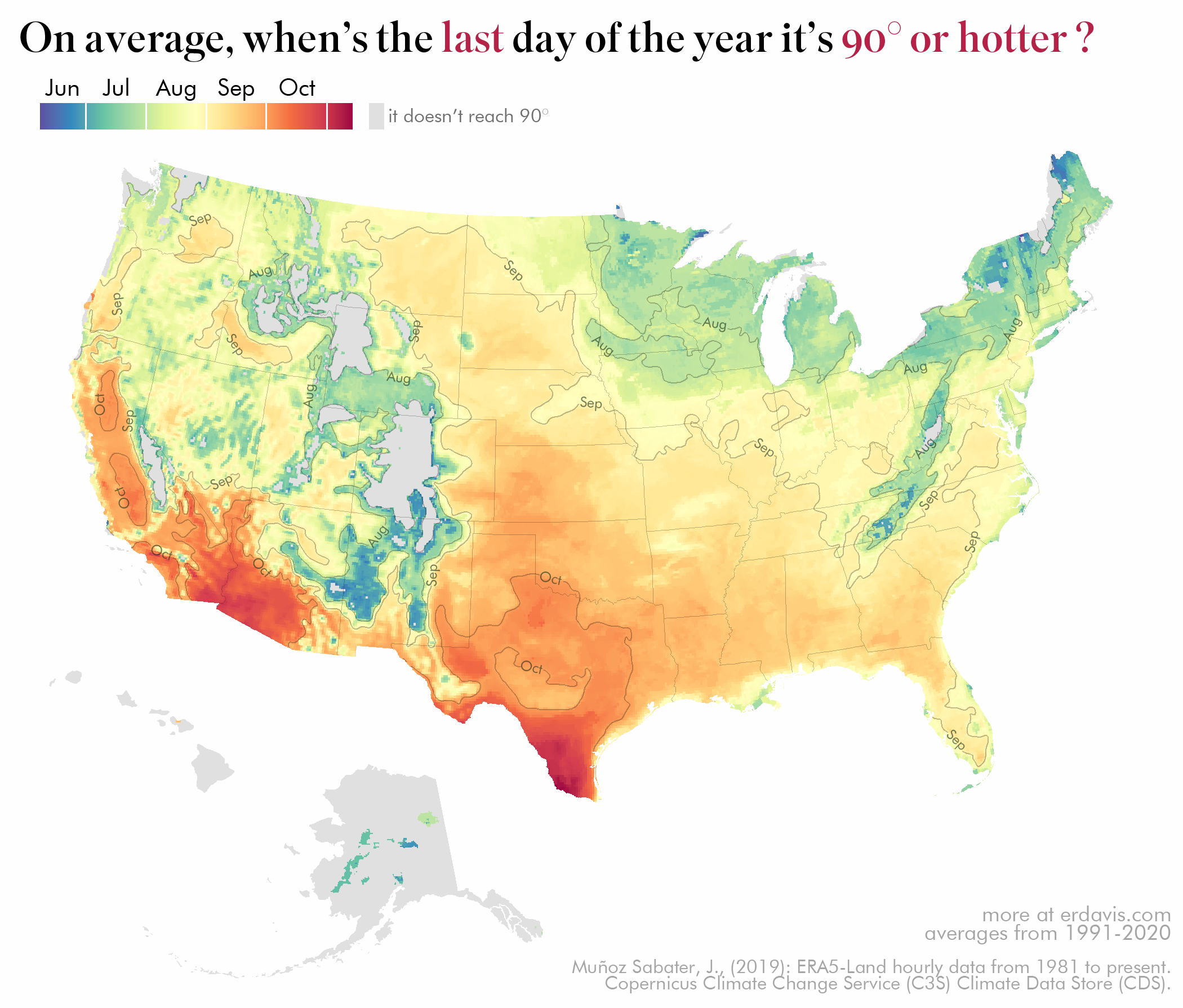
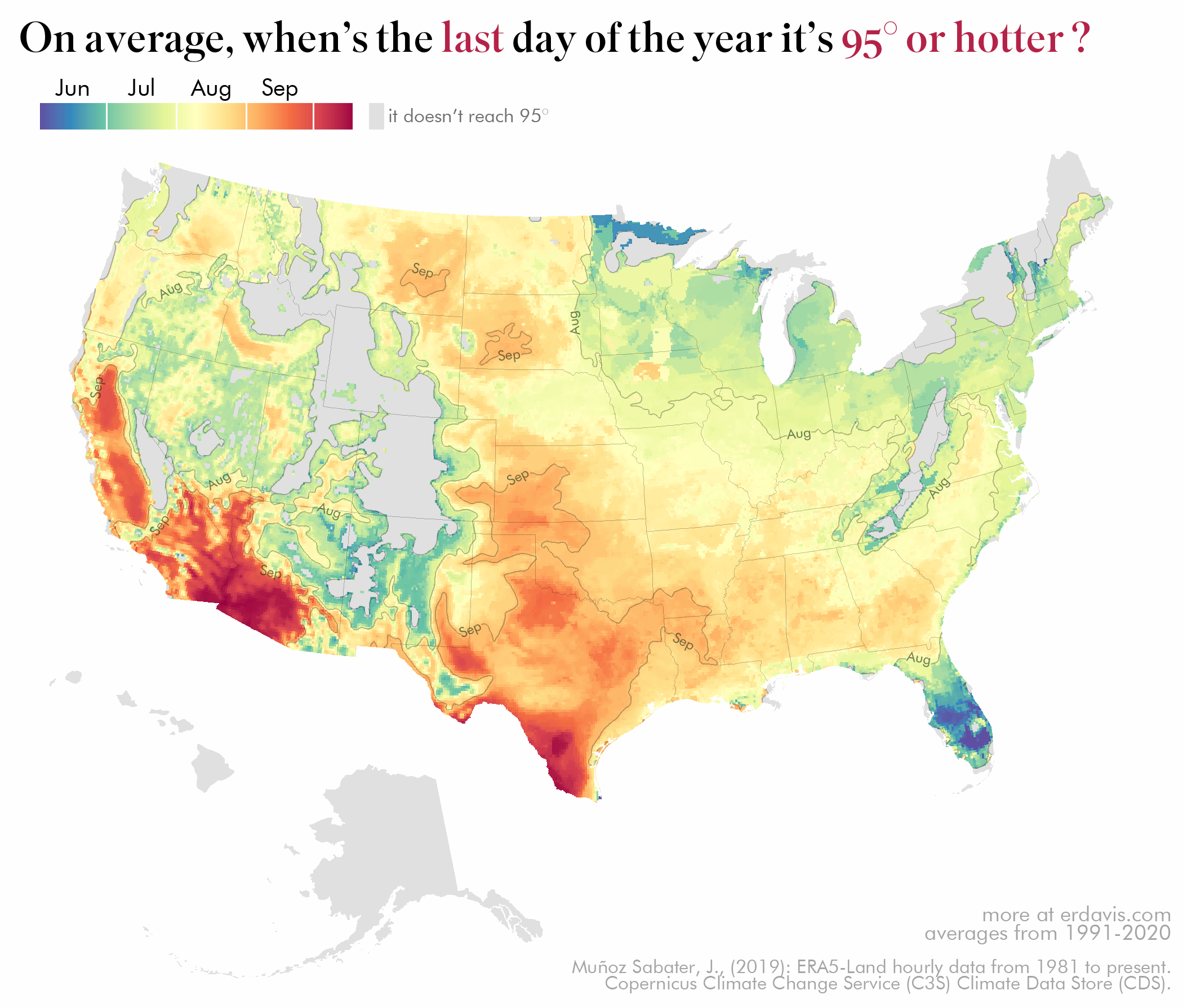
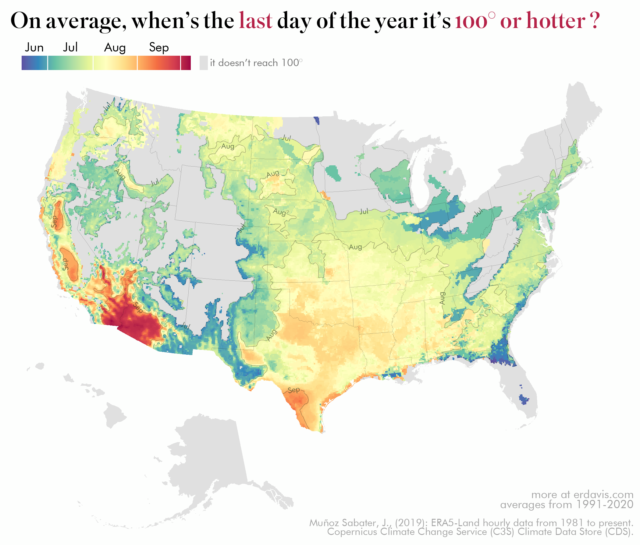
Naturally, I had to make a series of maps to explore this. I chose to visualize the day, on average, it first/last reaches a series of temperatures.
This is a super visual-heavy post (20+ maps, 20+ line charts), so get your scrolling finger ready…
PS: I’m sorry to the colorblind! I chose this palette because it sparked joy (something I need much more of), but it isn’t colorblind safe. My next giant dump of maps will be more friendly, I promise.
When’s the first day it’ll reach…
When’s the last day it’ll reach…
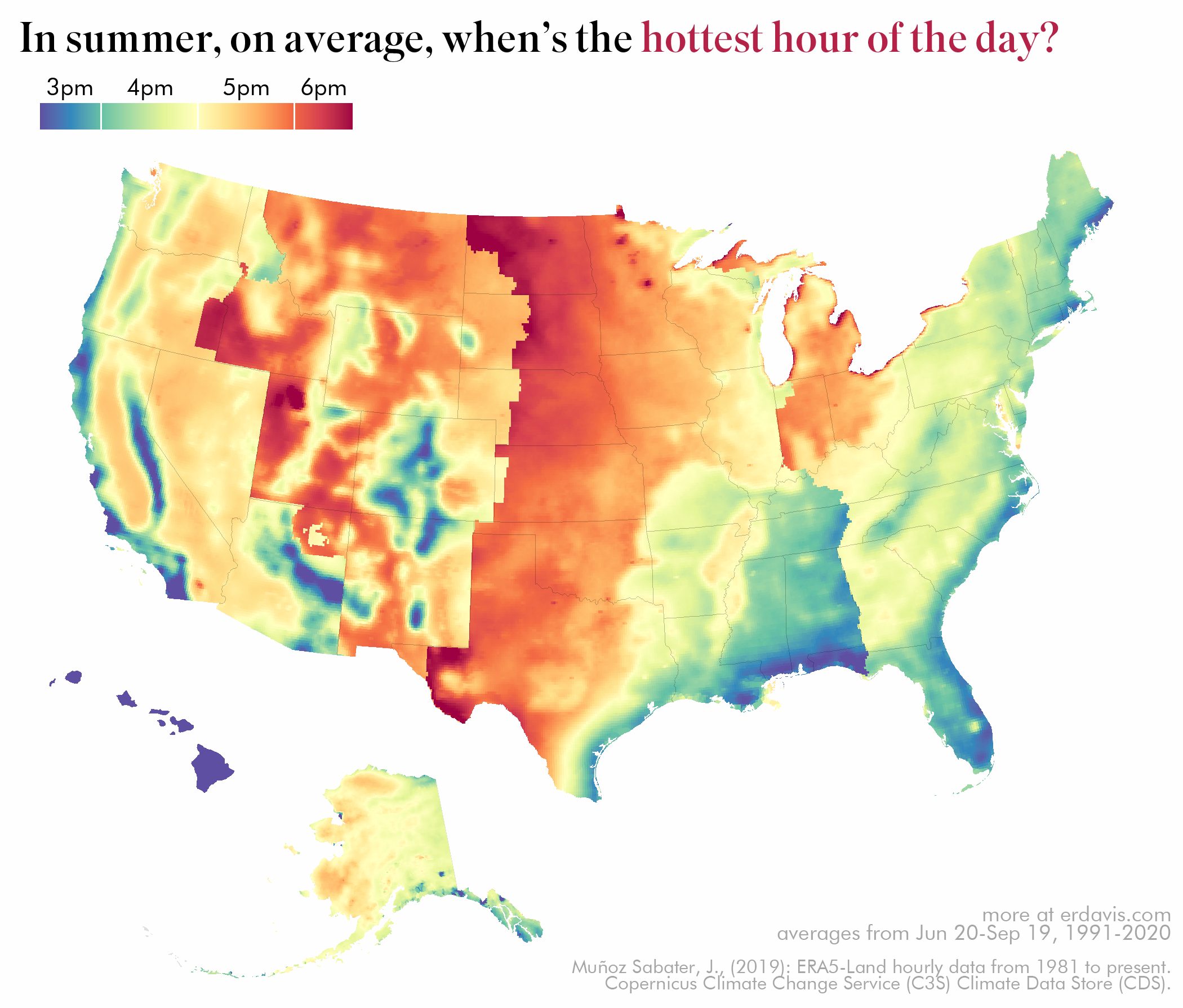
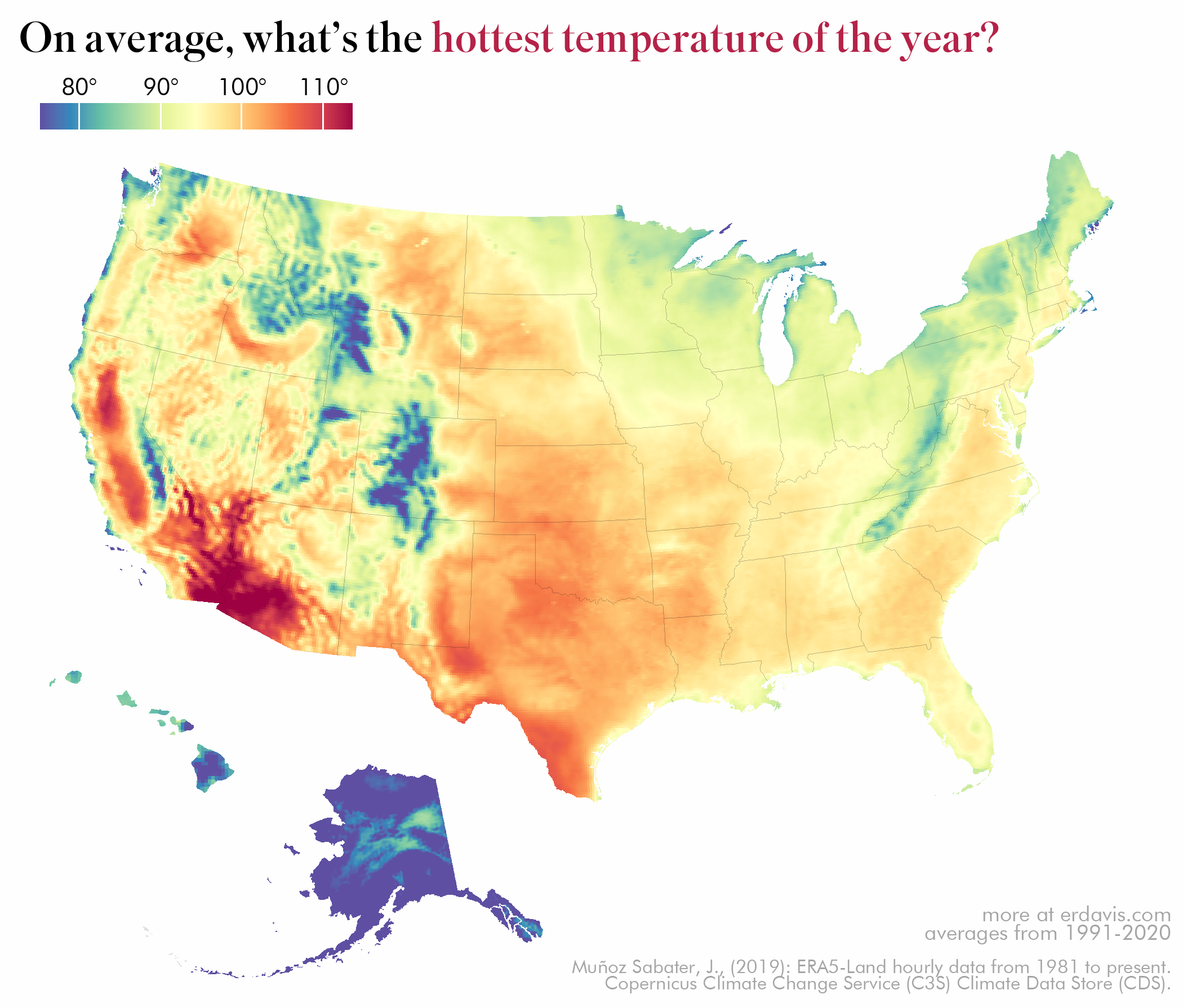
Overall maps
Of course, I couldn’t gather all this data and not make even more maps than I needed.
After moving to Portland from LA, I felt that it stayed much hotter later in the day. This (crazy) map shows that yes, that is in fact the case.
And of course there’s no reason not to visualize the hottest day of the year, on average:

And the average maximum annual temperature!
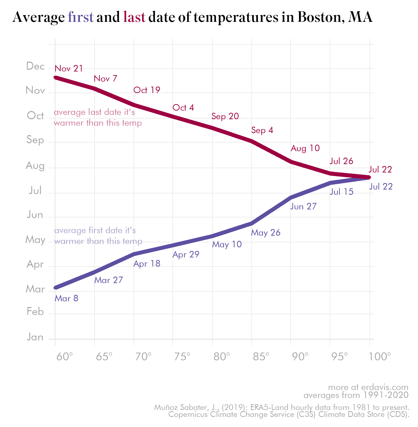
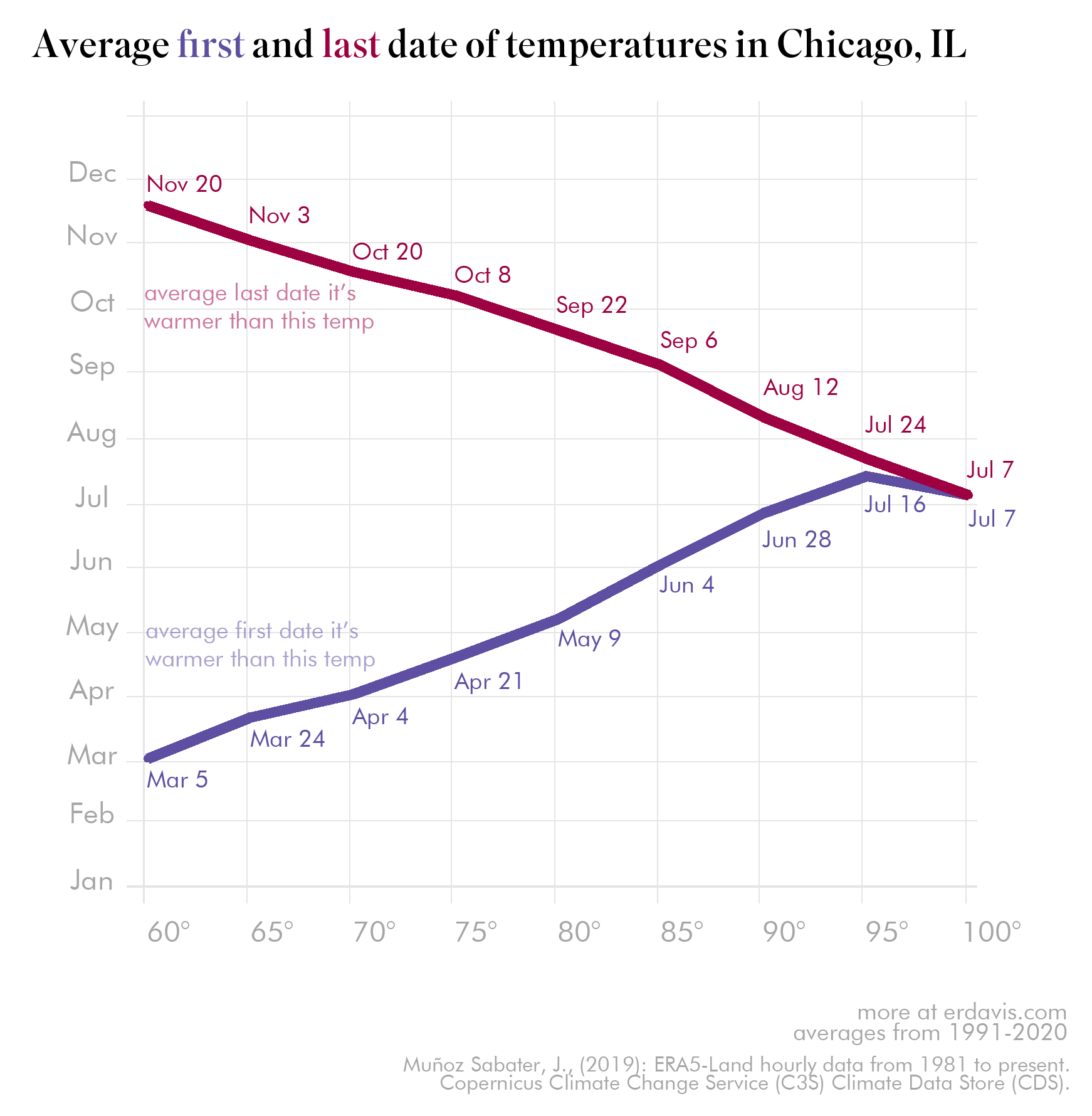
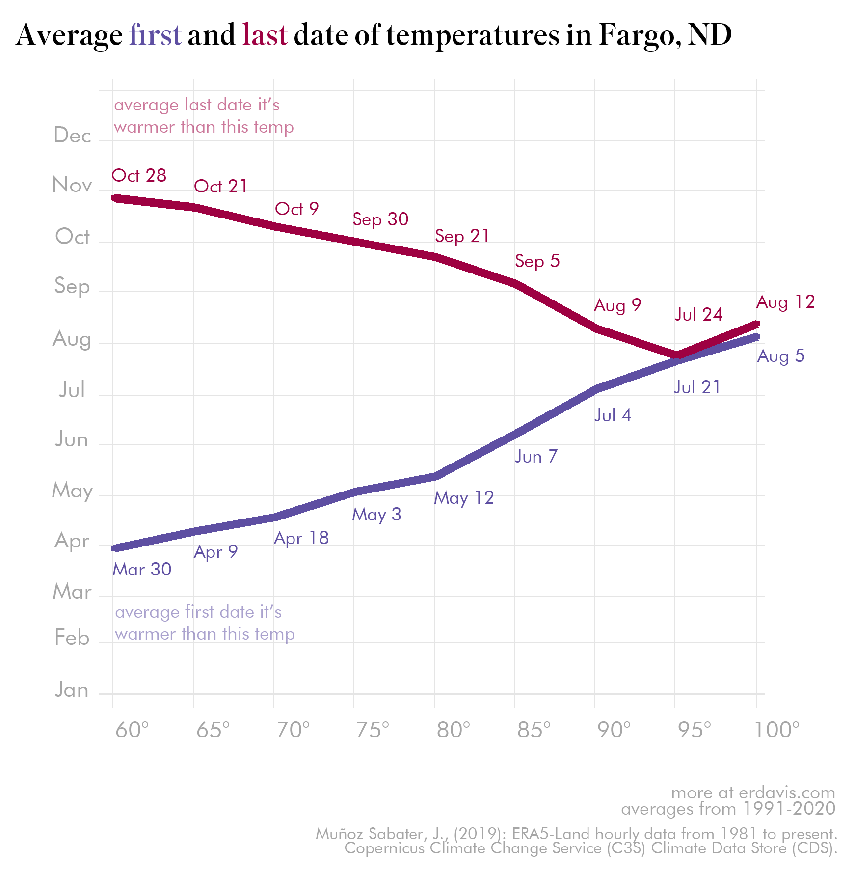
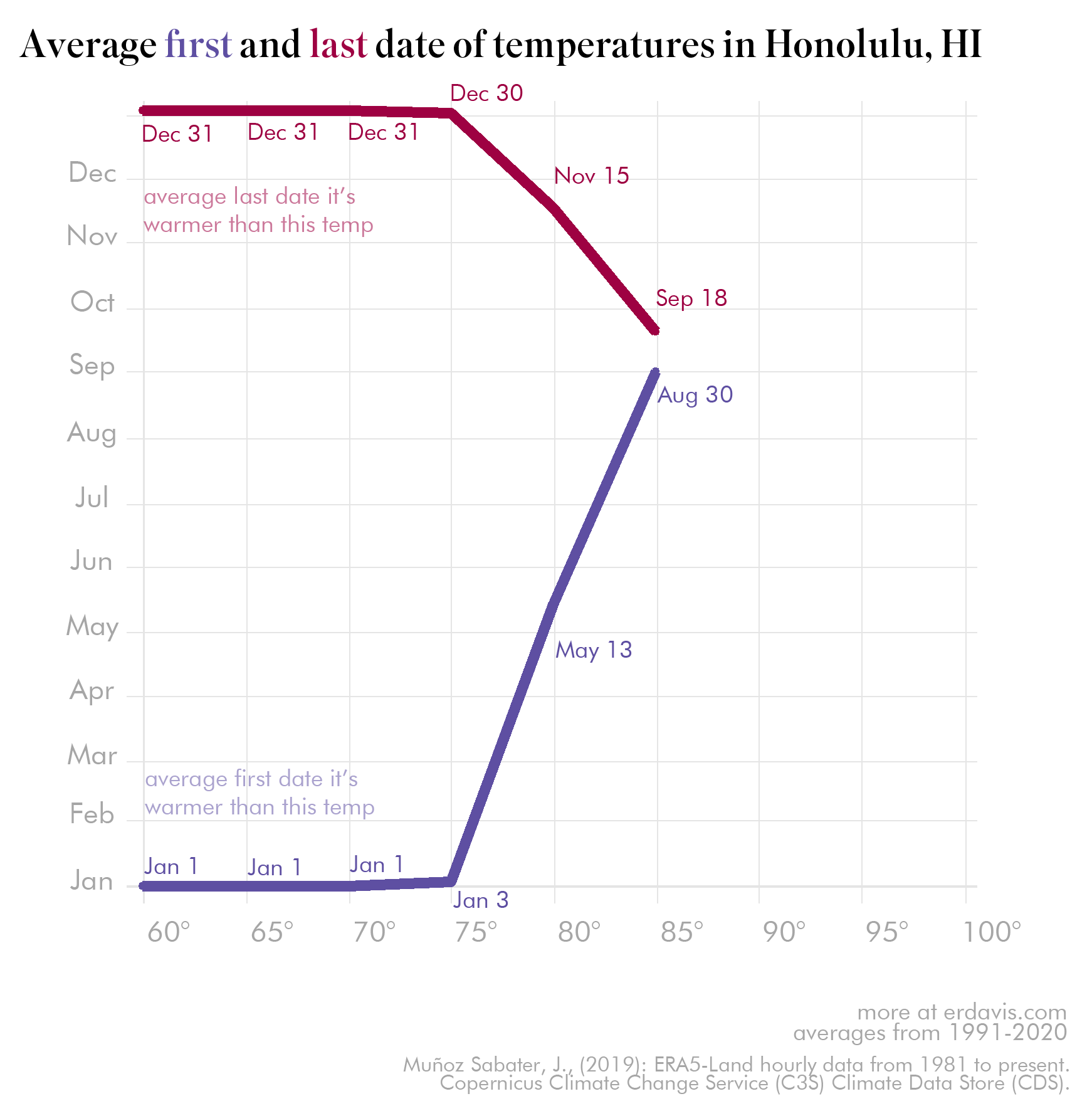
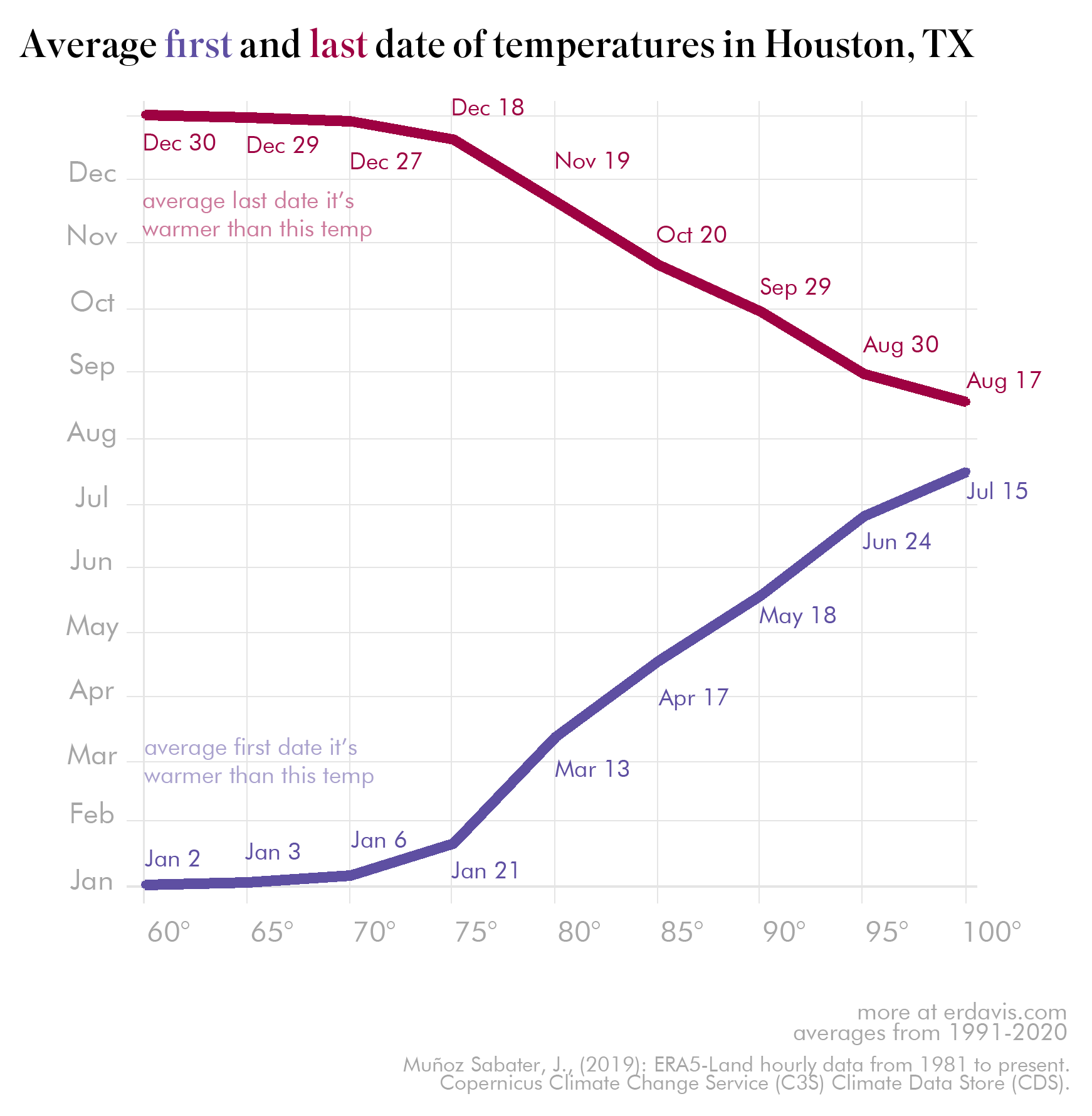
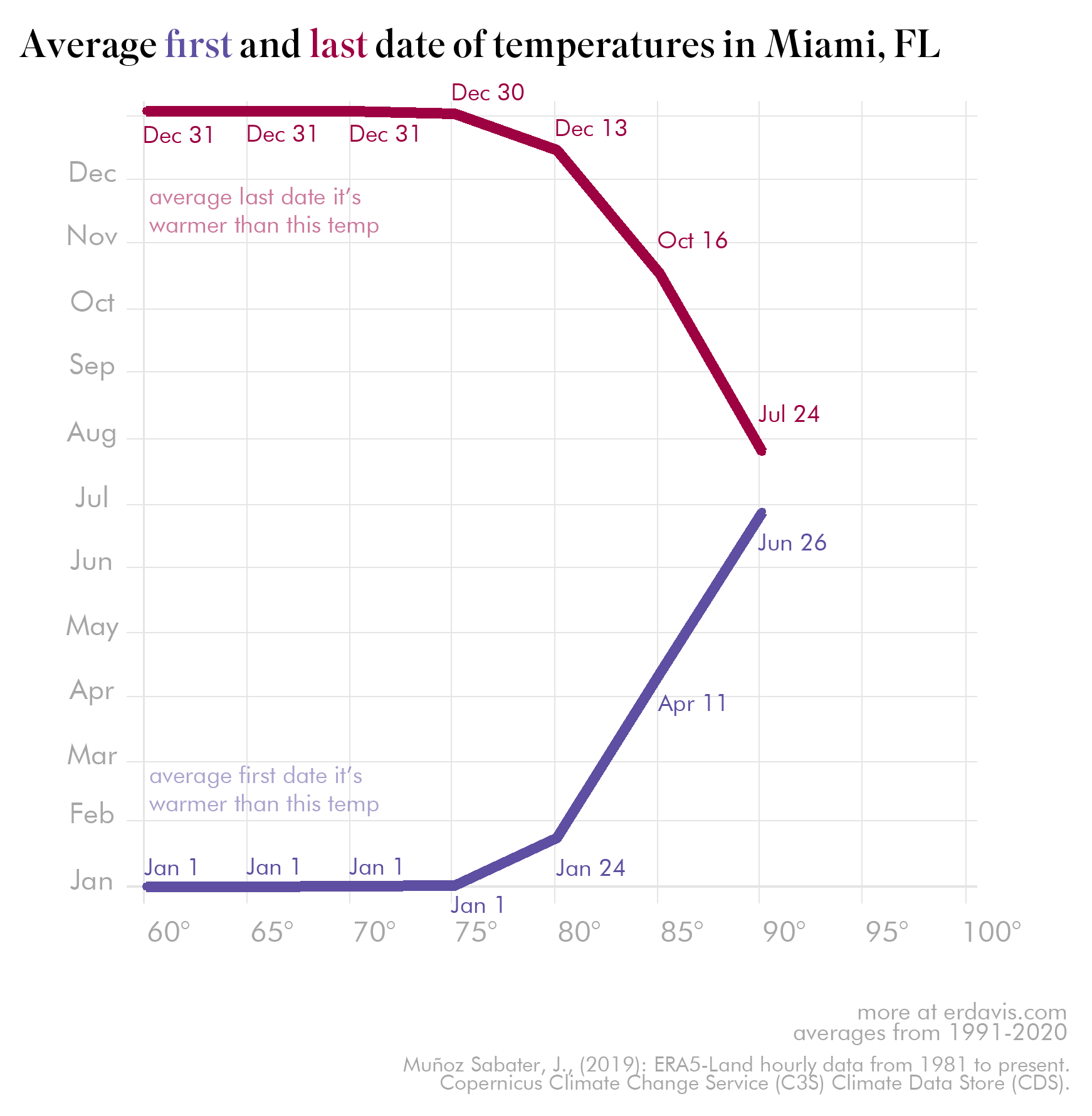
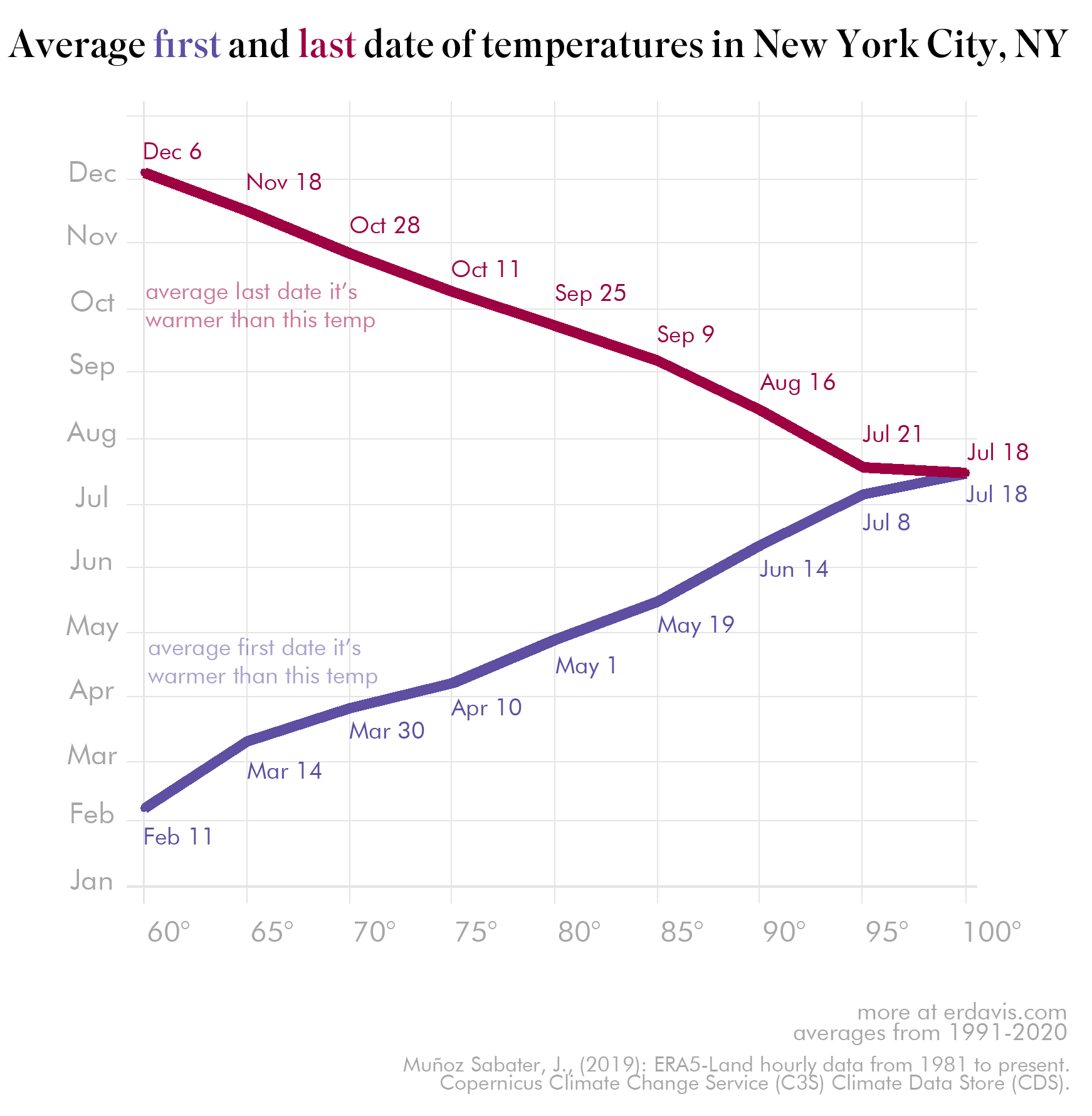
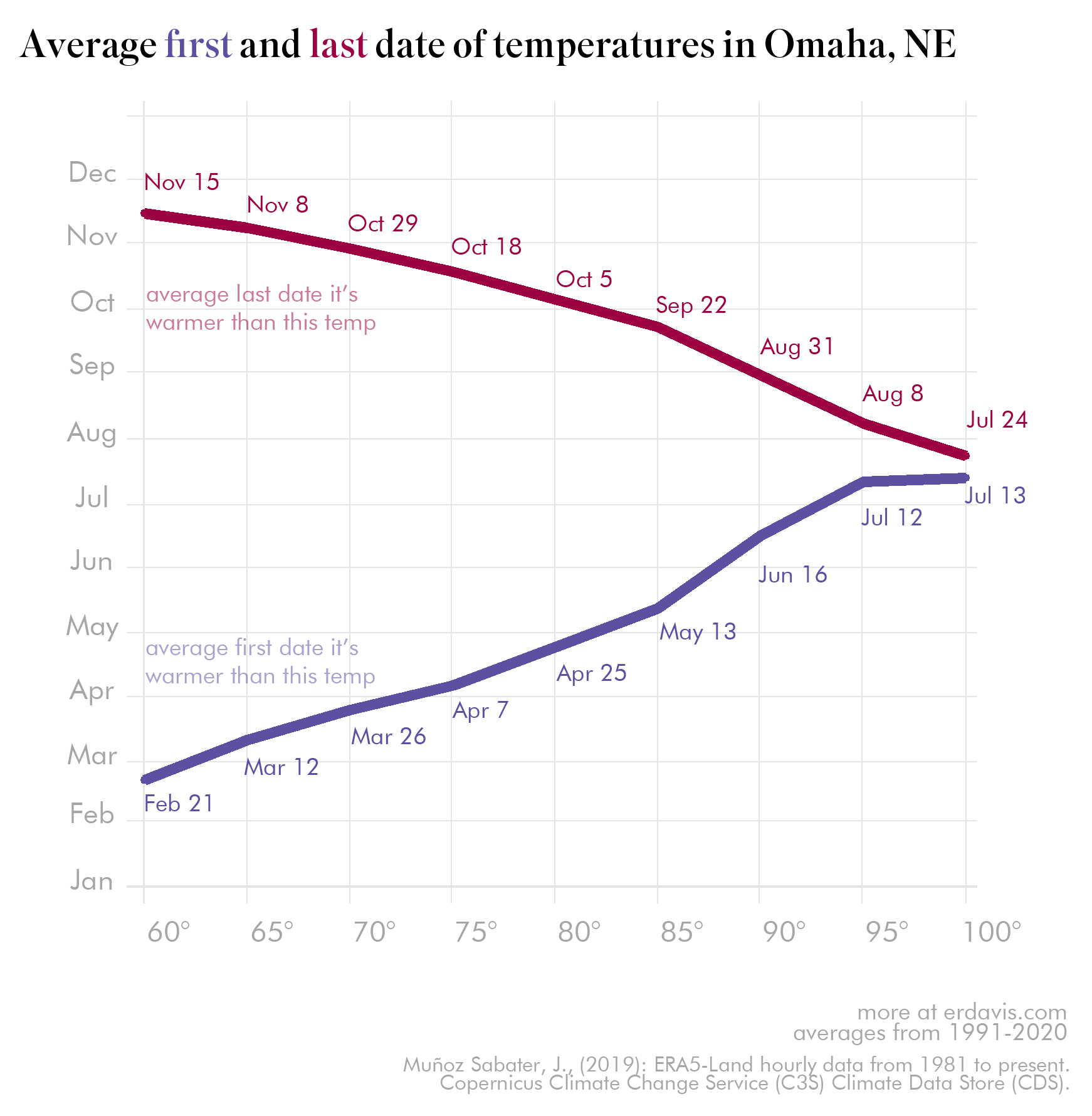
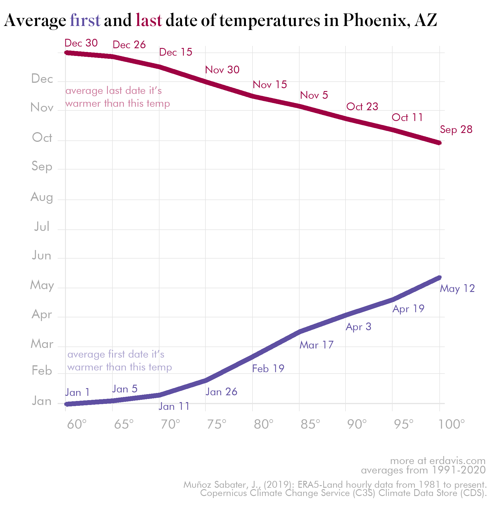
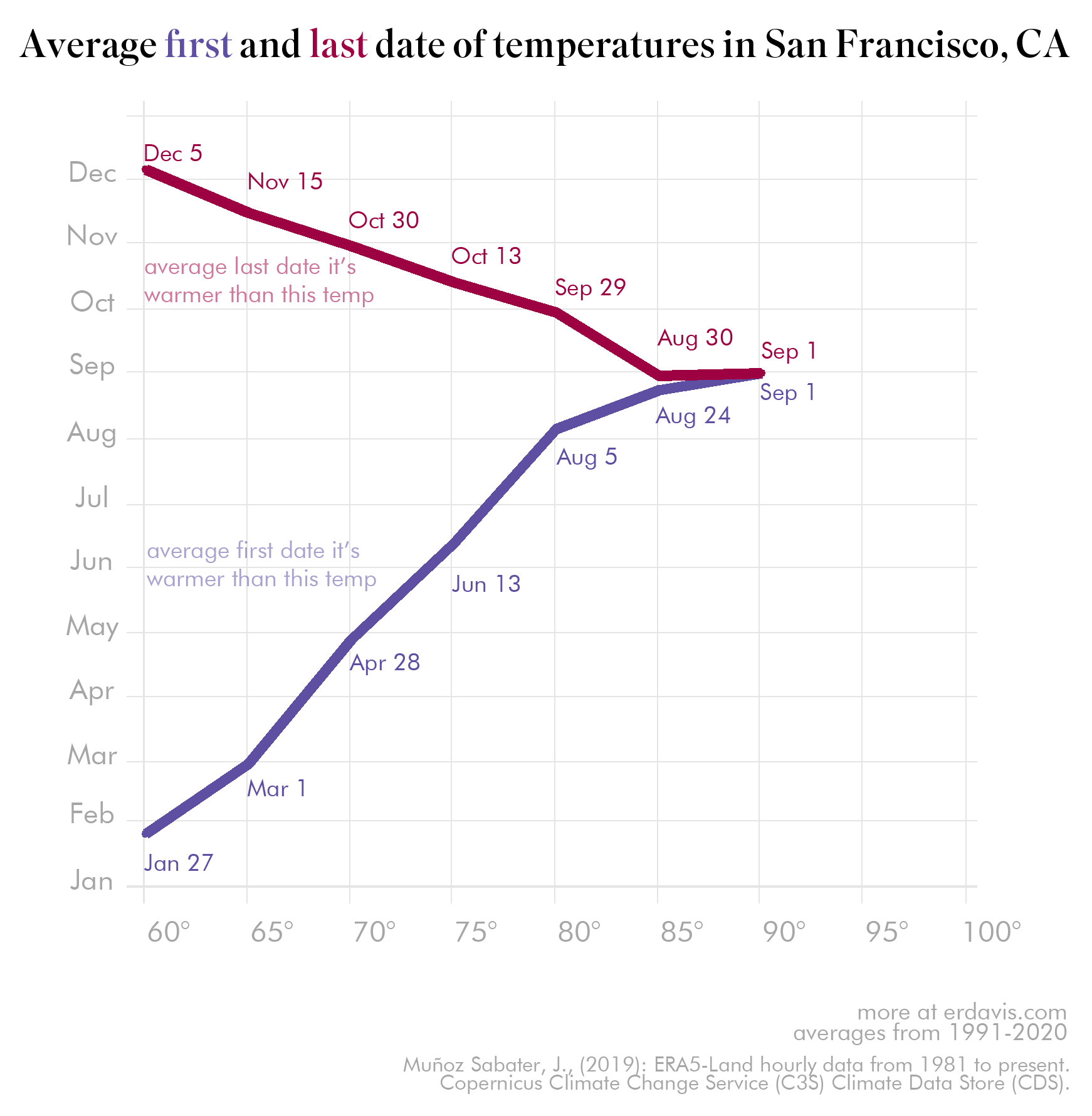
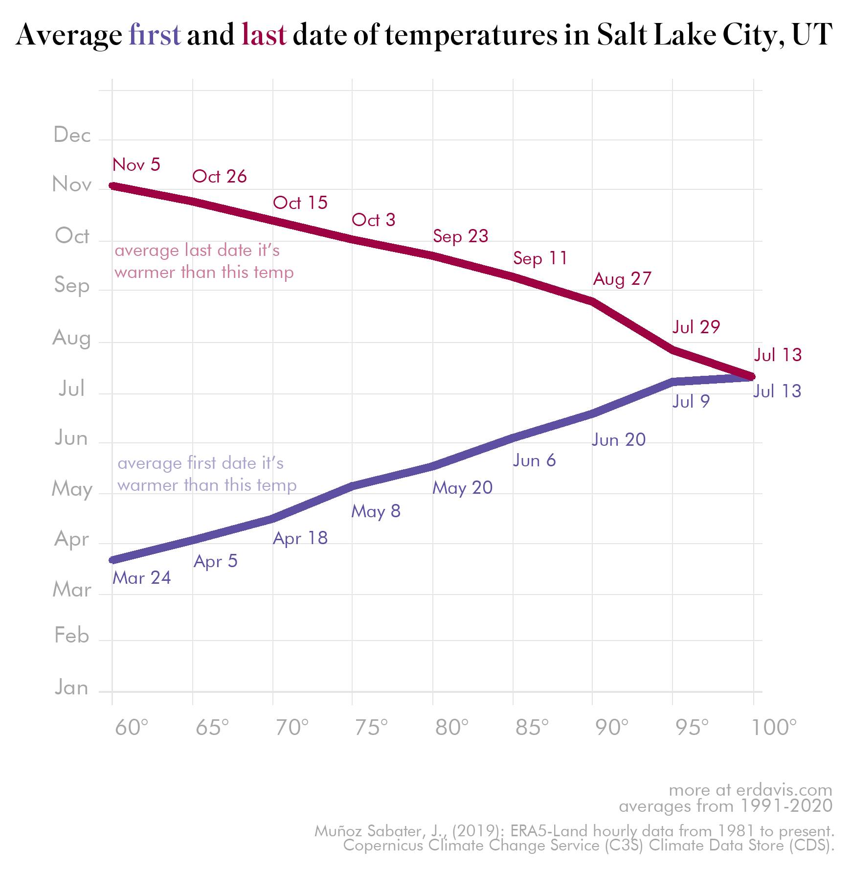
Temperature curves for specific cities
The maps are all well and good, but for a specific location a line chart is much easier to read. I selected 20-odd cities that interested me, and plotted their average first/last dates in an easier to read format.


Wow, you got to the bottom
Here’s the puppy for your efforts 🙂
His name is Mango, he’s 8 months old and a durn fool


Discover more from Data Stuff
Subscribe to get the latest posts sent to your email.
This was interesting!