My last post, Average Colors of the World, leaked out of this blog and spread all over the internet! It was super neat, but a common piece of feedback stuck in my head: I only mapped what the world looked like in summer. The colors would be vastly different in any other season.
I really wanted to take a look at the seasonal average colors of the world, but finding a dataset eluded me. Processing raw Landsat or Sentinel data was waaaay more work than I wanted to do for an admittedly pointless side project.
Luckily, Petr Sevcik at EOX (the folks who created the cloudless Sentinel imagery I used in my last post) reached out to see if I had any other ideas potentially using their data. I did! Unfortunately, EOX doesn’t provide seasonal cloudless mosaics, but Petr was able to direct me to a dataset from SInergise. And miracle of miracles, it was exactly what I was looking for: 120m resolution, 10-day-interval global cloudless imagery.
Unfortunately, the files are massive, split by channel (red/green/blue/etc), and stored in an AWS S3 bucket. Figuring out how to download them and mash them back together took a bit of research on my part. My code is at the end of the post should you wish to do this yourself.
And now for a side note: for some reason, the average colors of the world post brought out some of the strangest, saltiest people I’ve had in my inbox. These folks felt compelled to contact me to rant that I did not map their country at the same level of detail as I did the US.
So, to set expectations upfront:
- Yes, I only mapped the US in this post. That is because it is where I live.
- No, I will not be mapping any other countries. It is a lot of work.
- It is very off-putting to demand that a total stranger spend dozens of hours to create a map that you will only look at for several seconds.
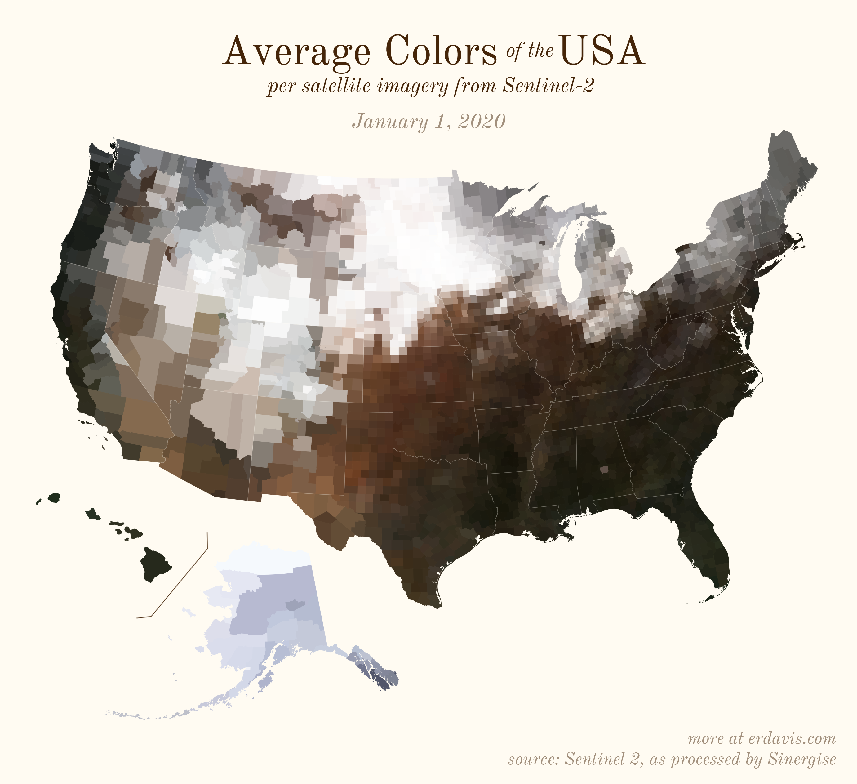
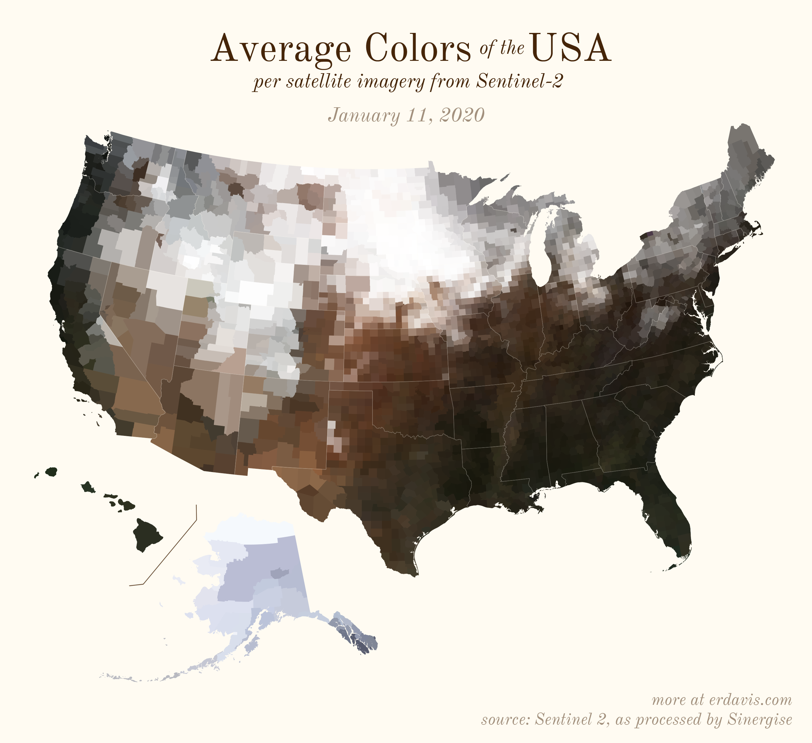
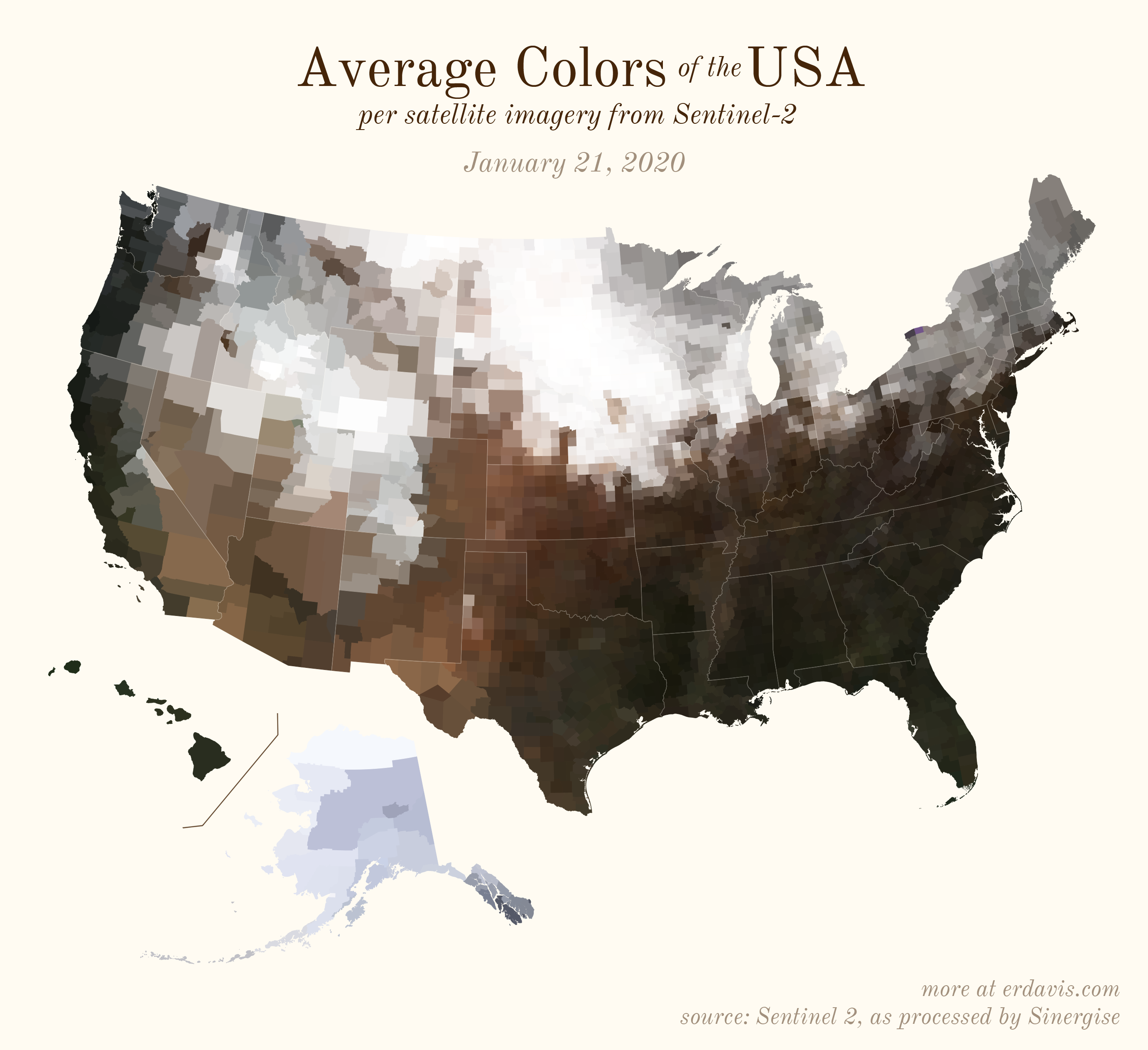
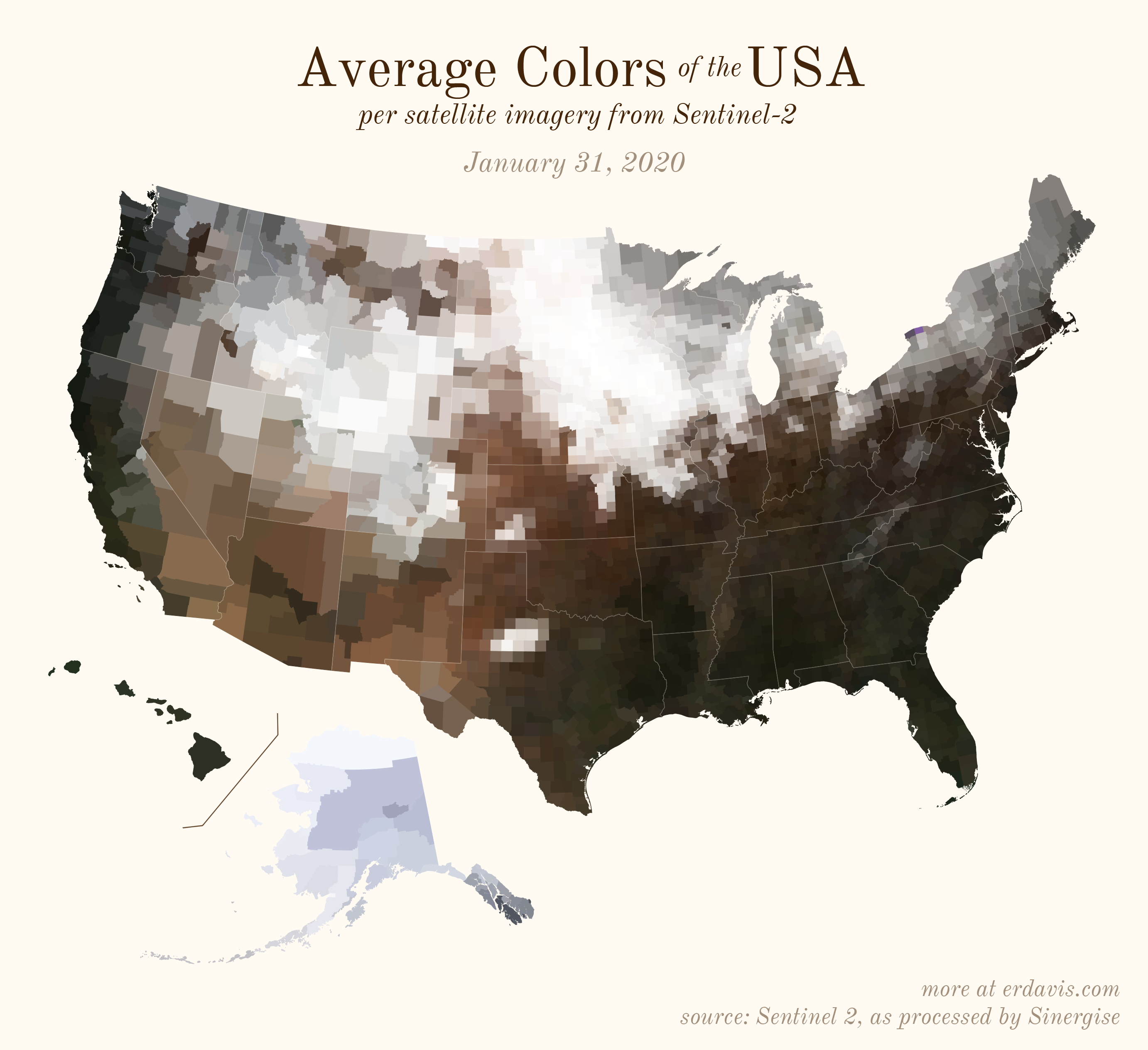
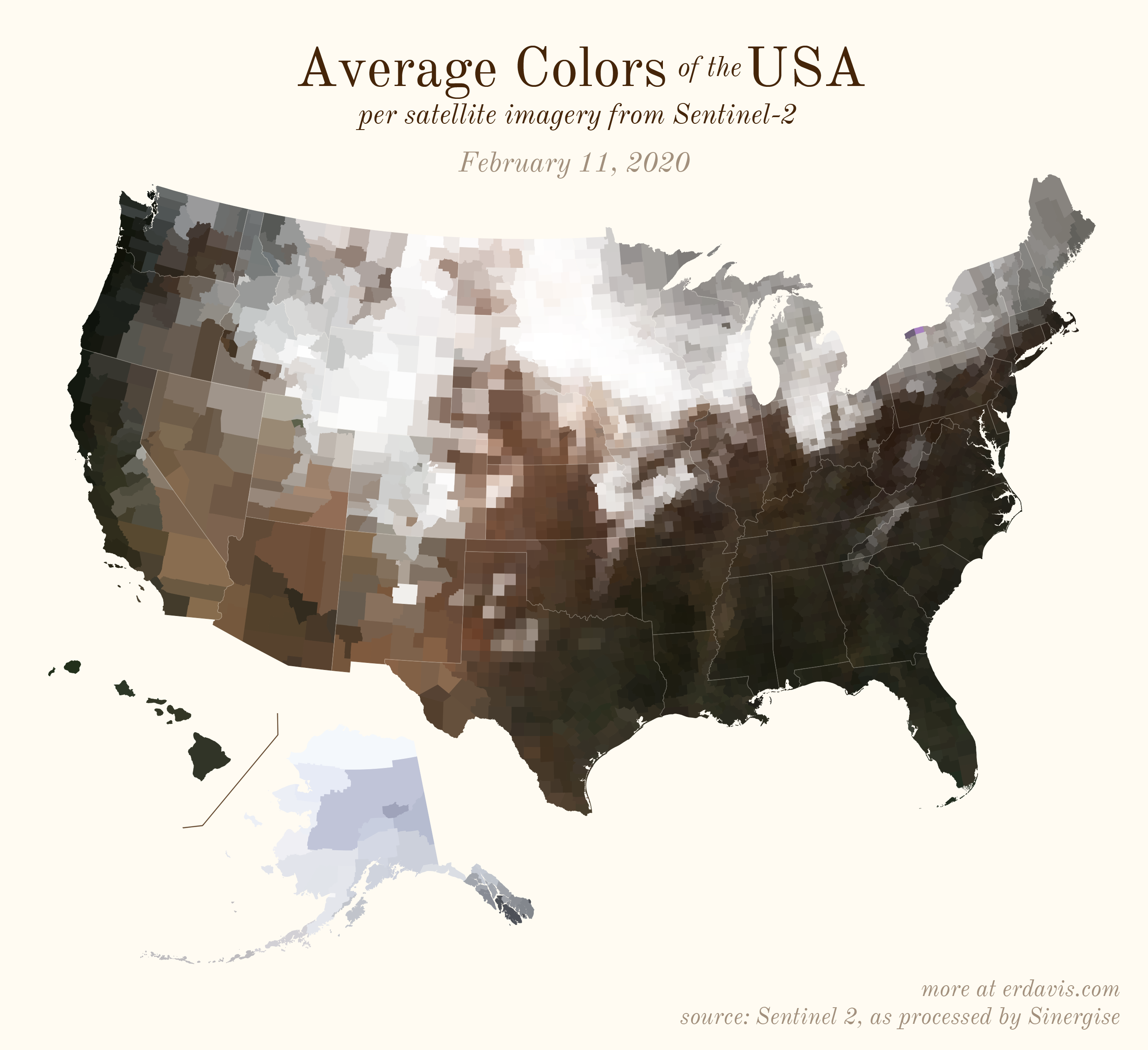
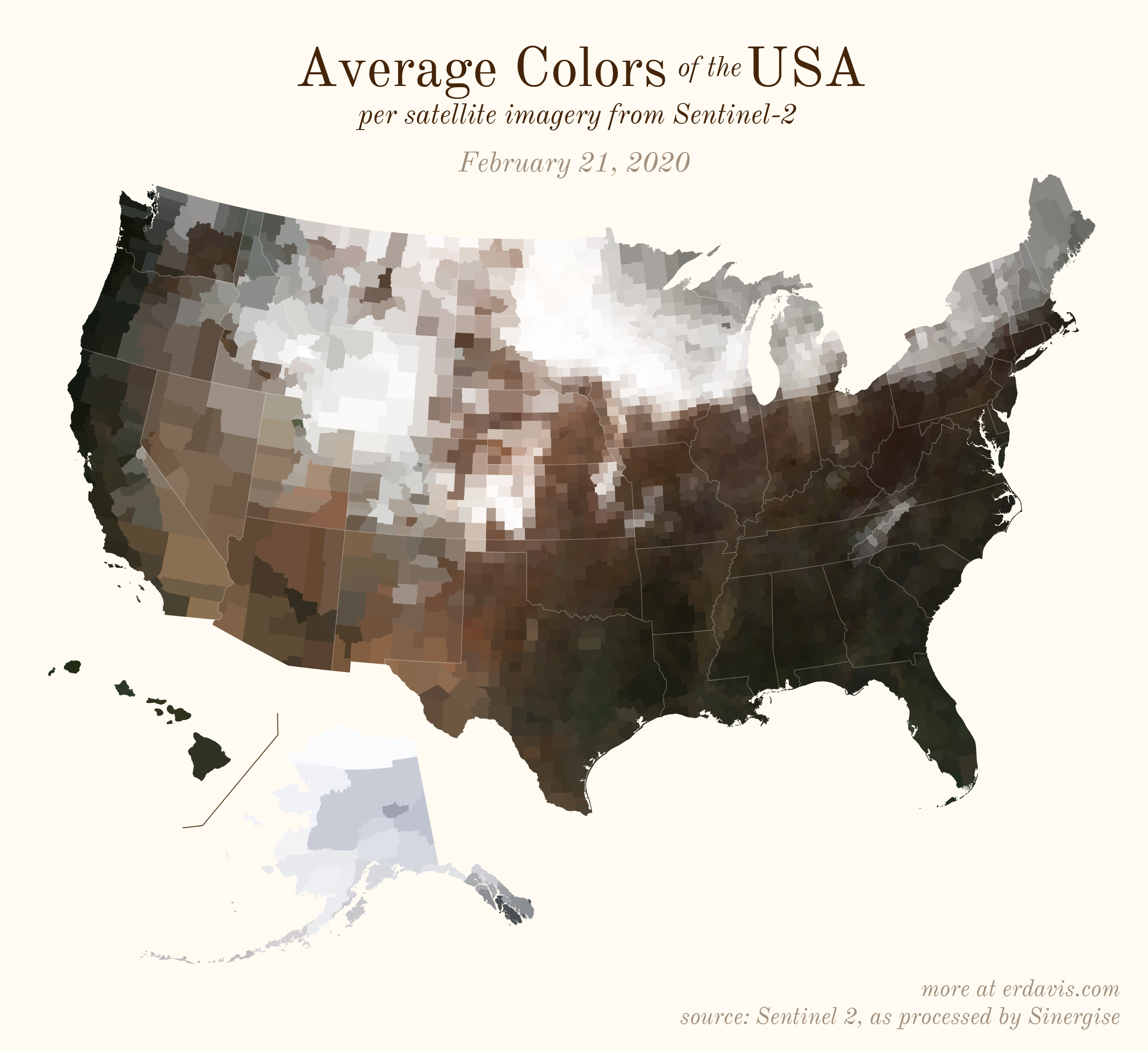
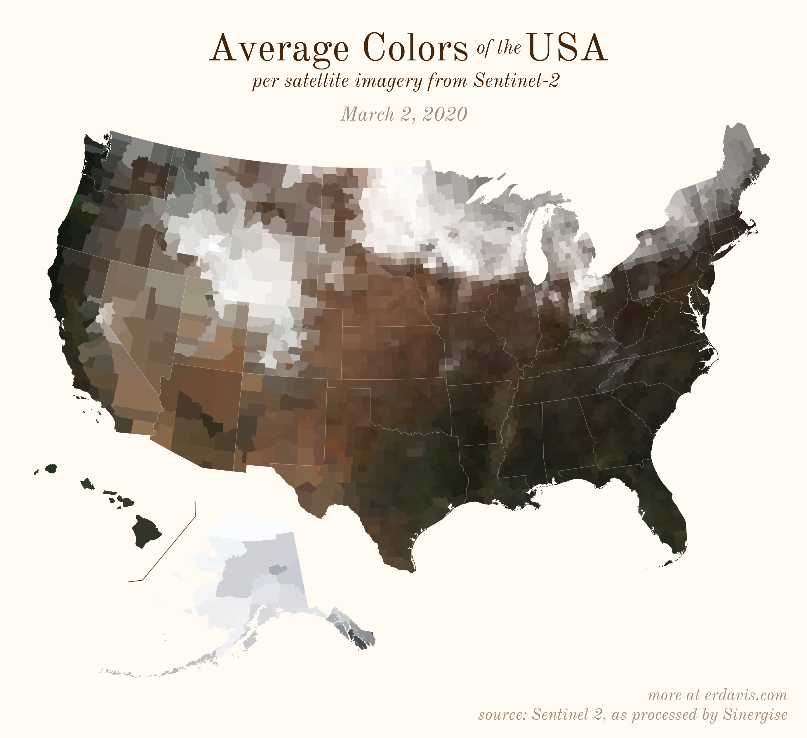
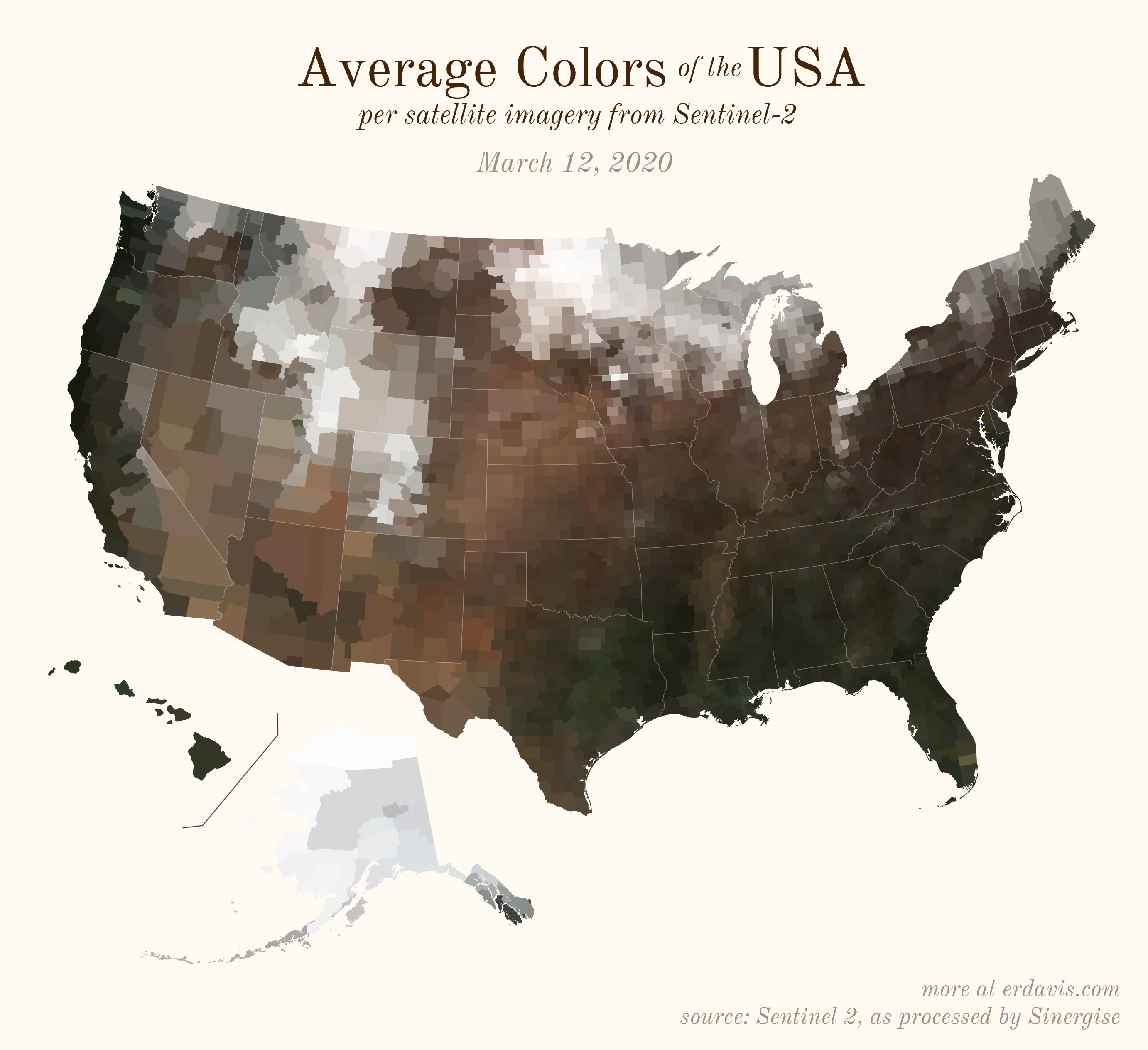
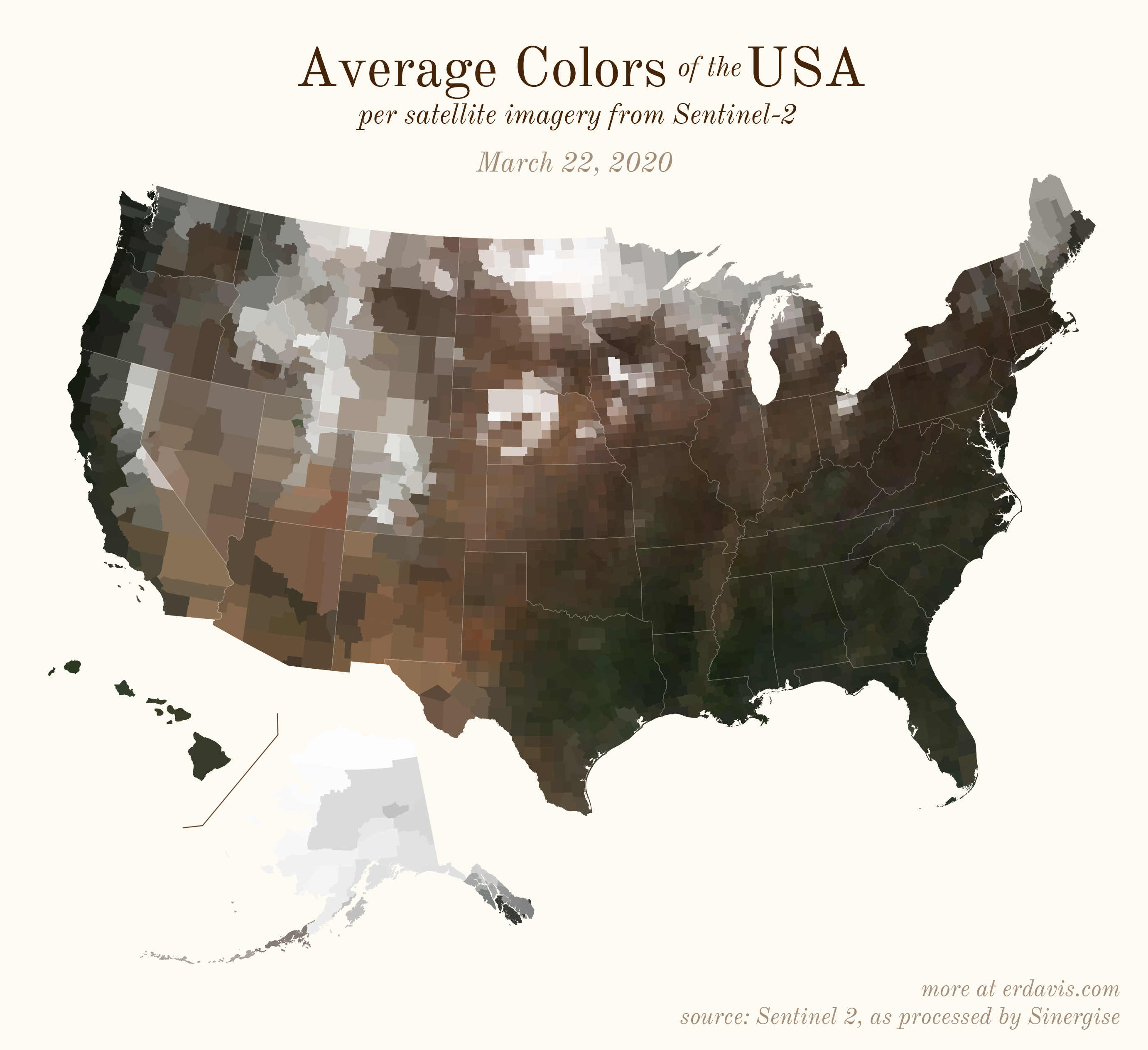
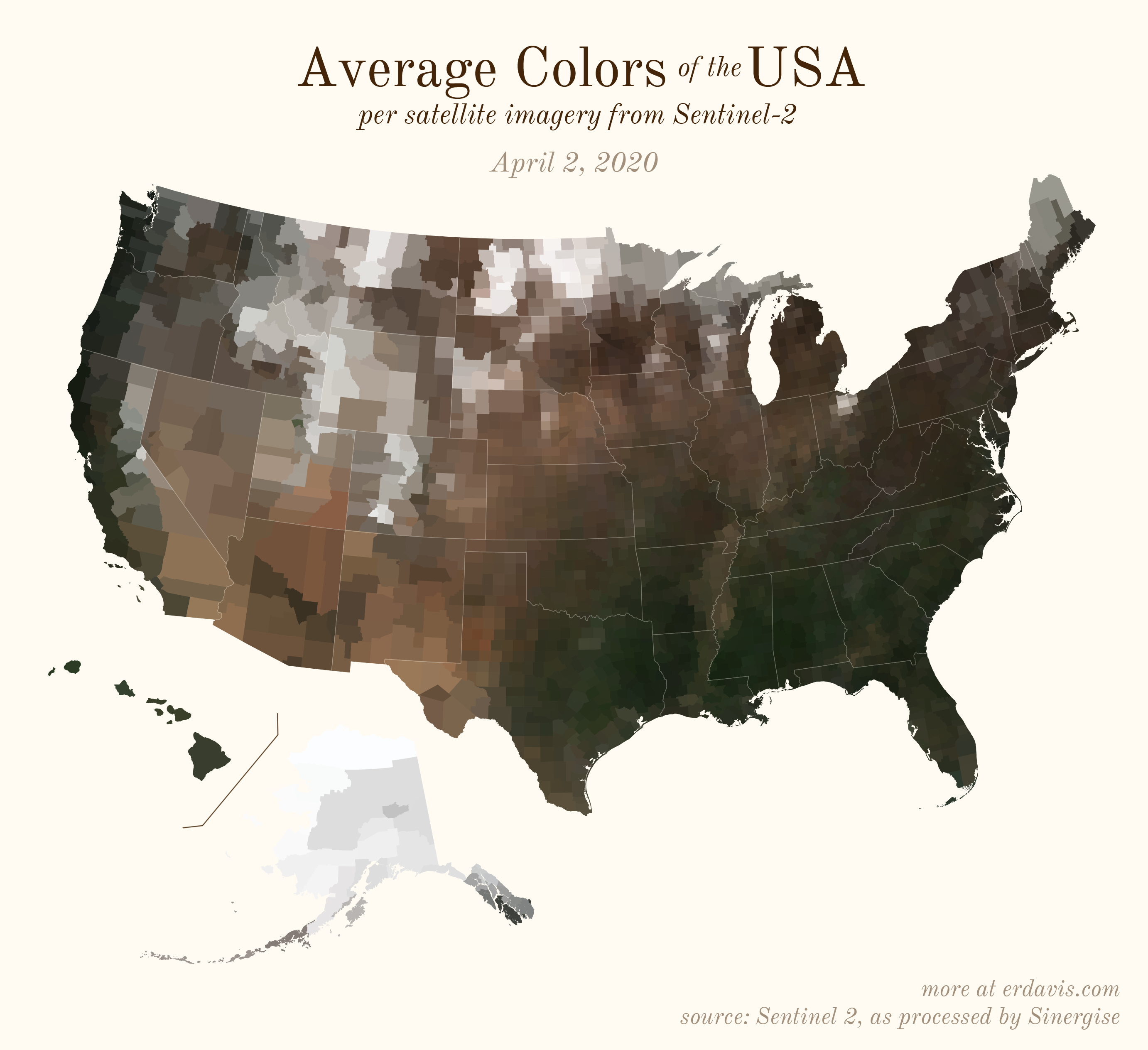
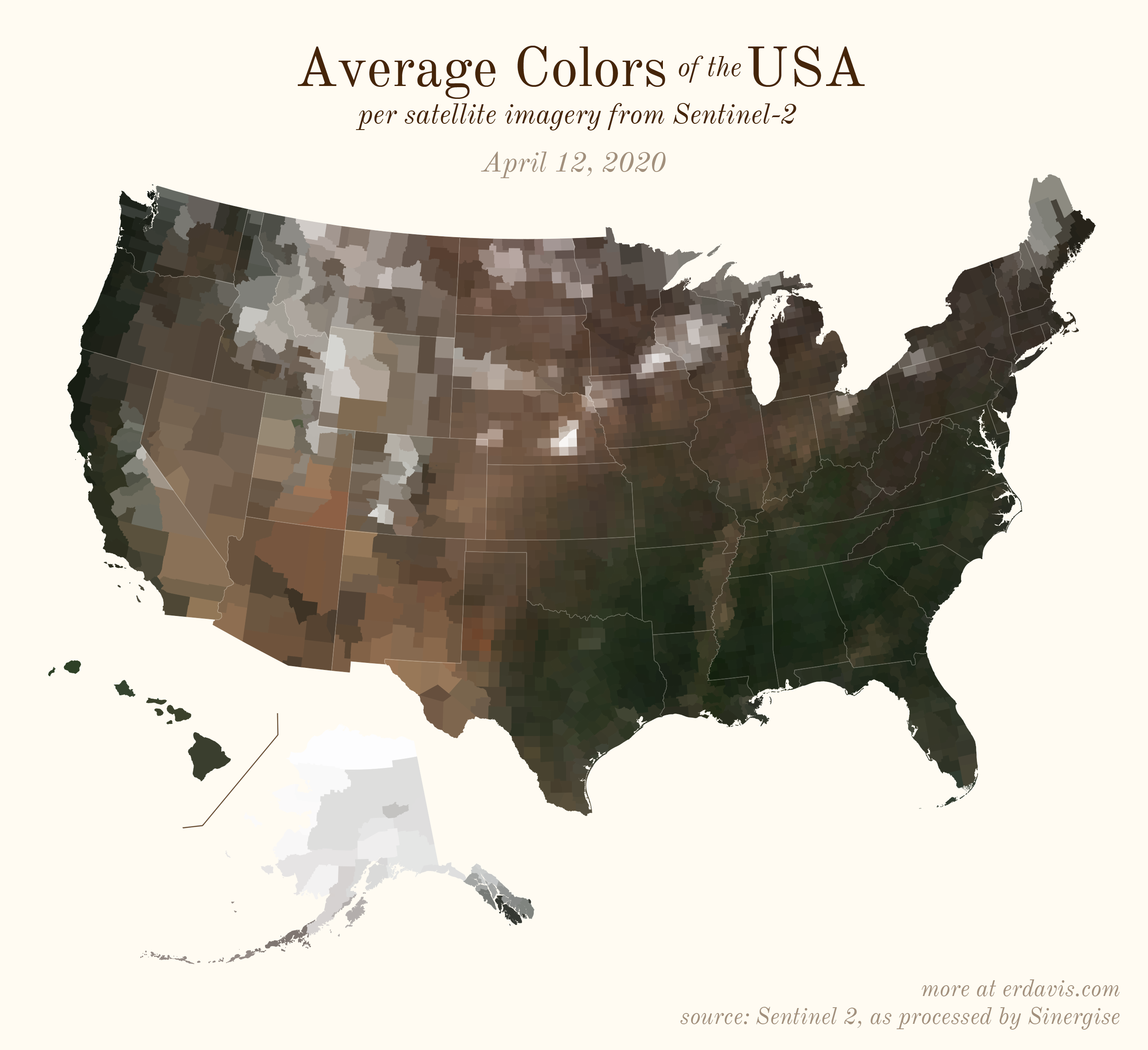
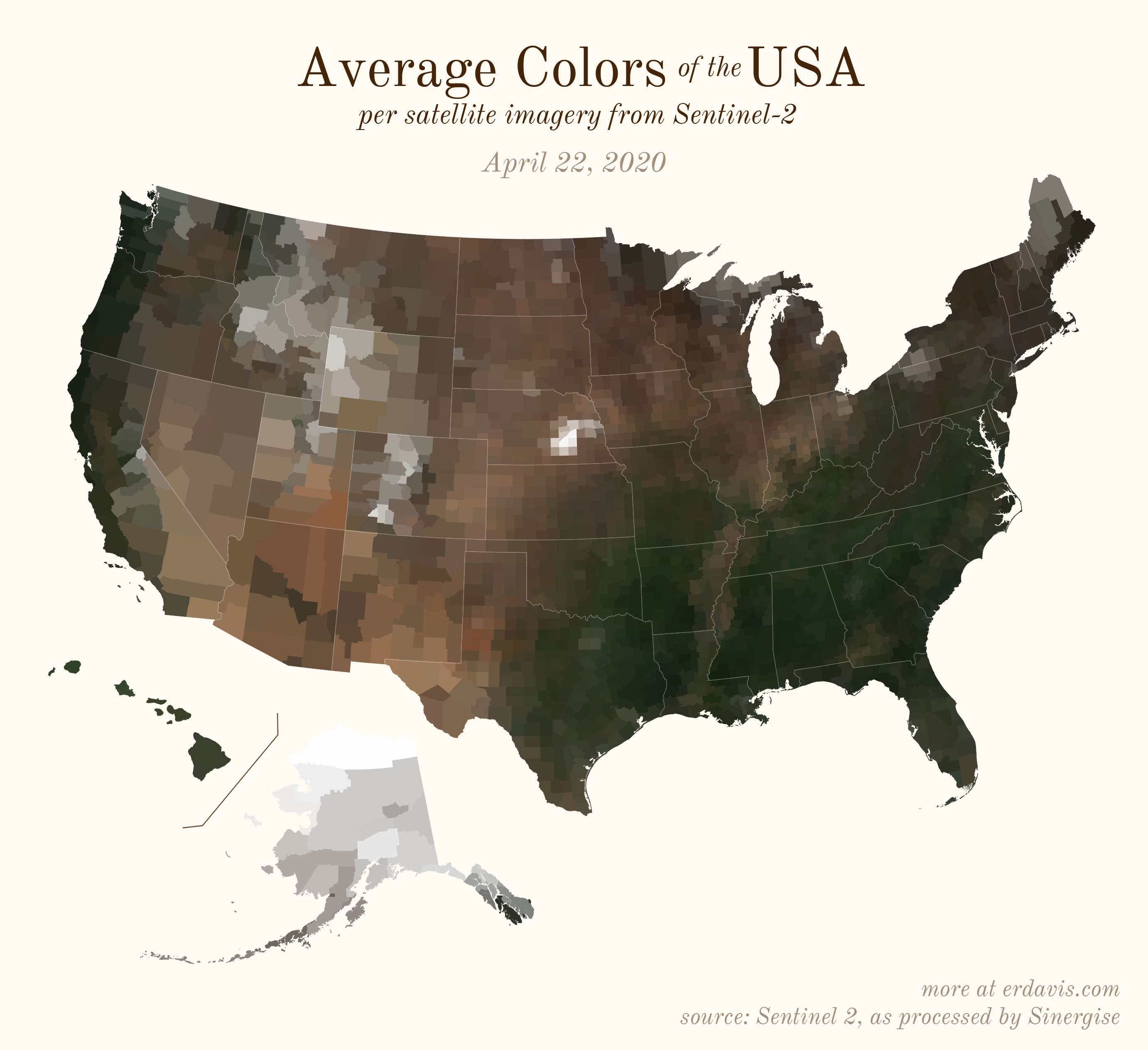
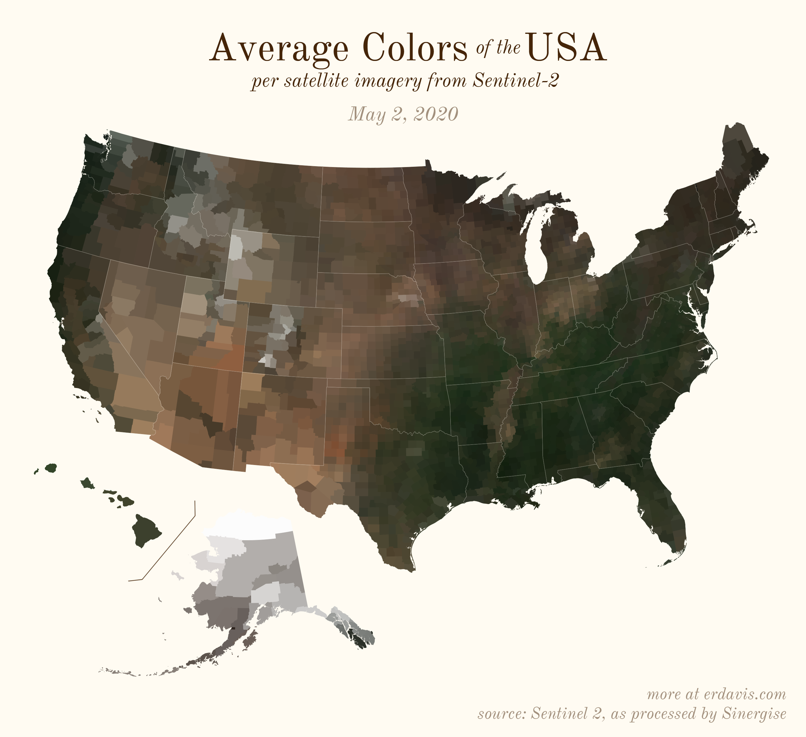
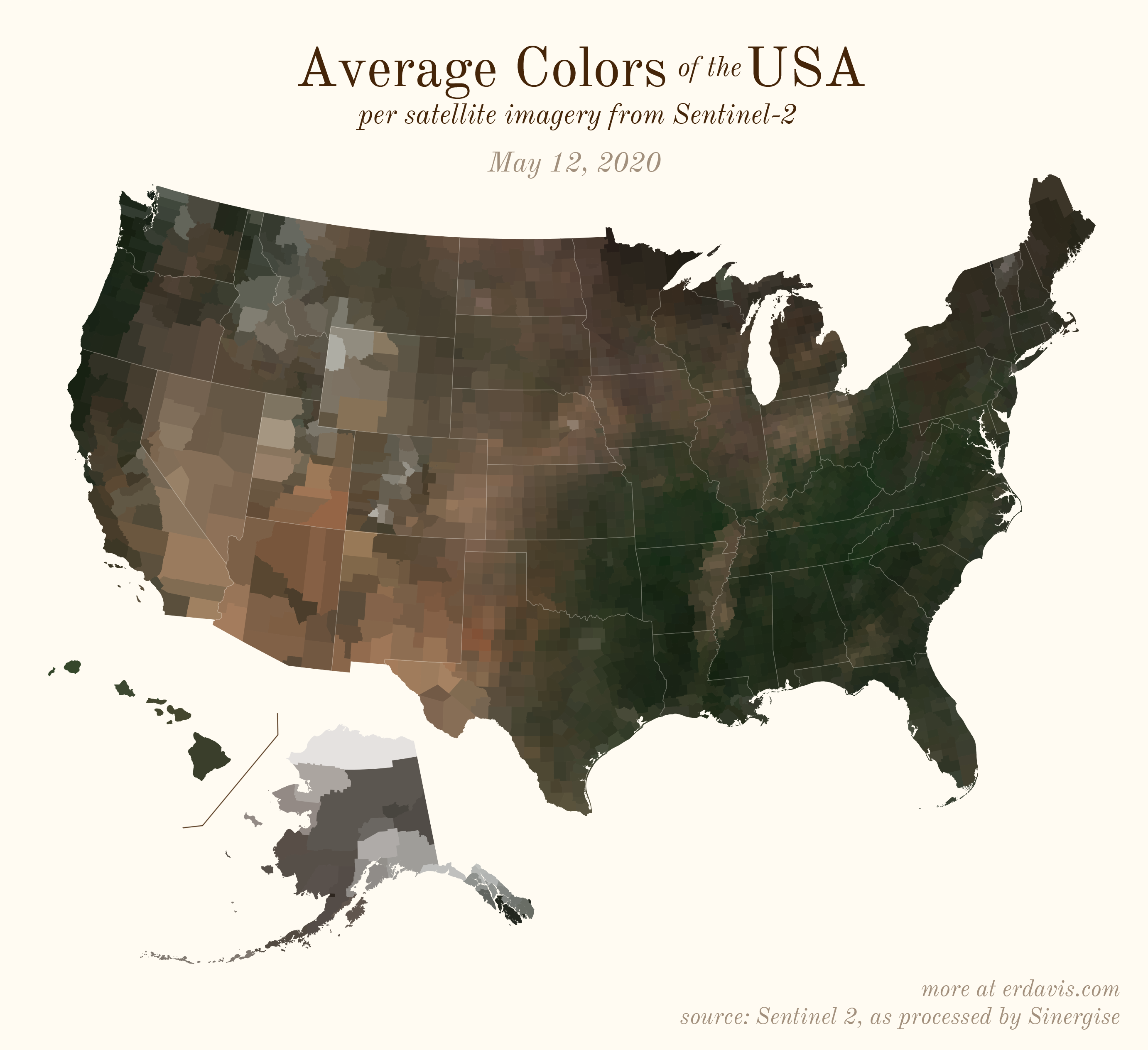
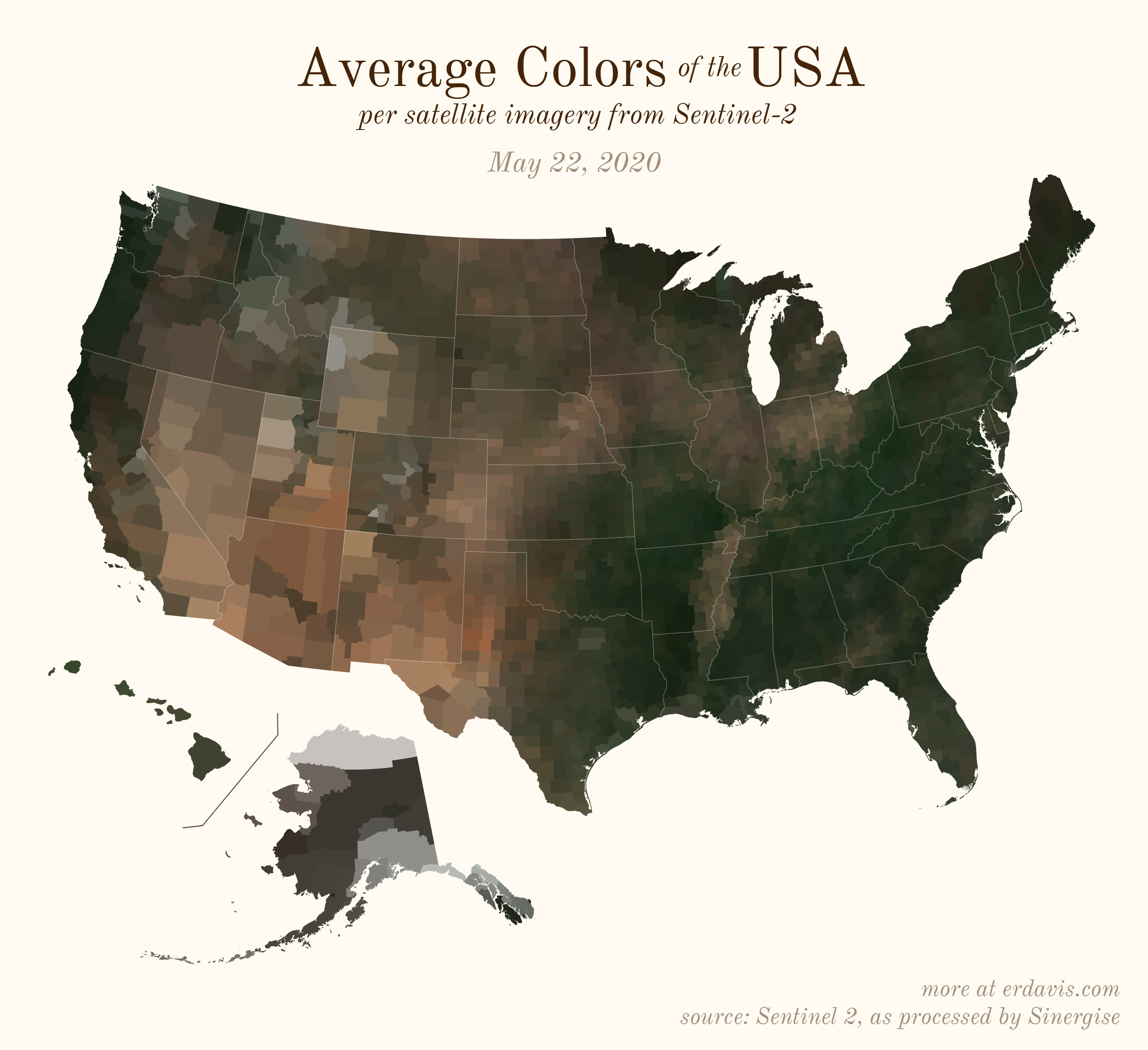
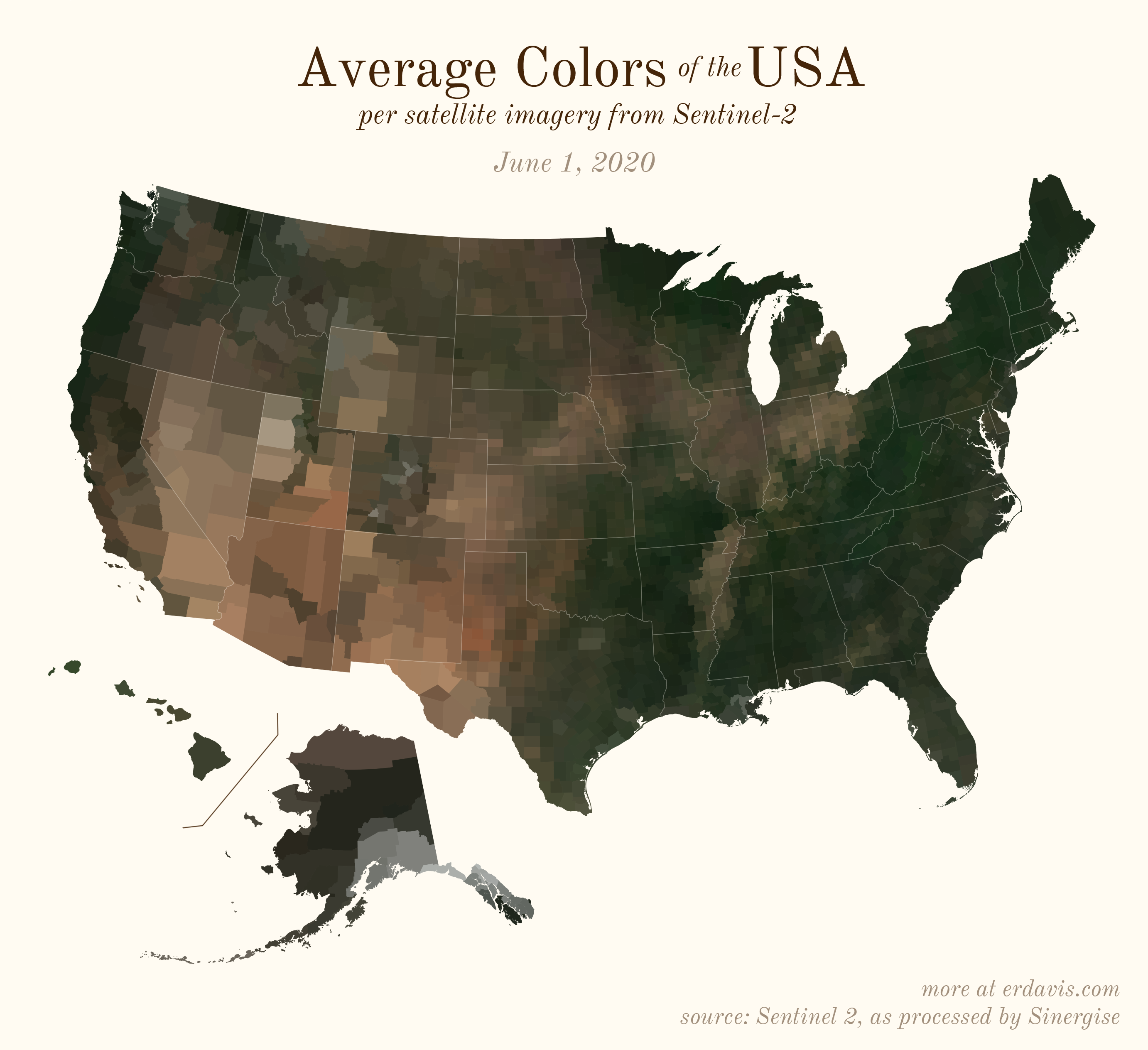
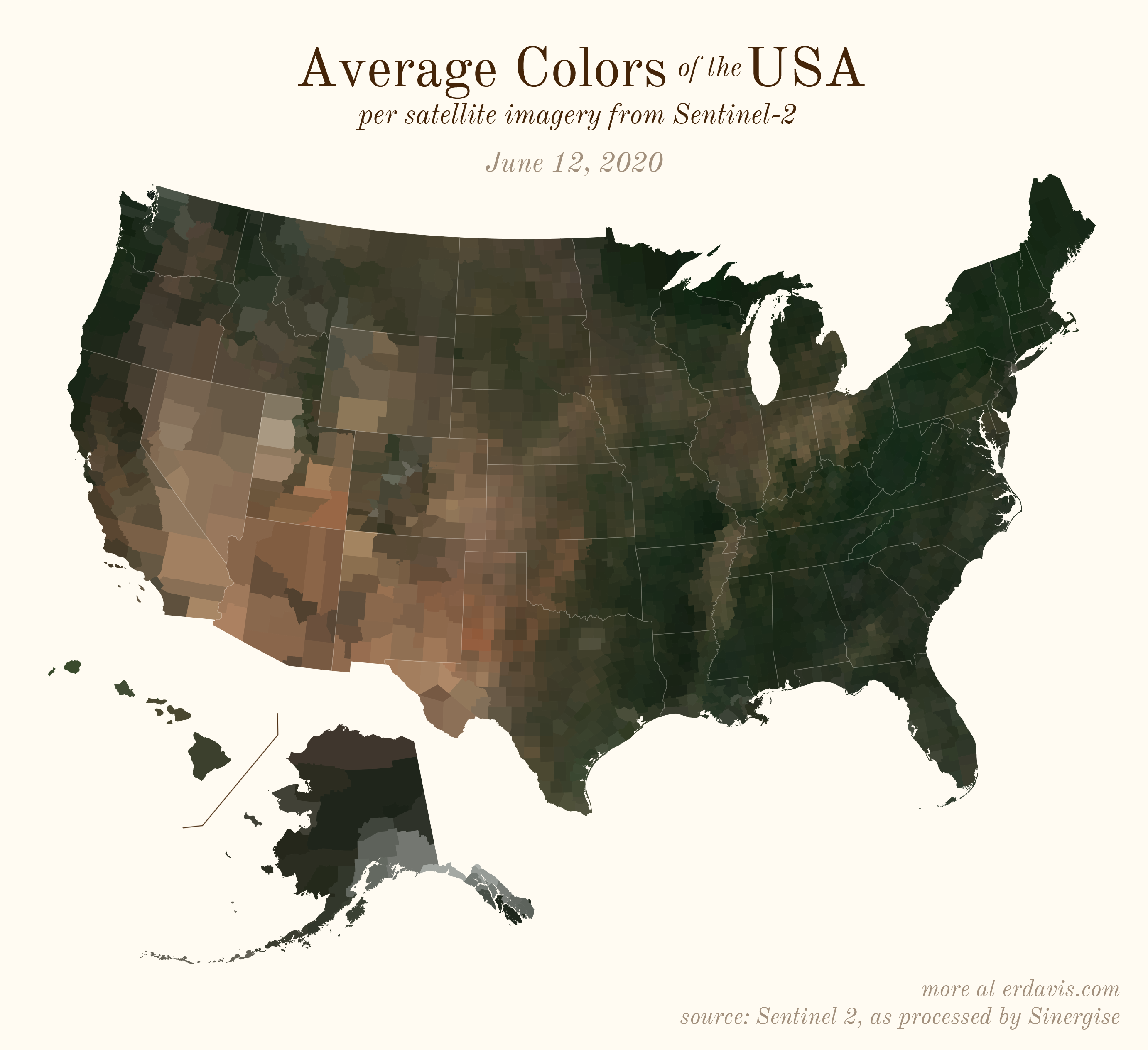
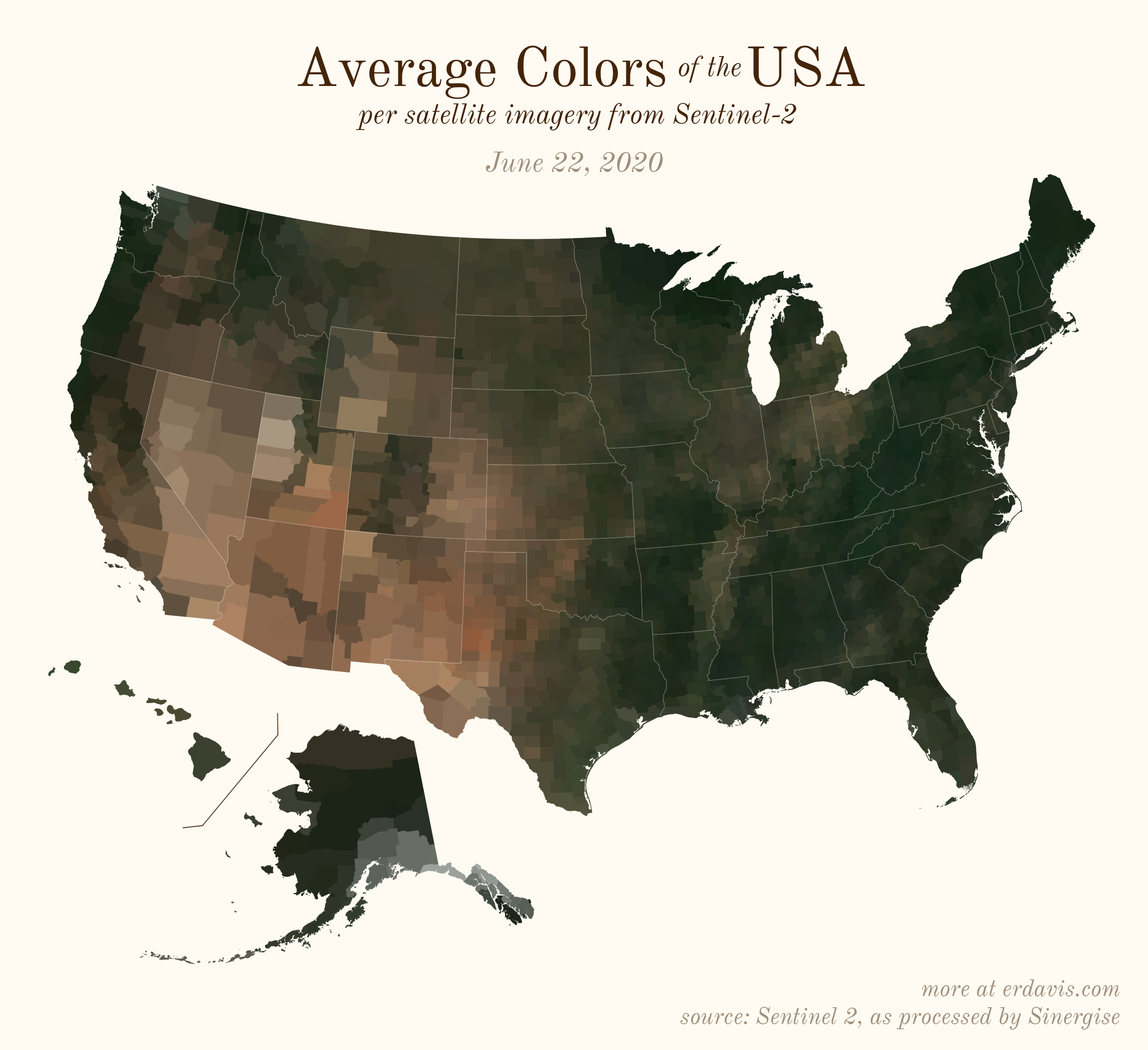
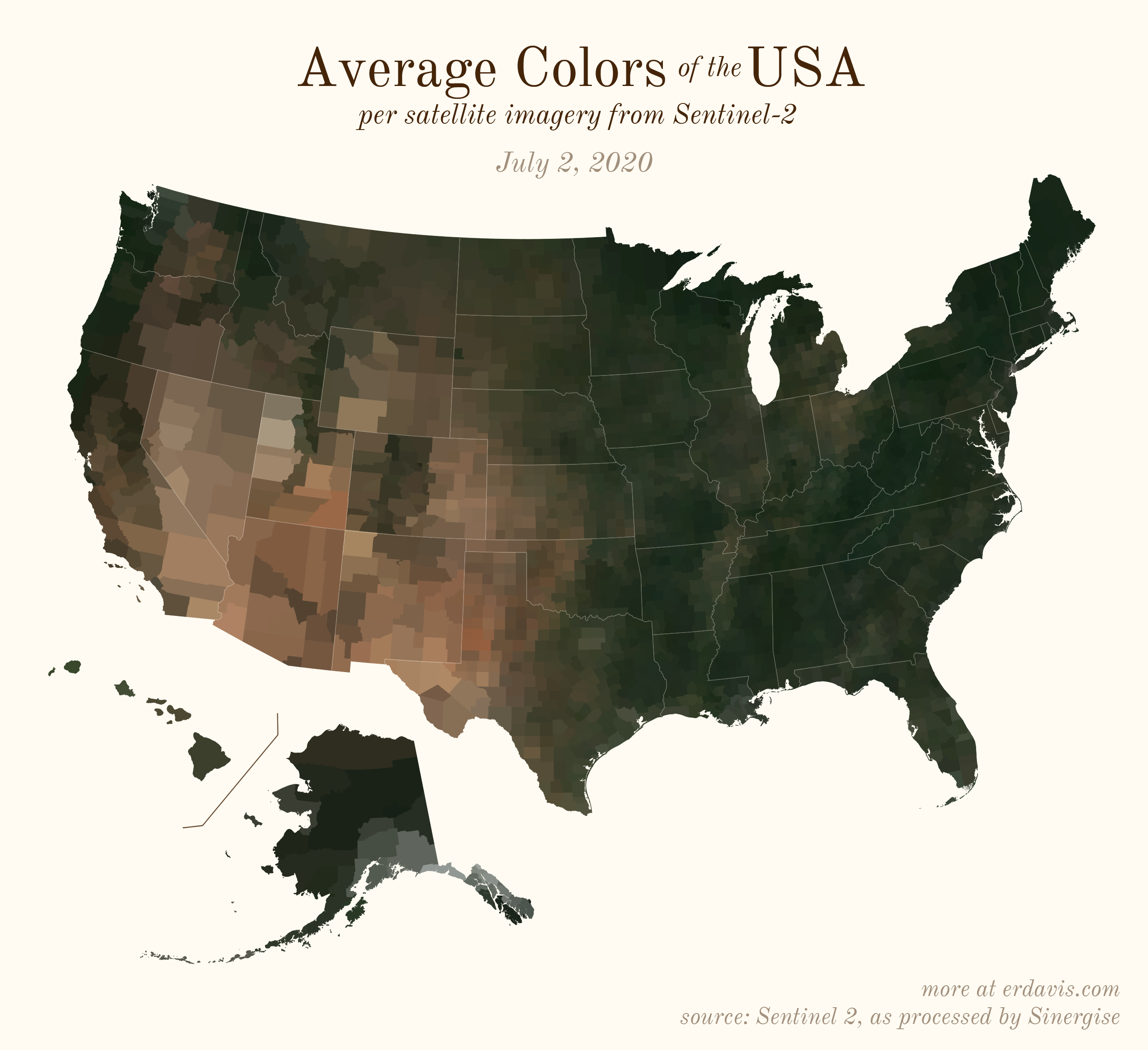
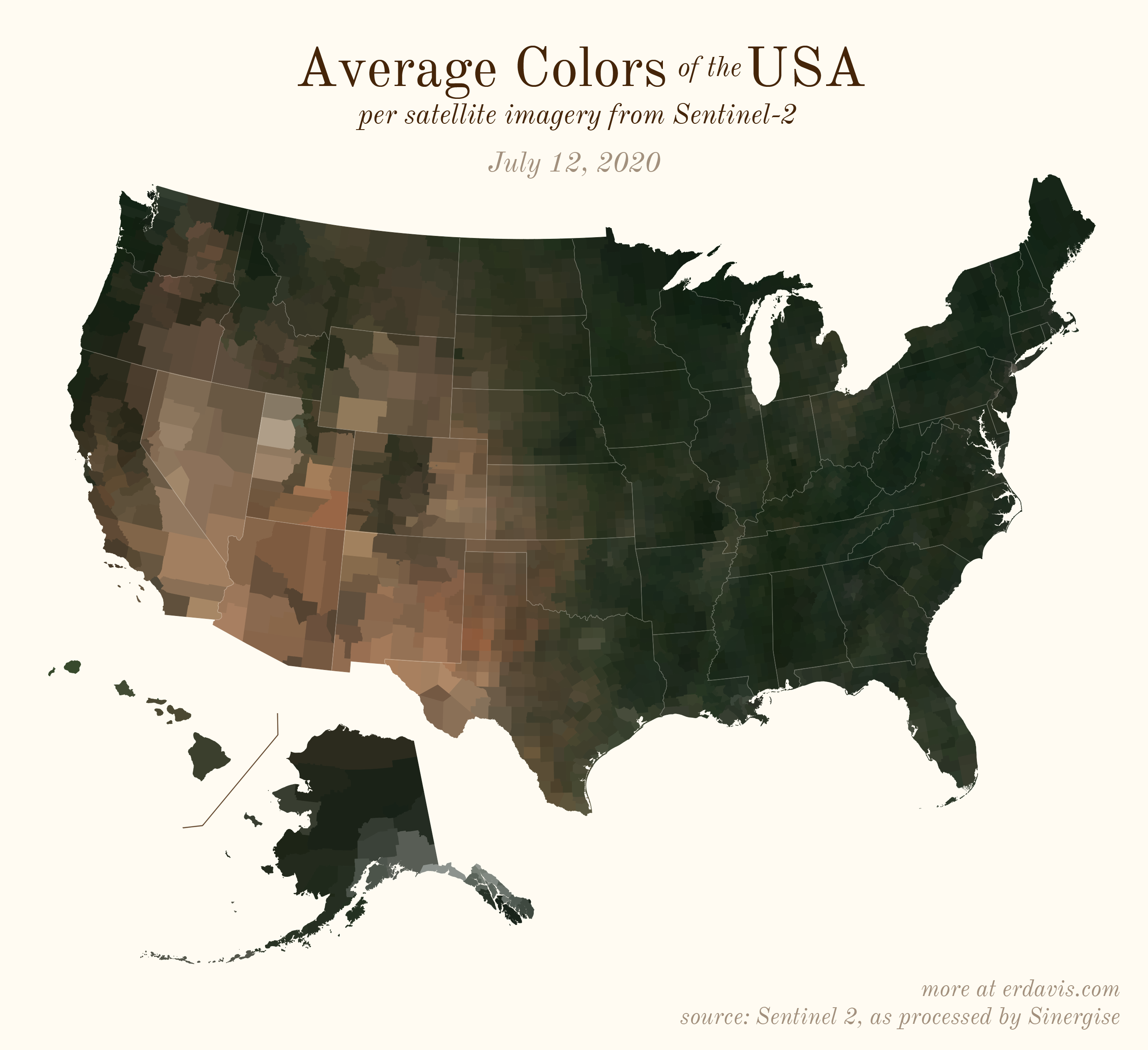
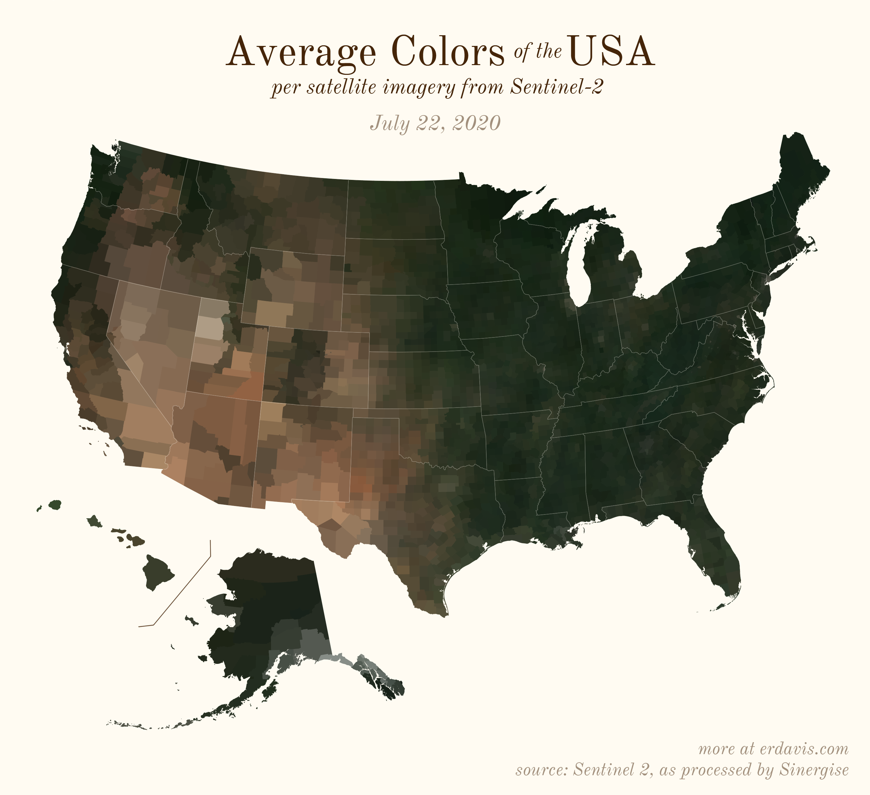
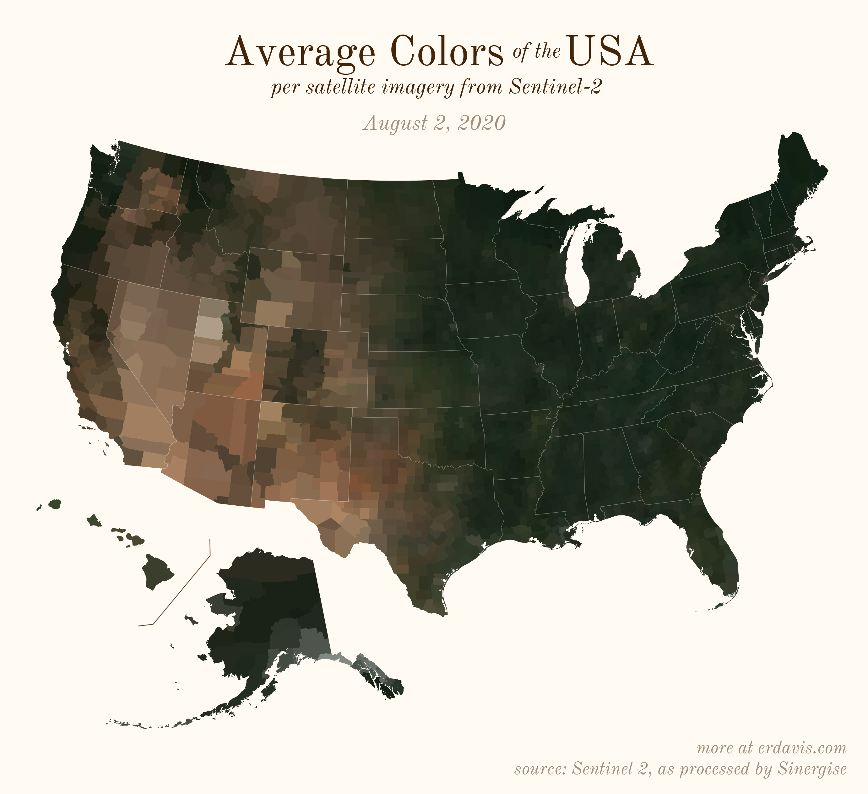
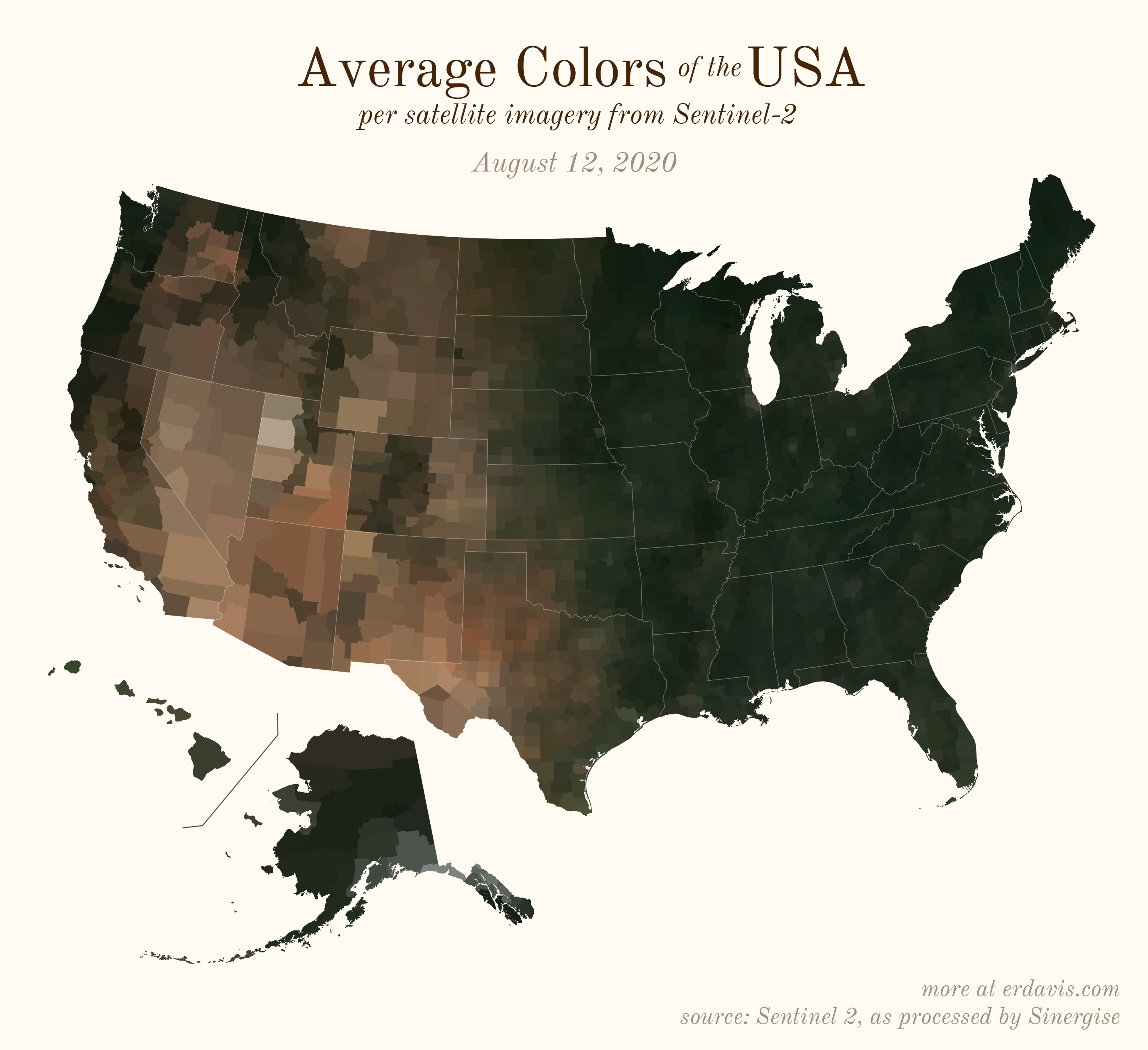
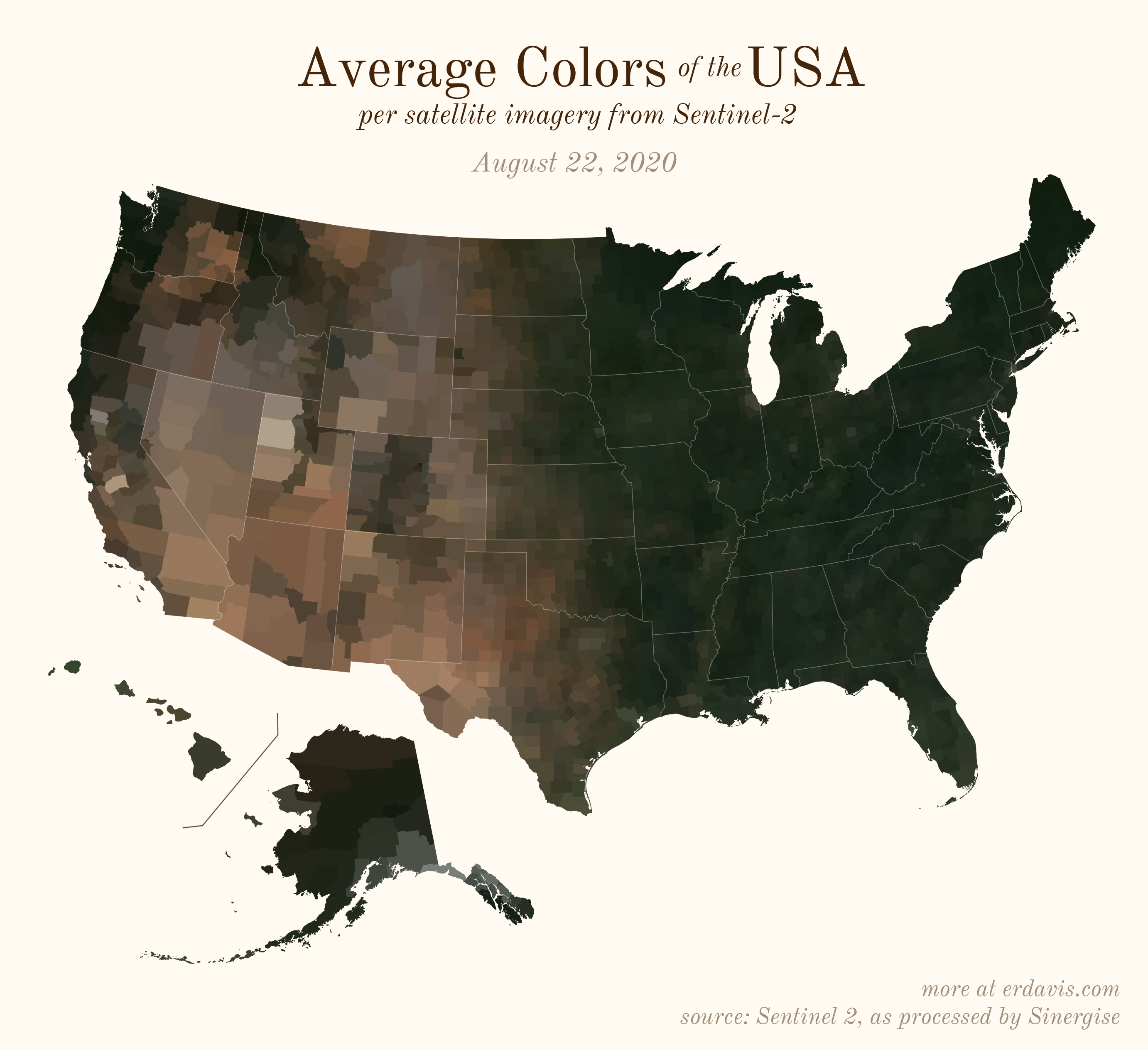
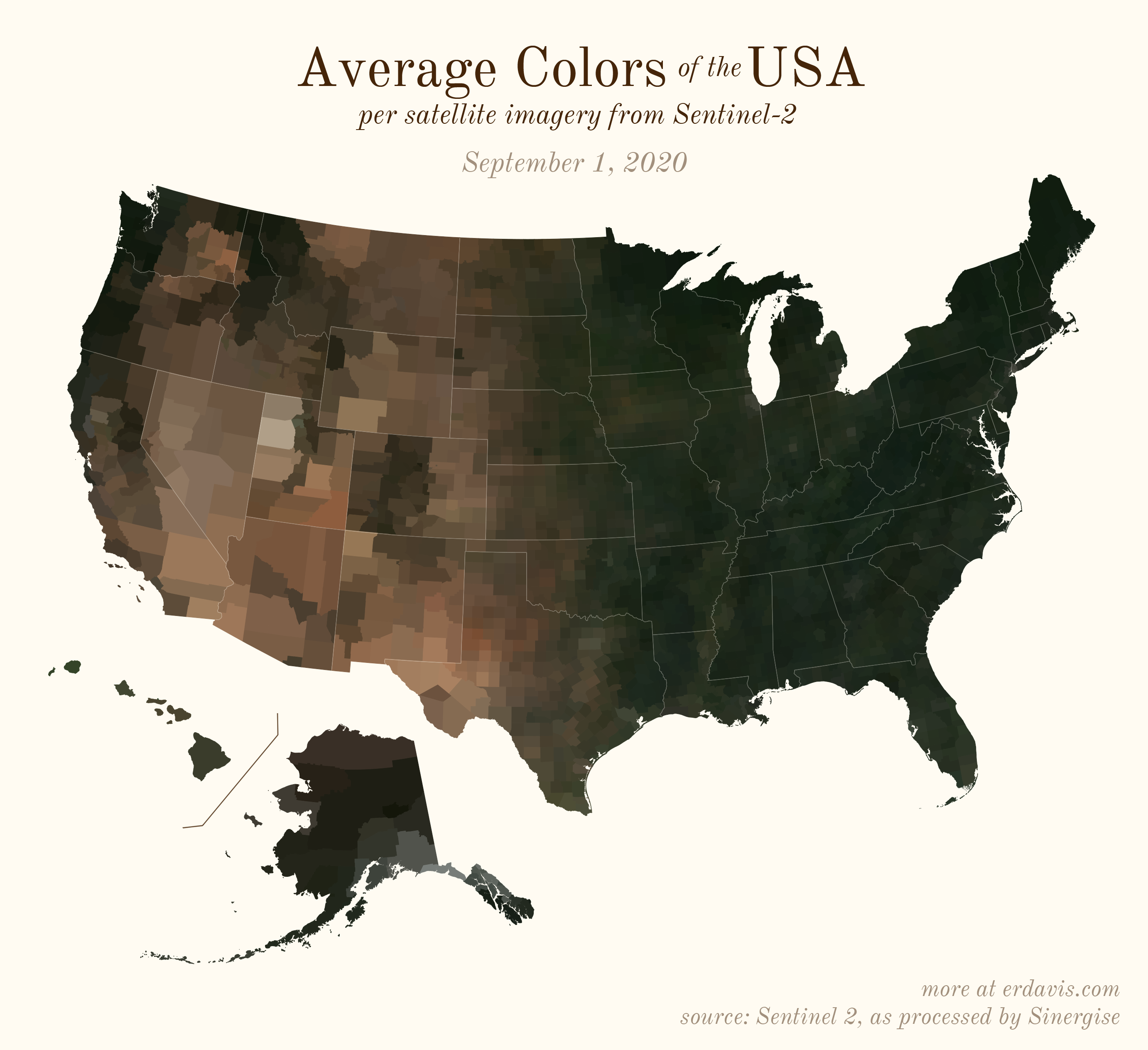
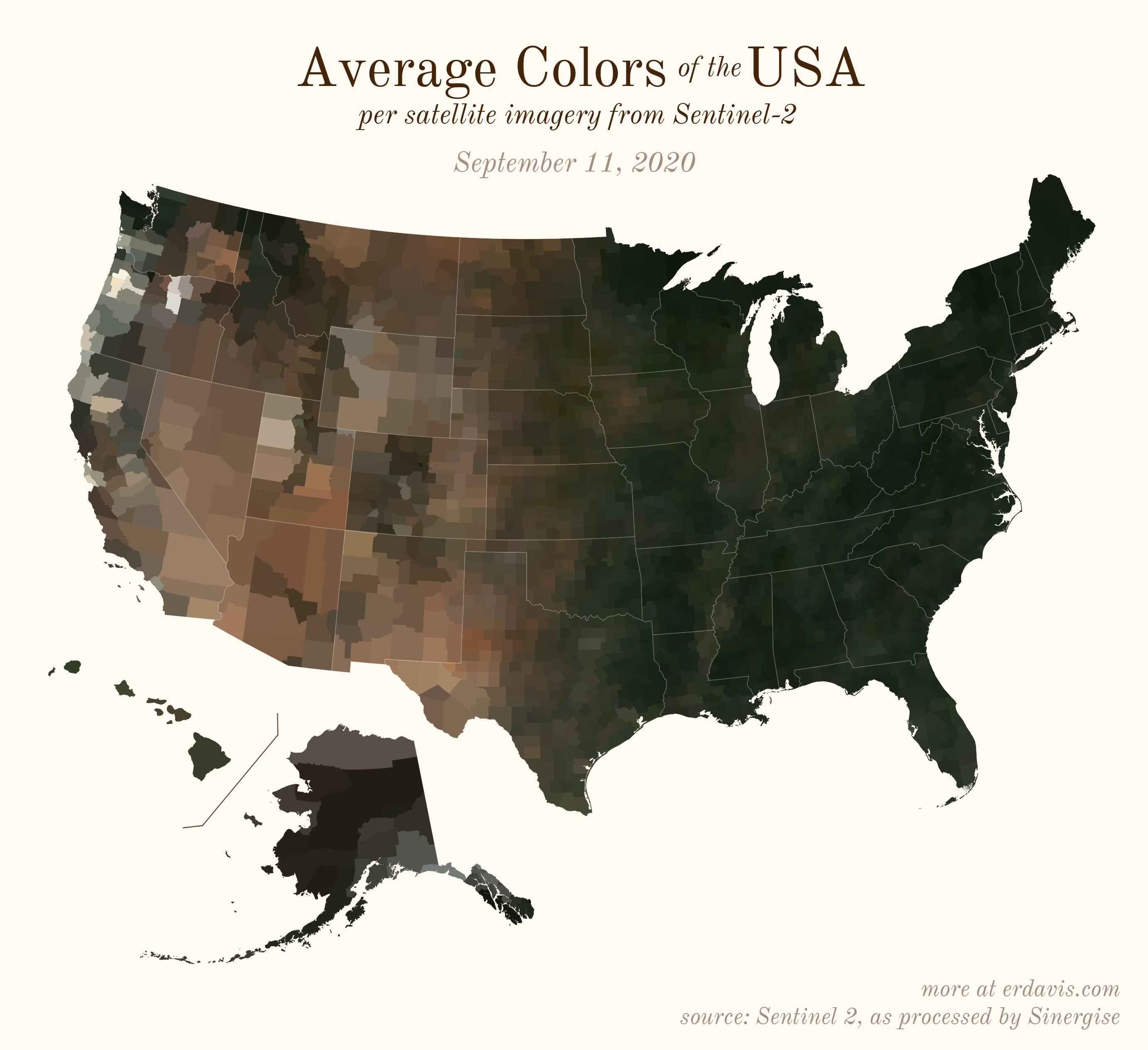
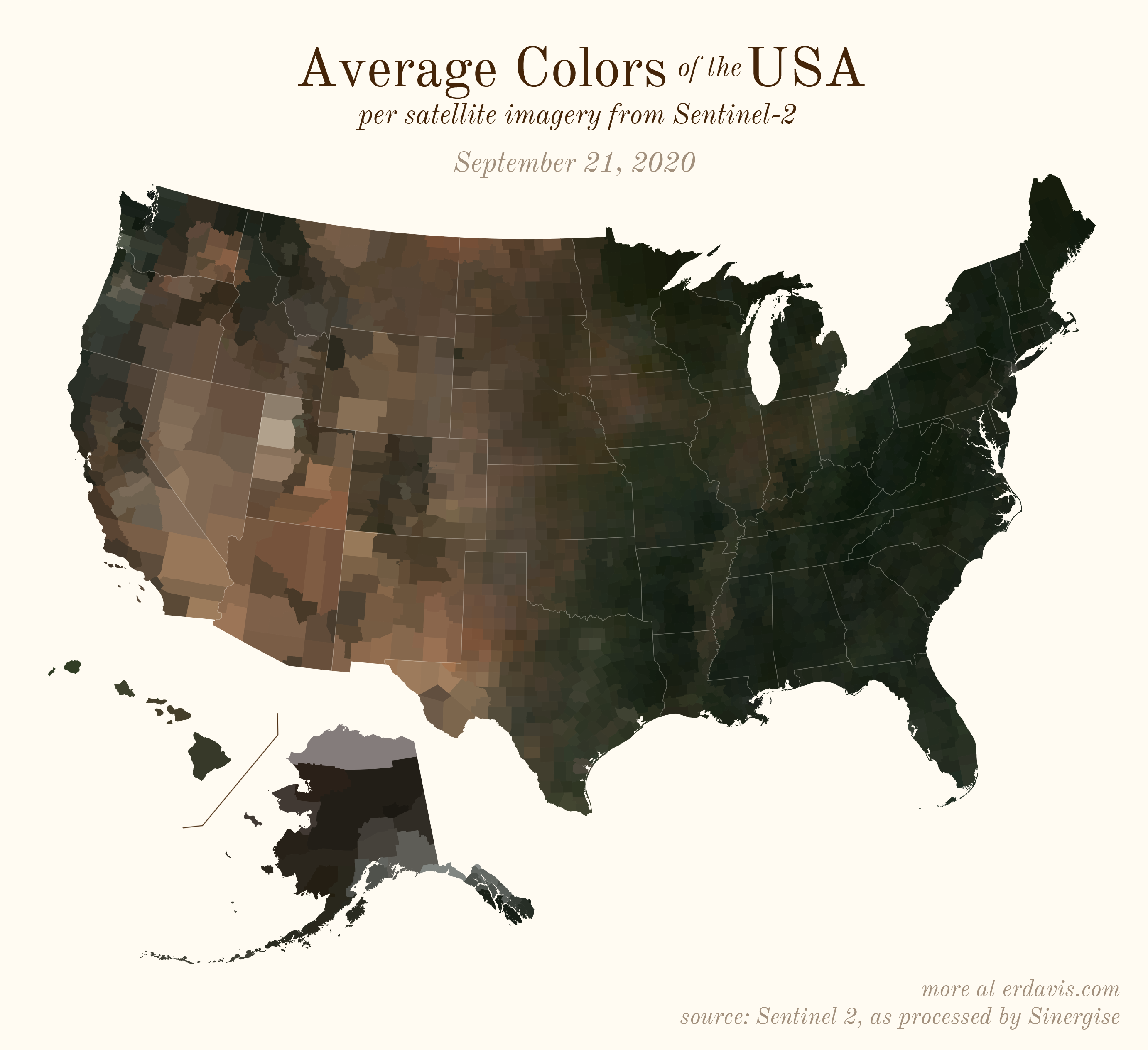
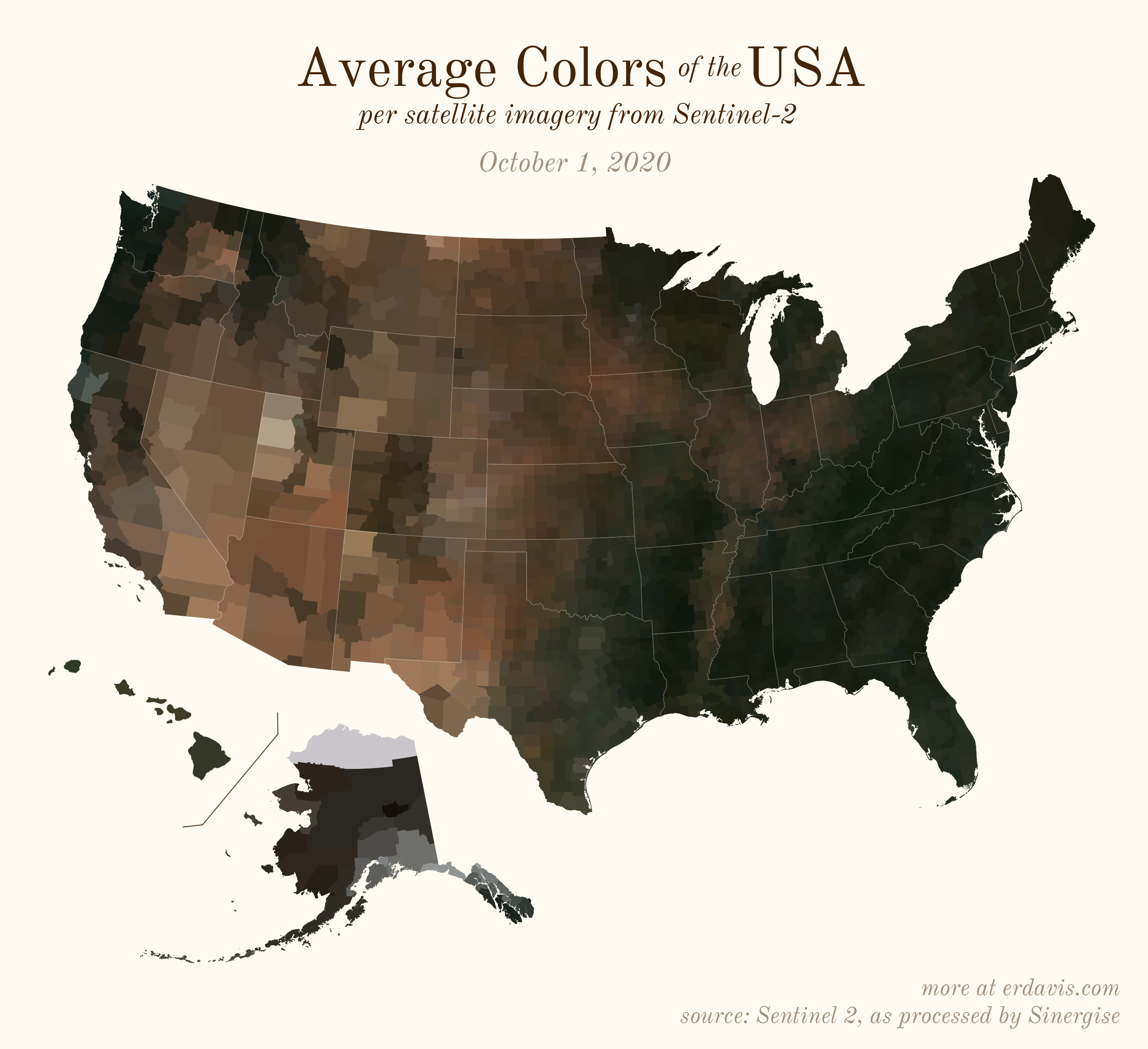
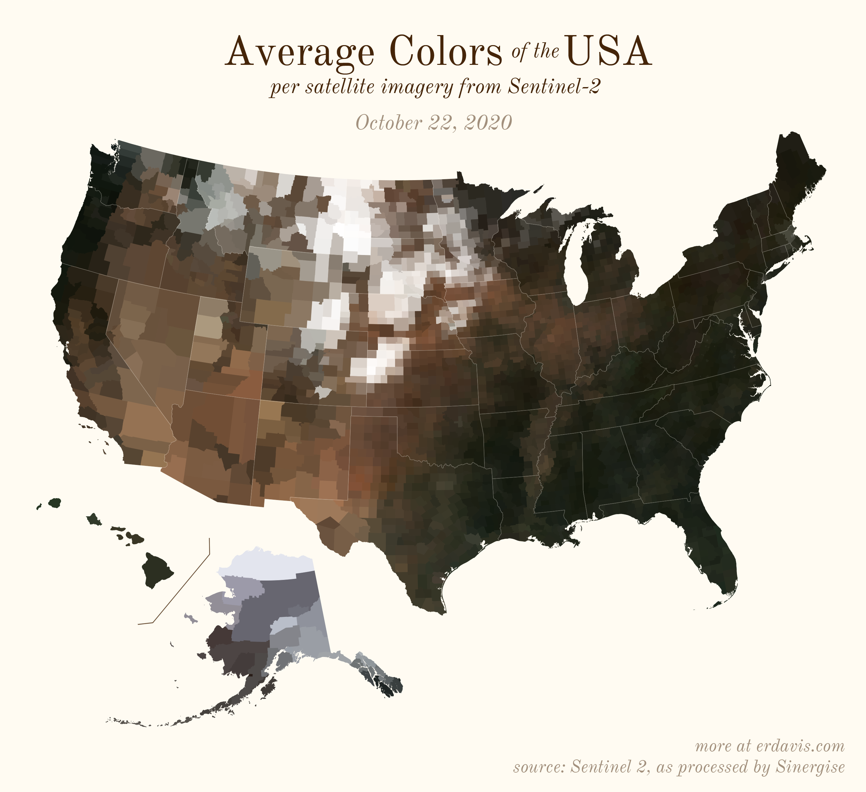
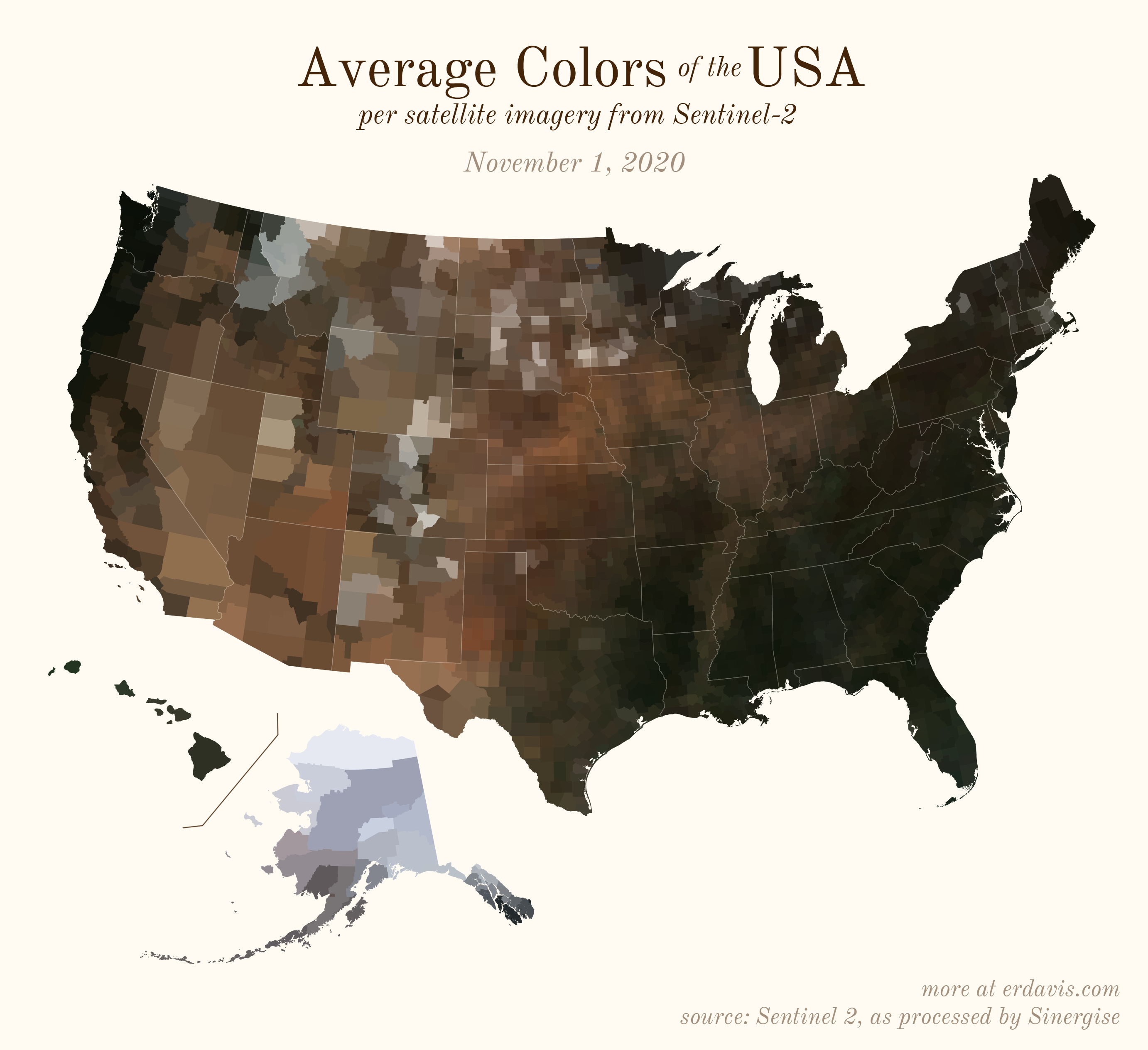
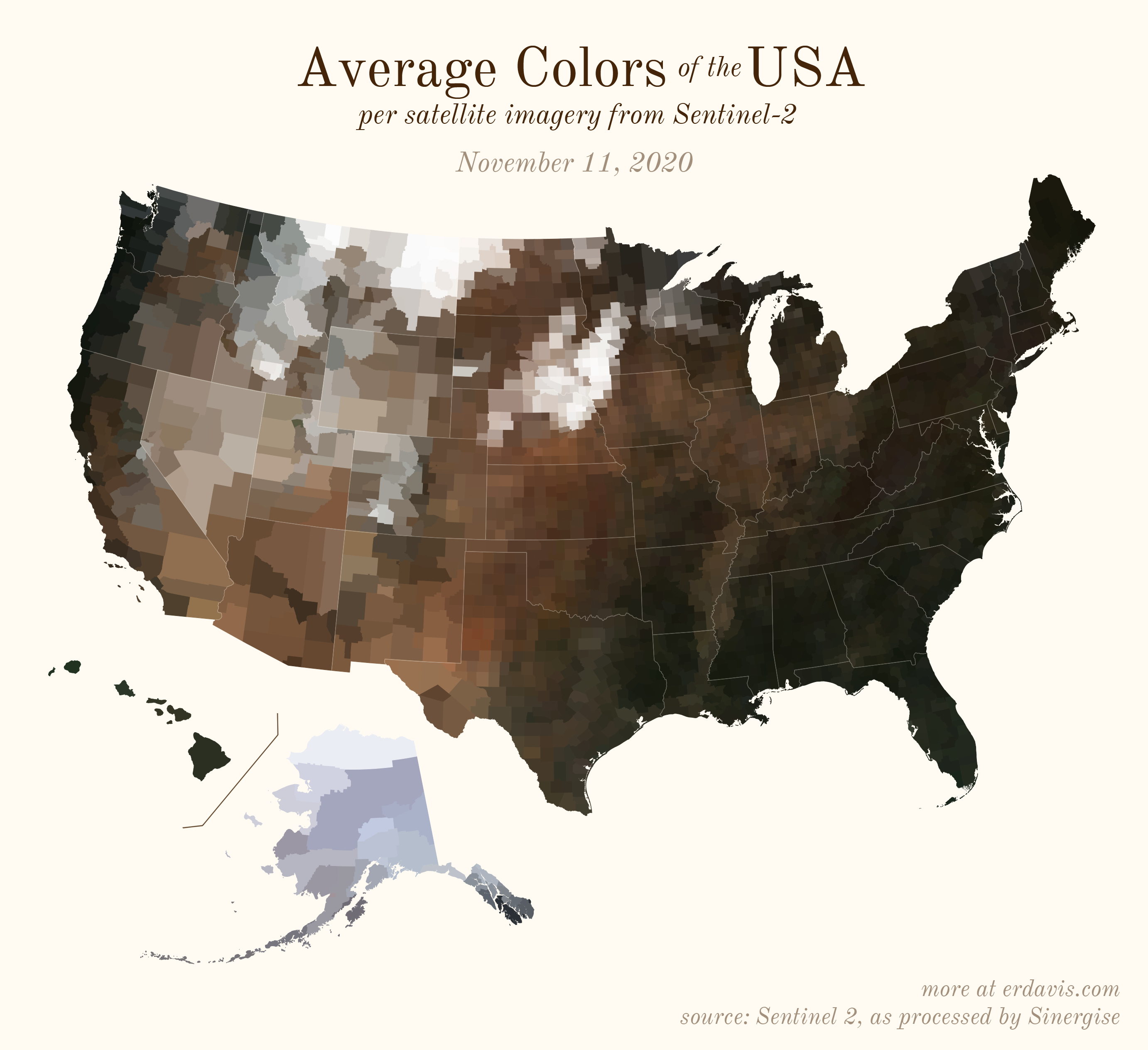
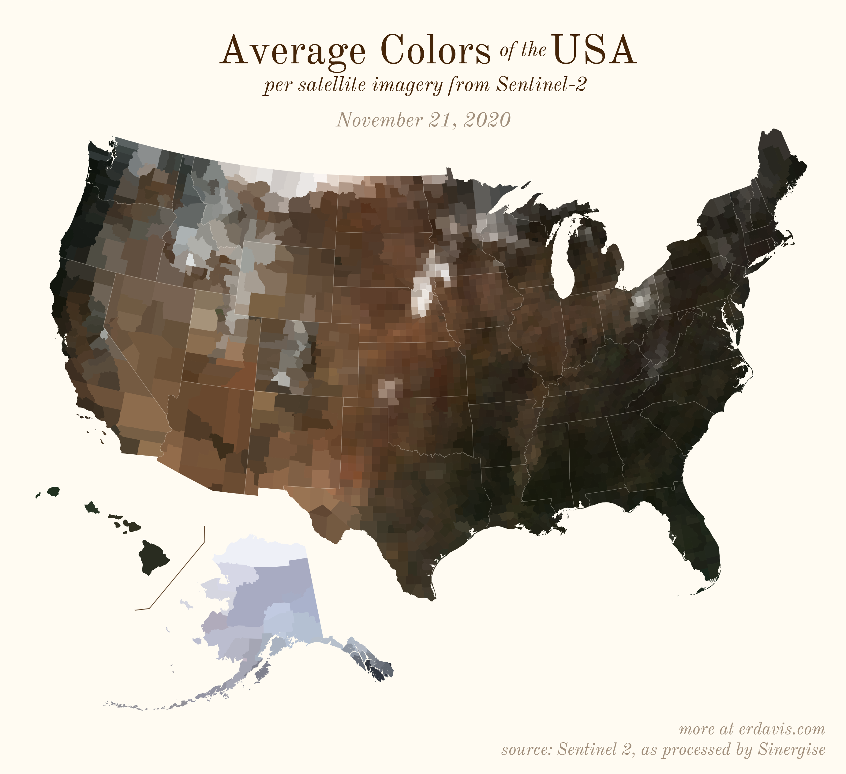
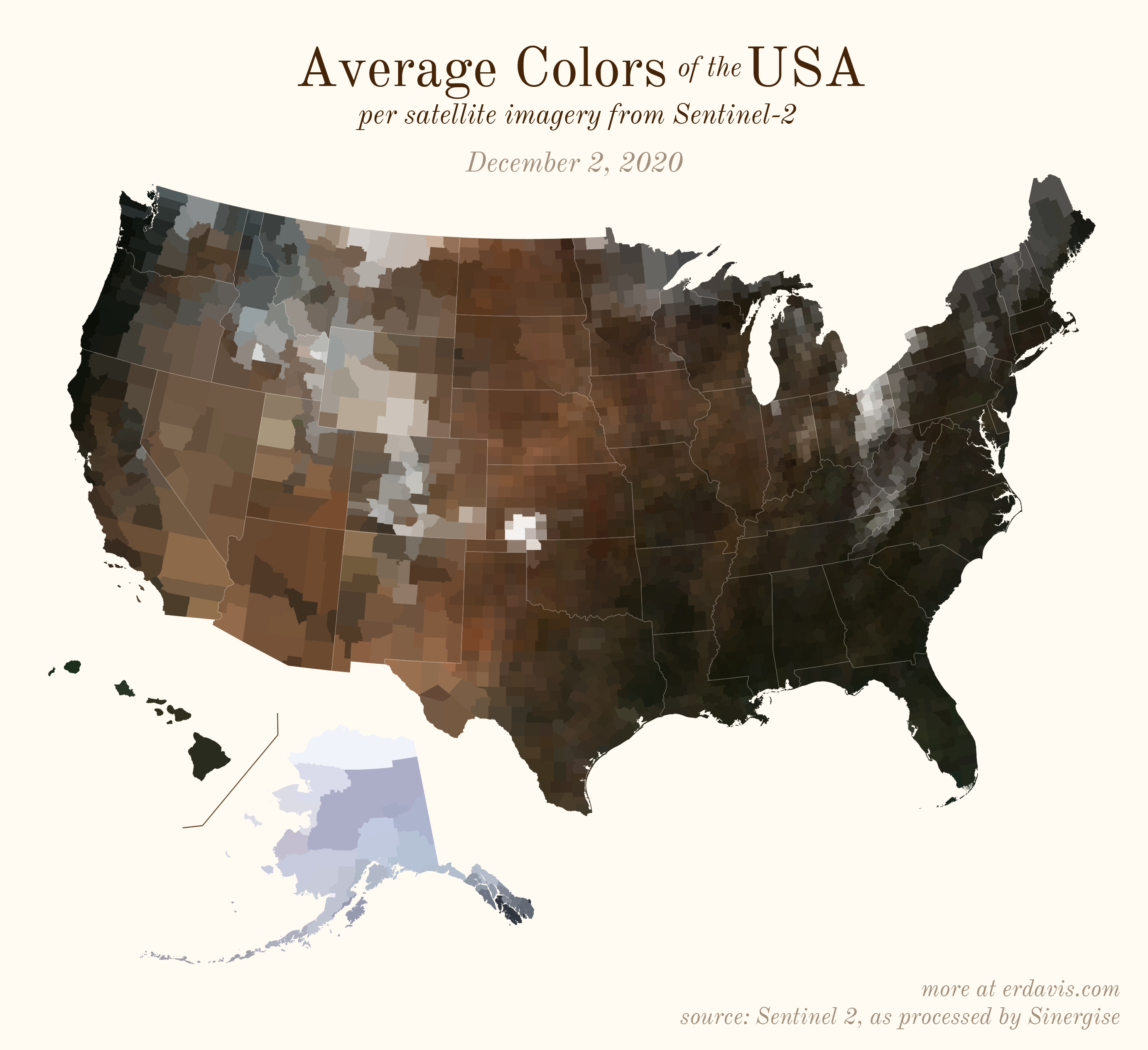
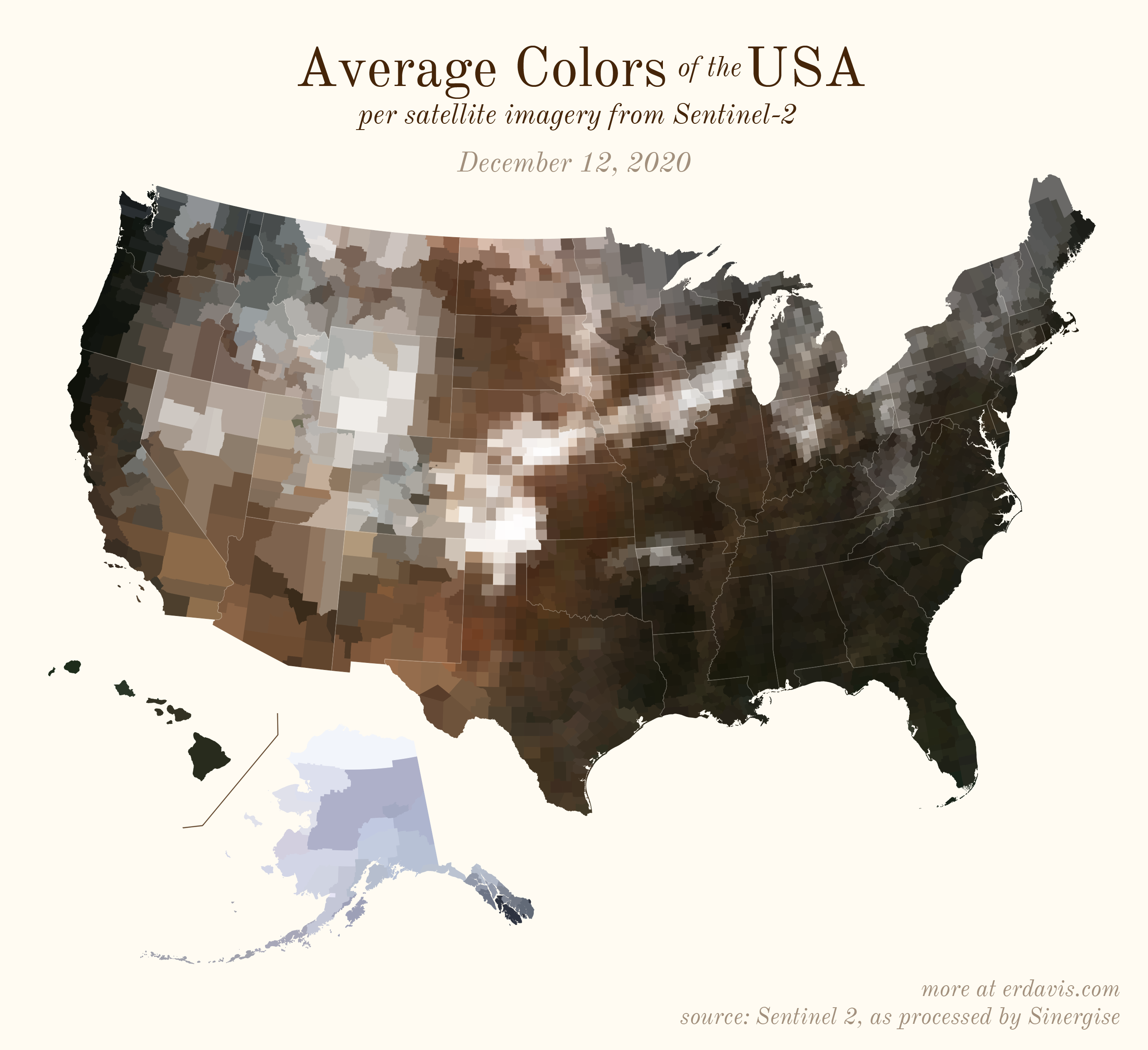
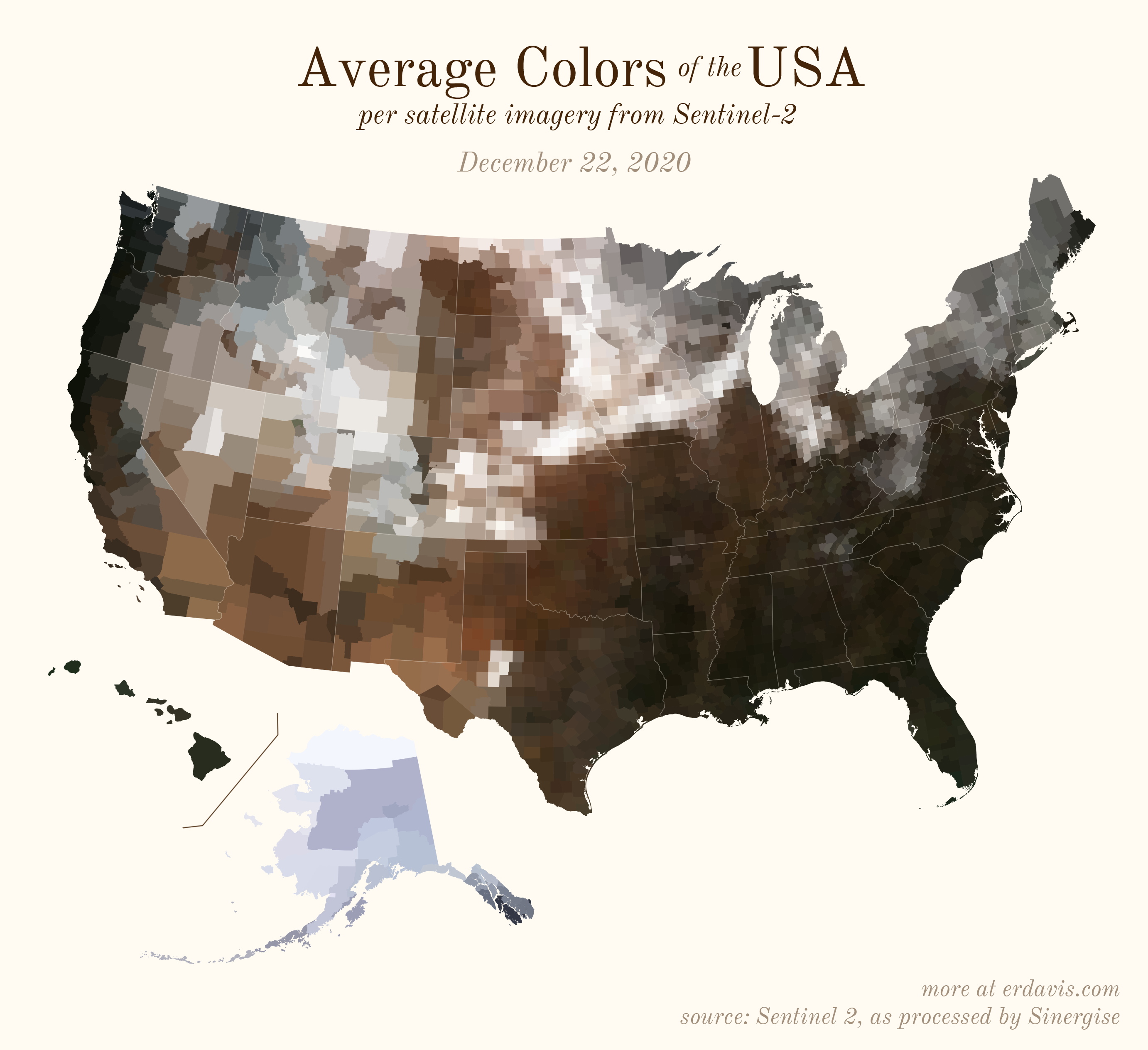
The Maps
Pick your poison: the gif shows the retreat of snow and the advancement of greenery quite nicely. The slideshow lets you look through the images at your own pace.


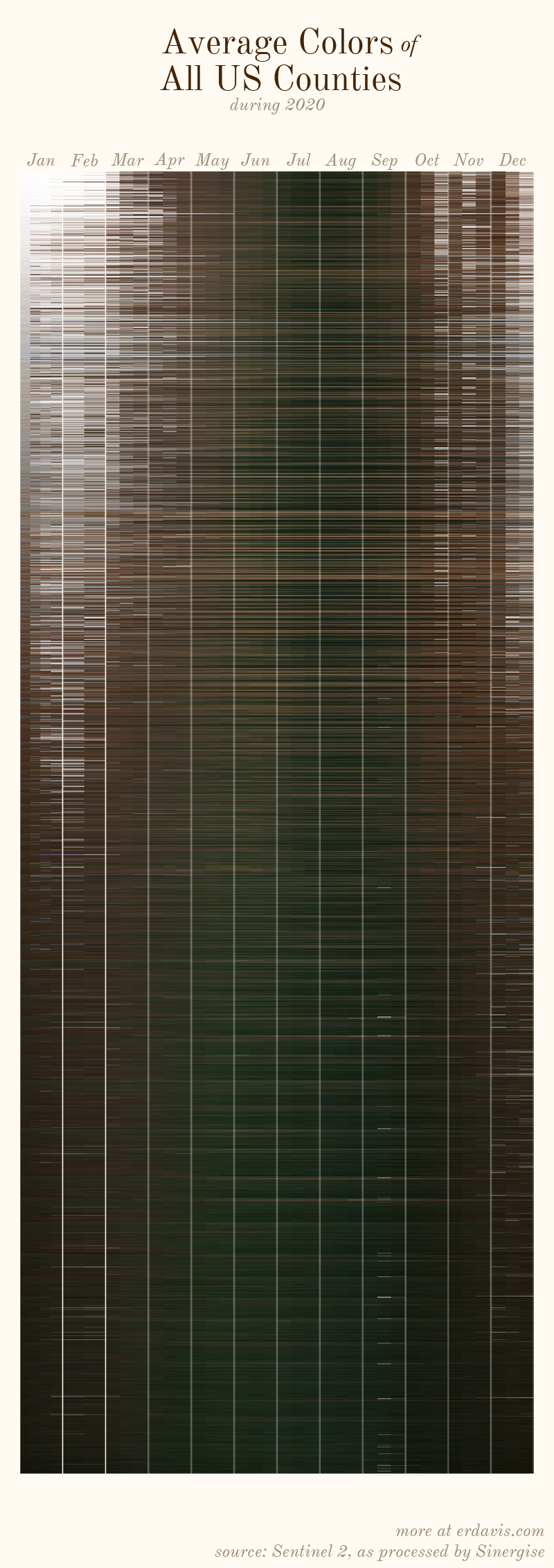
All together, now
And why not view all the counties across all the dates all at once? Each row is a county and each column is a date.
The white band in September is the horrible wildfire smoke we had on the west coast last year.
Some thoughts
I think the ultimate expression of this idea would be finding the average color by county across several years. I’d like to see not individual snowstorms, but rather the overall likelihood that an area is snowy at a particular time of year. Unfortunately, Sinergise only has pre-processed 2019 and 2020 data, but perhaps they’ll continue to do this in future years.
How I did it
To download and process your own satellite images, you’ll need to start by downloading+installing a few things:
- R and RStudio
- the AWS command line interface
- OSGeo4/QGIS (download the OSGeo4 Network Installer, run it, and select Express Install)
Step 0a: Find your area of interest
The files we will be downloading here are quite large, and unless you have an amazing internet connection and a huge hard drive, I strongly suggest you pick a specific area of interest. For context, the files I downloaded to map the United States were more than 280GB (for the whole year).
The files are broken down by the military grid reference system. Take a look at this map and figure out what rows and columns cover your area of interest. For example, if I wanted to download the contiguous US, I’d need rows R, S, T, and U and columns 10 through 19.
Step 0b: Find your date of interest
The following code downloads data for one specific date. You need to decide what date you’d like to download.
To do that, open the command window (in Windows, open the start menu, type cmd, and press enter. Mac users, you’re on your own).
Next, paste in this line and hit enter:
aws s3 ls s3://sentinel-s2-l2a-mosaic-120/ --no-sign-request
If you properly installed the AWS CLI, you should get a list of subfolders returned. Here, we can see that the subfolders 2019 and 2020 are available.
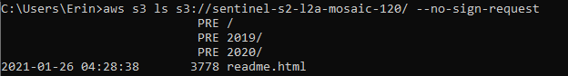
Pick one. I picked 2020, as I wanted the most recent data available.
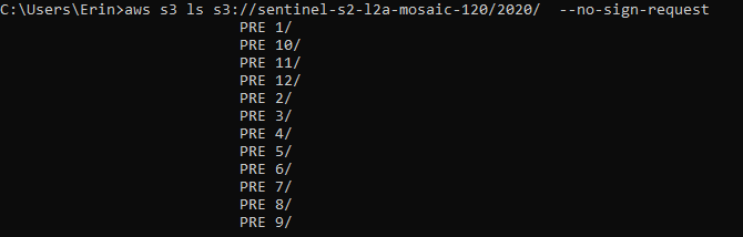
Next, type in the following to see what subfolders are within the 2020 folder.
aws s3 ls s3://sentinel-s2-l2a-mosaic-120/2020/ --no-sign-request
We can see that there are subfolders 1-12 (representing the months of the year).
Finally, let’s see what days are available for each month. I’m interested in month 1, January.
aws s3 ls s3://sentinel-s2-l2a-mosaic-120/2020/1/ --no-sign-request
And, finally, we know that we can download data for January 1, 11, 21, or 31, 2020

Obviously, you must choose a date that is actually available, thus this exercise of looking through the subfolders to see what’s in there.
Step 1: Download from AWS
Paste the following code into a new script in Rstudio.
Read through the code carefully. You’ll see there’s areas where you need to plug in your own information: your working directory, your date of interest, and the rows and columns covering your area of interest.
Once you do that, highlight all the code and run it (ctrl+enter). This code will create a custom script for you to paste into the AWS CLI that will download the right satellite files for you.
#pick the folder path to download to
setwd('C:/Users/Erin/Documents/DataViz/Satellite')

#set the date you want to download
year <- '2020'
month <- '01'
day <- '01'

#determine what rows (letters) and columns (numbers) cover your area of interest
#the values below are for the contiguous USA
#https://legallandconverter.com/images/world-mgrs-grid.jpg
rows <- c('T', 'S', 'R', 'Q')
cols <- 10:19

#create folder structure to organize your downloads
for (n in cols) {
  for (a in rows) {
    dir.create(paste0(getwd(), "/", n, a))
  }
}

#create a script to download the files
if (file.exists("script.txt")) { file.remove("script.txt")}

for (n in cols) {
  for (a in  rows) {
    n_path <- ifelse(n < 10, paste0("0", n), n)
    path <- paste0('"', getwd(), "/",  n, a, '/"')
    cmd <- paste0('aws s3 cp s3://sentinel-s2-l2a-mosaic-120/',
                  year, '/', gsub("^0","", month), '/', gsub("^0","", day), '/', n_path, a, '/ ',
                  path,
                  ' --no-sign-request --recursive --exclude "*"',
                  ' --include "B02.tif" --include "B03.tif" --include "B04.tif"')

    write(cmd, file="script.txt",append=TRUE)
  }
}
Open up script.txt and copy all the contents within. Then open up the command window and paste everything from script.txt. Hit enter.
Wait for your files to finish downloading before moving on to the next step.
Step 2: Merge the files into one image
The downloaded files are highly fragmented. For each military grid cell, you’ll see that B02.tif, B03.tif, and B04.tif were downloaded. These are separate, greyscale files that represent the blue, green, and red bands of visible light, respectively. We need to overlay these files into full-color images. Then, we need to stitch the image from each grid cell into one picture.
Paste the following code into RStudio, highlight it, and run it.
if (file.exists("script.txt")) { file.remove("script.txt")}

#reproject all the files into the same projection
for (n in cols) {
  for (a in  rows) {
    for (i in 2:4) {
      path <- paste0('"', getwd(), "/",  n, a, '/B0', i, '.tif"')
      file_final <- paste0('"', tempdir(),  "/", n, a, '_B0', i, '.tif"')
      cmd <- paste0("gdalwarp -t_srs EPSG:4326 ",
                     path, ' ',
                    file_final)
      write(cmd,file="script.txt",append=TRUE)
    }
  }
}

#create virtual rasters
cmd <- paste0("gdalbuildvrt ",
              '"', tempdir(), '/mosaic_B02.vrt" ',
              '"', tempdir(), '/*B02.tif"')
write(cmd,file="script.txt",append=TRUE)

cmd <- paste0("gdalbuildvrt ",
              '"', tempdir(), '/mosaic_B03.vrt" ',
              '"', tempdir(), '/*B03.tif"')
write(cmd,file="script.txt",append=TRUE)

cmd <- paste0("gdalbuildvrt ",
              '"', tempdir(), '/mosaic_B04.vrt" ',
              '"', tempdir(), '/*B04.tif"')
write(cmd,file="script.txt",append=TRUE)


#create final mosaic
cmd <- paste0("gdalbuildvrt -separate ",
              '"', tempdir(), '/allband.vrt" ',
              '"', tempdir(), '/mosaic_B04.vrt" ',
              '"', tempdir(), '/mosaic_B03.vrt" ',
              '"', tempdir(), '/mosaic_B02.vrt"')
write(cmd,file="script.txt",append=TRUE)


#convert virtual raster to tiff
cmd <- paste0("gdal_translate -of GTiff ",
              '"', tempdir(), '/allband.vrt" ',
              '"', tempdir(), '/allband.tif" ')
write(cmd,file="script.txt",append=TRUE)
This will again output a file called script.txt with a custom script to mash and merge all your separate downloaded files.
This time, open up the OSGeo4 Shell (In Windows, open the start menu, search OSGeo4, and select OSGeo4 Shell).
Open up script.txt, copy all its contents, and paste it into the OSGeo4 shell. Hit enter.
Again, you’ll see your script fly by in the shell window as it processes your data.
Wait for it to finish processing before moving on to the next step.
Step 3: Cleanup
Getting the final image generated a bunch of files and subfolders we don’t want hanging around. Paste the following into RStudio and run it to get rid of all that detritus.
#remove everything except your final image
file.rename(paste0(tempdir(), "/allband.tif"), paste0(getwd(), "/allband.tif"))

files <- list.files(".", recursive = T, include.dirs = T)
files <- files[!grepl("allband.tif", files)]
do.call(file.remove, list(files))
unlink(files, recursive=TRUE)

files <- list.files(tempdir(), recursive = T, include.dirs = T)
do.call(file.remove, list(files))
unlink(files, recursive=TRUE)
Step 4: Render the final image
Open up QGIS. Find the file allband.tif (generated in step 2) and drag and drop it into the workspace.
You’ll likely see that your picture looks… off. In my case, my images were usually way too dark.
In the left hand Layers pane, right click your file and choose Properties.
Here’s the tricky part: adjusting the Min and Max of your red, green, and blue bands to create a more reasonable image. I couldn’t find any super helpful documentation here, but I ended up with the impression that the right thing to try would be setting the min value to 0 for all bands and the max value to 4096.
Depending on your area, you may find different values end up with a better look.
Once you’ve adjusted the image to your liking, it’s time to export it to a rendered image.
Go to Project > Import/Export > Export Map to Image.
Then, in the Extent box, click Calculate from Layer and choose your file.
If you plan on using this image in the Average Colors code, make sure that “Append georeference Information” is checked off.
Adjust the Resolution until you get the output size you prefer. If you plan on feeding this image back into the Average Colors code, you’ll want to pick something fairly large–I exported the contiguous United States at about 20000px by 10000px
Click Save, choose the .tif format, and you’re done!
Step 5: (Optionally) find the average colors
For this optional step, you’ll need to have a shapefile of your sub-areas of interest. In my case, I downloaded the counties shapefile from the US Census.
First, get the necessary packages installed. You only need to run this line of code once ever.
install.packages(c('dplyr', 'ggplot2', 'sf', 'magick', 'ggthemes'))
Next, load those packages. This needs to be run every time you open a new RStudio session.
library(dplyr)
library(sf)
library(magick)
library(ggthemes)
library(ggplot2)
Set your working directory (the folder you want to work out of). Indicate where your satellite image and shapefile are.
setwd('C:/Users/Erin/Documents/DataViz/Satellite')
shapefile_path <- "C:/Users/Erin/Documents/DataViz/!Resources/Counties/counties.shp"
image_path <- "C:/Users/Erin/Documents/DataViz/Satellite/allband.tif"
Now, split your shapefile into separate files, one per feature. Notice here that the field GEOID uniquely identifies each row (ie, feature) of my shapefile. If your shapefile is different, you will need to replace GEOID with your own unique ID across the rest of the code.
#save each shape as a separate file
#note that here my shapes are uniquely identified by the field GEOID.
#If your shapefile has a different unique ID, substitute its name for GEOID everywhere in the code.
dir.create(paste0(getwd(), "/shapes/"))
shape <- read_sf(shapefile_path)

for (i in 1:nrow(shape)) {
  write_sf(shape[i,], paste0("./Shapes/", shape$GEOID[i], ".shp"))
}
Now we’ll create a new script.txt file to pop into the OSGeo4 shell. This script will crop the master satellite image into individual files, one per feature.
#create a script to crop your image
#again, note that you may need to replace GEOID in this piece of code!
if (file.exists("script.txt")) { file.remove("script.txt")}

for (i in 1:nrow(shape)) {
  file_shp <- paste0(getwd(), '/shapes/', shape$GEOID[i], '.shp')
  file_crop <-  paste0(tempdir(), "/", shape$GEOID[i], '_crop.tif')

  cmd <- paste0("gdalwarp -cutline",
                ' "', file_shp, '"',
                " -crop_to_cutline -of GTiff  -dstnodata 255",
                ' "', image_path, '"',
                ' "', file_crop, '"',
                " -co COMPRESS=LZW -co TILED=YES --config GDAL_CACHEMAX 2048 -multi")
  write(cmd,file="script.txt",append=TRUE)

}
Open up script.txt, copy its contents, and paste into the OSGeo4 shell. Wait for it to finish running before moving on to the next piece of code.
This code will extract the average color of each of your cropped images. It does this with a neat trick: it shrinks each image down to 1×1 pixel, then grabs the color of that pixel.
Again, make sure to replace GEOID with the correct unique field name.
colors <- NULL

for (i in 1:nrow(shape)) {
  img <- image_read(paste0(tempdir(), "/", shape$GEOID[i], "_crop.tif"))

  #convert to a 1x1 pixel as a trick to finding the avg color. ImageMagick will average the
  #colors out to just 1.
  img <- image_scale(img,"1x1!")

  #get the color of the pixel
  avgcolor <- image_data(img, channels = "rgba")[1:3] %>% paste0(collapse="")

  #save it in a running list
  temp <- data.frame(color = paste0("#", avgcolor), id = shape$GEOID[i])
  colors <- bind_rows(colors, temp)
}

#save the color file if you need it later
write.csv(colors, 'colors.csv', row.names = F)
And now you can plot your beautiful map:
#you'll need to change the join column name here if you're not using GEOID
shapes <- inner_join(shapes, colors, by = 'GEOID')

#transform the shapefile to a reasonable projection
#if you're unsure here, google "epsg code" + "your region name" to find a good code to use
shapes <- st_transform(shapes, 2163)


#plot it
ggplot() + theme_map() +
  geom_sf(data = shapes, aes(fill = I(color)), color = NA) +
  theme(plot.background = element_rect(fill = '#fffbf2', color = '#fffbf2'))

#save it
ggsave("avgcolors.png", width = 7, height = 9, units = "in", dpi = 500)
Discover more from Data Stuff
Subscribe to get the latest posts sent to your email.
[…] the first day of 2020 (as derived from Sentinel 2 satellite imagery). If you visit Erin's post the Average Seasonal Color of the USA you can view 35 other maps showing how the average colors of the USA change over the course of the […]
[…] you can see a snapshot of the average colors of all U.S. counties as of January 1, 2020. Visit Erin’s blog to observe their change during the last year, in a slideshow or in an animated GIF. Enjoy a […]
Can I request a Canadian version, please.
[…] Average seasonal colors of the USA. Link. […]
[…] this map created by Erin Davis, the average colors of the U.S. by county are revealed, showing drastic […]
[…] Erin Dataviz | ‘Average seasonal colors of the USA’ […]