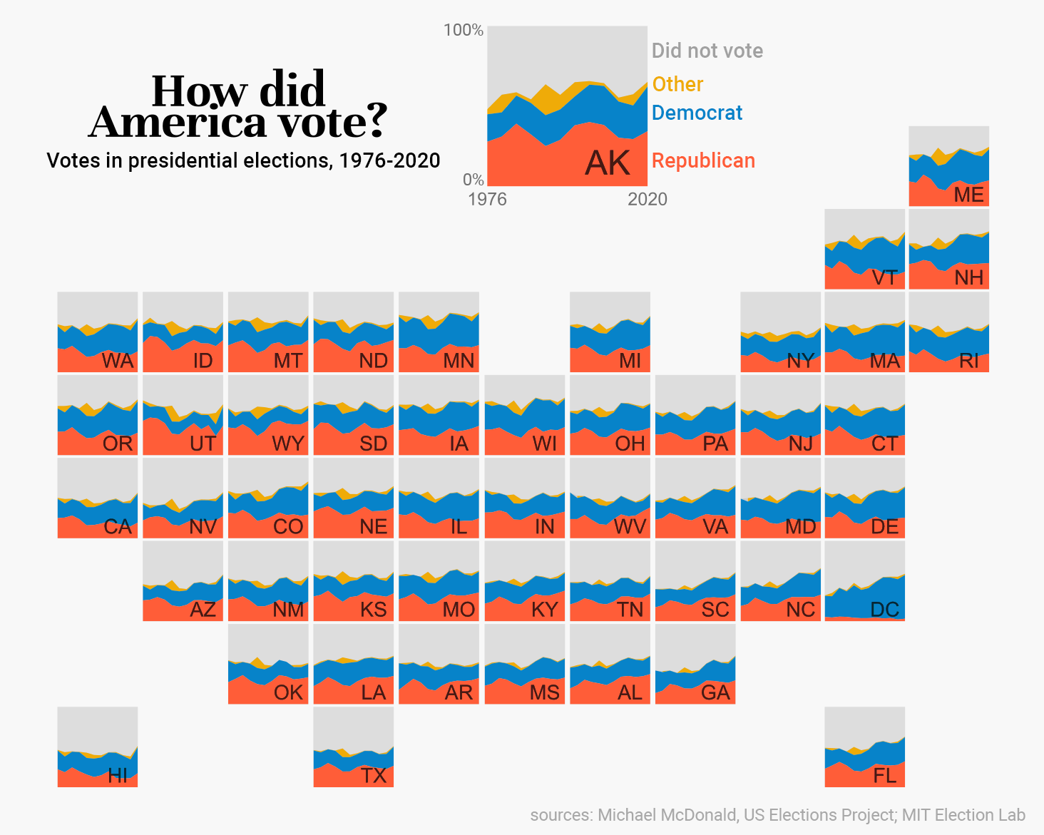
I made a map! And it went viral! Neat!
I got a number of requests for the code, so I thought this would be the best forum to share how I made it.
To be honest, I whipped this out to quickly to illustrate a concept in Slack, then tweeted it because I liked it. I really didn’t expect this amount of attention! The original was made with my signature slurry of sloppy R code and Photoshop, so before sharing a “how to” I had to clean up the process quite a bit.
@RJFravel on Twitter asked if I could make a similar map for election results, so I’ll be using that idea as a sample project to walk through.
Getting set up
I’m going to write this as if you’ve never used R before in your life. It’s fairly easy to get started, but you will need to download and install a few things.
- The R language itself
- RStudio, the software you will use to write code in the R language
Once installed…
- Open RStudio. Go to File > New File > R Script.
- A blank R script will appear. As you follow the tutorial below, paste each chunk of code into the R script. (don’t forget to save it)
- To run a chunk of R code, highlight the bit you want to run, then press the Run button at the top right of the script (or press ctrl+Enter)
- Alternatively, HERE IS A LINK to a zipped folder with the full script and data in it, so you can open that up and run it instead of copy/pasting code.
One thing to note: lines that begin with # and are green-colored are code comments. These are simply notes from me to you about what the code is doing. They don’t actually run any code. Do take your time to read them, as some of them have important instructions.
#this is an example comment
First steps
In your fresh R script, paste the following code. Highlight and run it. This will install the code libraries we need for the rest of the project. Only run this one time; once they’re installed, you’re good to go for the future.
install.packages(c('dplyr', 'ggplot2', 'ggthemes', 'patchwork'))
Next, paste this and run it. This will load the newly installed code libraries so they’re available to use in this R script. You’ll want to run this each time you open your script
library(dplyr)
library(ggplot2)
library(ggthemes)
library(patchwork)
library(extrafont)
Next, change the folder path to whatever folder on your computer you plan to be working out of. Hot tip: make sure to use / in the filepath instead of the default \ (it’s an annoying R thing)
setwd('C:/Users/Erin/Documents/Projects/Election/')
Get your fonts ready
Fonts are honestly one of the most annoying things I deal with in R. This bit can be kind of finicky, so it’s worth spending some time getting it all set up.
First, determine where on your system your fonts are saved. For me, on a Windows machine, I just went to Font Settings, selected the font I was interested it, and looked at where the path was.
font_import(paths = 'C:/Users/Erin/AppData/Local/Microsoft/Windows/Fonts/')
loadfonts(device='win')
Next, you’ll need to know how to refer to the fonts you plan to use. Run the following so a tab with font details pops up. Find your fonts in the list, and make note of the “font family.”
View(fonttable())
Then, we’ll save those font families in variables to use later. Be careful to type them exactly as they appear in the font table.
label_font <- 'Roboto Medium'
title_font <- 'Unna'
Import your data
Now we need some data. I have provided my data HERE if you’d like to use that. If you’re using your own, make sure it is formatted the same (down to the column names).
year: year of the data
state: the region the data is for (eg state, province, country)
party: the category (eg political party, place of birth, etc)
pct: the percent this category makes up for the year. It is assumed they will add up to 1 for a given state+year.
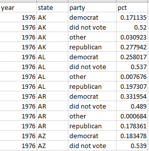
#change data.csv to the filepath where your info is saved
data <- read.csv('data.csv')
Then the more fun bits: set what colors you want to use, the order your categories should appear in the plot, and the min and max years of your data
#set the order you want the categories to appear in (top to bottom)
data$plot_order <- factor(data$party, levels=c('did not vote', 'other', 'democrat',  'republican'))

#determine the colors you want for each category
colors <- c('democrat' = '#0783c9', 'republican' = '#ff5d38', 'other' = '#EFAB08', 'did not vote' = '#dddddd')

#set the first and last years in your data
firstyear <- 1976
lastyear <- 2020

#make a title for your plot. the \n character is a line break
title <- 'How did\nAmerica vote?'
Make a legend image (optional)
I decided to make Alaska my legend. If you have a particular region you want to be the legend, change the “AK” criteria to the name of your region.
#make a special legend plot for AK
#skip this whole chunk if you don't need a legend.
#alternatively, replace 'AK' with the criteria that defines your special legend region
legend <-
  ggplot(subset(data, state == 'AK'), aes(x = year, y = pct, fill = plot_order, group = plot_order)) +
  geom_area() +
  geom_text(aes(x = .75*lastyear, y = .15), label = 'AK', alpha = .03, size = 10, family = label_font) +
  scale_fill_manual(values = colors) +
  scale_x_continuous(limits = c(firstyear, lastyear), expand = c(0, 0)) +
  scale_y_continuous(limits = c(0, 1.0001),  expand = c(0, 0)) +
  theme(legend.position = 'none',
        aspect.ratio=1,
        panel.background =  element_rect(fill = '#cccccc', color = '#cccccc'),
        axis.title = element_blank(),
        axis.ticks = element_blank(),
        axis.text.y = element_blank(),
        axis.text.x = element_text(size=15, family = label_font, colour = '#707070'),
        plot.margin=grid::unit(c(0,0,0,0), "mm"))
Make all the other region images
Here, I have a specific line that filters out AK from the list of states to make images for. If you actually want AK in the plot (or if AK isn’t relevant to you), just delete the second line in this chunk.
This will output one variable per region containing a plot object for that region.
#create a mini chart for each state except AK
states <- unique(data$state)
states <- states[!grepl('AK', states)]

for (i in 1:length(states)) {
  plot <-
    ggplot(subset(data, state == states[i]), aes(x = year, y = pct, fill = plot_order, group = plot_order)) +
    theme_map() +
    geom_area() +
    geom_text(aes(x = .75*lastyear, y = .15), label = states[i],alpha = .03,  size = 6, family = label_font) +
    scale_fill_manual(values = colors) +
    scale_x_continuous(limits = c(firstyear, lastyear), expand = c(0, 0)) +
    scale_y_continuous(limits = c(0, 1.0001),  expand = c(0, 0)) +
    theme(legend.position = 'none',
          aspect.ratio=1,
          panel.background =  element_rect(fill = '#cccccc', color = '#cccccc'),
          plot.margin=grid::unit(c(0,0,0,0), "mm"))

  assign(states[i], plot)
}
Make the title
Naturally, you’ll want to change the “How did America vote” text to whatever your title should say.
#make the title a ggplot so we can easily slot it into the final layout
title <-
  ggplot() +
  theme_map() +
  geom_text(aes(x = 0, y = 0), label = title, size = 15, lineheight = .5, family = title_font, fontface = 'bold') +
  theme(plot.margin=grid::unit(c(0,0,0,0), "mm"))
Figure out how you want your plot arranged
I found this easiest to do in Excel. What you want is a nice grid layout that shows what row and column each mini-plot should be placed in.
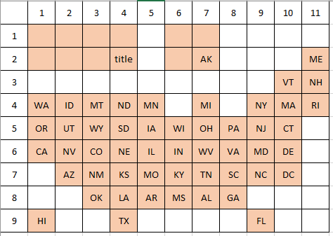
Then, we create the layout in R. This layout is a skeleton framework that determines what parts of a grid will have a plot in them.
For parts of the graph that take up more than one square, like the title and legend, the formula is area(top,left,bottom,right), where top and bottom are the row numbers occupied by that object, and left and right are the columns occupied.
For items that only take up one square, you can simply specify area(top, left) as shown below.
For easy comprehension, I worked my way across my Excel template top to bottom, left to right.
layout<-c(
  area(1,1,2,4),
  area(1,6,2,7),
  area(2,11),
  area(3,10),area(3,11),
  area(4,1),area(4,2),area(4,3),area(4,4),area(4,5),
  area(4,7),area(4,9),area(4,10),area(4,11),
  area(5,1),area(5,2),area(5,3),area(5,4),area(5,5),
  area(5,6),area(5,7),area(5,8),area(5,9),area(5,10),
  area(6,1),area(6,2),area(6,3),area(6,4),area(6,5),
  area(6,6),area(6,7),area(6,8),area(6,9),area(6,10),
  area(7,2),area(7,3),area(7,4),area(7,5),area(7,6),
  area(7,7),area(7,8),area(7,9),area(7,10),
  area(8,3),area(8,4),area(8,5),area(8,6),area(8,7),area(8,8),
  area(9,1),area(9,4),area(9,10)
)
Then, the moment of truth: actually plotting the plot.
Above, we simply determined what parts of the grid would have a plot in them. In this piece of code, we specify which plot goes into which slot. Make sure to specify the plots in the same order you specified the layout.
The names of the plots are determined by the code in the section “Make all the other region images”, and will correspond with the region names in your data file.
Do note that the plot preview in RStudio might look kind of weird, but when we save it everything will fall into place.
wrap_plots(title, legend,
  ME, VT, NH, WA, ID, MT, ND, MN, MI, NY, MA, RI,
  OR, UT, WY, SD, IA, WI, OH, PA, NJ, CT,
  CA, NV, CO, NE, IL, IN, WV, VA, MD, DE,
  AZ, NM, KS, MO, KY, TN, SC, NC, DC,
  OK, LA, AR, MS, AL, GA, HI, TX, FL,
  design = layout) &
  plot_annotation(theme = theme(plot.background = element_rect(color  = '#f8f8f8')))
And finally, save your plot!
This part can also be tricky, as the font sizes may look different upon saving. Don’t be afraid to go back up to the plot-generating code and tweak the font sizes. You’ll want to rerun those sections of code as well as everything that follows to see the updates.
It’s pretty common for me to adjust the font sizes multiple times before I get a configuration that looks good.
Another tip is to choose a width/height that are the same ratio as your number of rows and columns in the layout.
ggsave("plot.png", width =11, height =9, units = "in")
Finally, you can get a better image quality by saving as an svg, opening that svg in an editor such as Illustrator or Inkscape, and exporting as a png.
install.packages('svglite')
ggsave("plot.svg", width =11, height =9, units = "in")
Finishing touches
I tried my best to get this all done in R, but it was too annoying to really customize and label the legend without distorting the rest of the plot.
I like to use Photoshop to add my bells and whistles, but this is honestly so simple you could do it in MS Paint.
I did the following:
- Widened the plot borders
- Added a subtitle
- Added in more context to the legend (years, percents, labels)
- Added in my sources
And you’re done!
Final thoughts
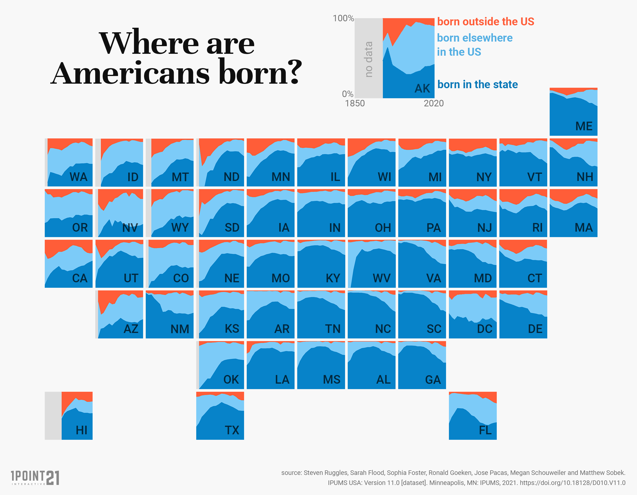
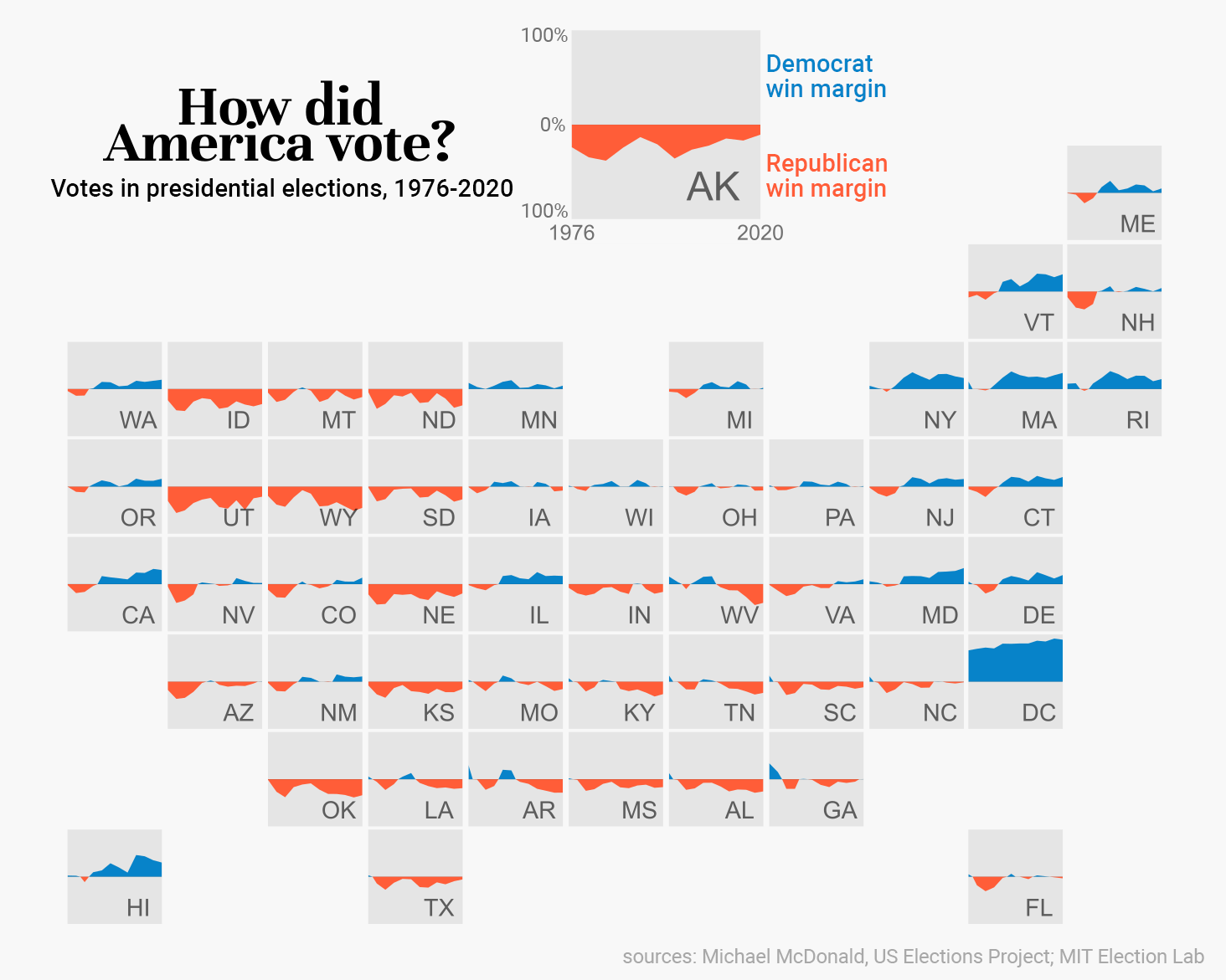
To be honest, I’m not so into this election map. I think the reason why the “where are Americans born?” map did so well is that it exhibits clear geographic trends that are easy to spot at first glance. The only thing that stands out to me in the election map is how overwhelming Democratic DC votes.
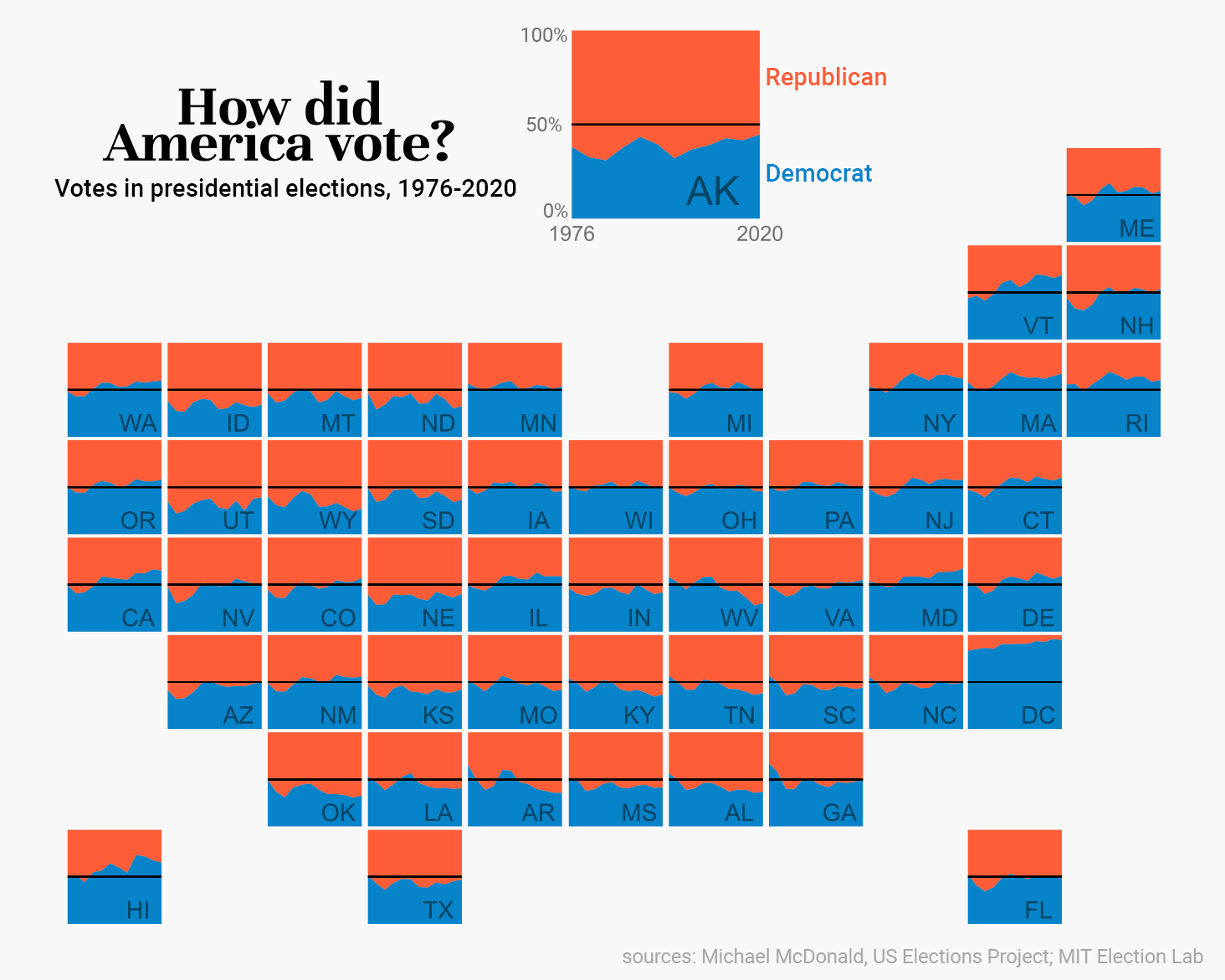
I made an alternate version showing just Dem/Rep votes, with a 50% line added to show which party won. Still not really a fan, but some other trends are visible, like WV’s slide towards Republicanism, and just how 50/50 Florida is.
Another version with the win margin. I think this is better than the version above because it’s much easier to tell who won and how it’s changed over time. It still doesn’t “grab” me the way the viral map did.
I think this just shows that while a chart type may work just fine for multiple datasets, one dataset may just have that “something” that the others don’t. It can be like capturing lightening in a bottle, and there’s no way to know until what will have that something and what won’t till you go through the trouble of making some charts.
Discover more from Data Stuff
Subscribe to get the latest posts sent to your email.
Any particular reason for using Photoshop here? Wouldn’t Illustrator (or other vector graphics editor) be better suited for the finishing touches?
You can use anything! I just like Photoshop because that’s what I’m most familiar with, and I don’t (currently) need any charts in vector form
Wouldn’t it be hilarious if I followed these directions and became a world famous data biz coder?
Sent from my iPhone
>
Why not try??
Excellent as always. Not just the viral thing but that you take the time to explain your process in such detail so anyone can do it and learn from it. Someone posted the map in Slack and I thought “oh how cool” and then proceeded to realize that it was by the one data viz person that I get and read the newsletter of. A tiny part of me wishes that Alaska was more to the left where it belongs but I love how you used it as the legend. Very clever.
That is so kind of you, thank you!
I just saw this reposted on LinkedIn (credit given). It’s a brilliant viz and an excellent idea to show this data! I may borrow the idea of combining graph with a map in this way 🙂