This project has been running in the background for some time, and I’m pleased to finally have it done! I was curious to see if people in different locations tend to use different emoji (emojis?).
There’s a variety of sources to collect emoji from, but the one that, in my opinion, best combines geolocation and high volume emoji usage is Twitter. Twitter offers a rate-limited API that lets you tap into a live stream of tweets. Given the rate-limiting, it would take quite some time to gather enough data, but luckily I had just bought a new laptop so I could let my old one run this full-time.
Starting on January 1, I ran R code that:
- Looked for any tweets geolocated in my list of 25 cities (thanks to the TwitteR package for making this easy)
- Extracted emojis in those tweets (this guide by Jessica Peterka-Bonetta was invaluable)
- Stored the emojis and city, but discarded the rest of the tweet information
This ran for most of January, or until I had about 45,000 emojis per city. Some cities hit this limit extremely quickly–New York and Tokyo, for example–and others I had to wait on (dangit, Omaha!)
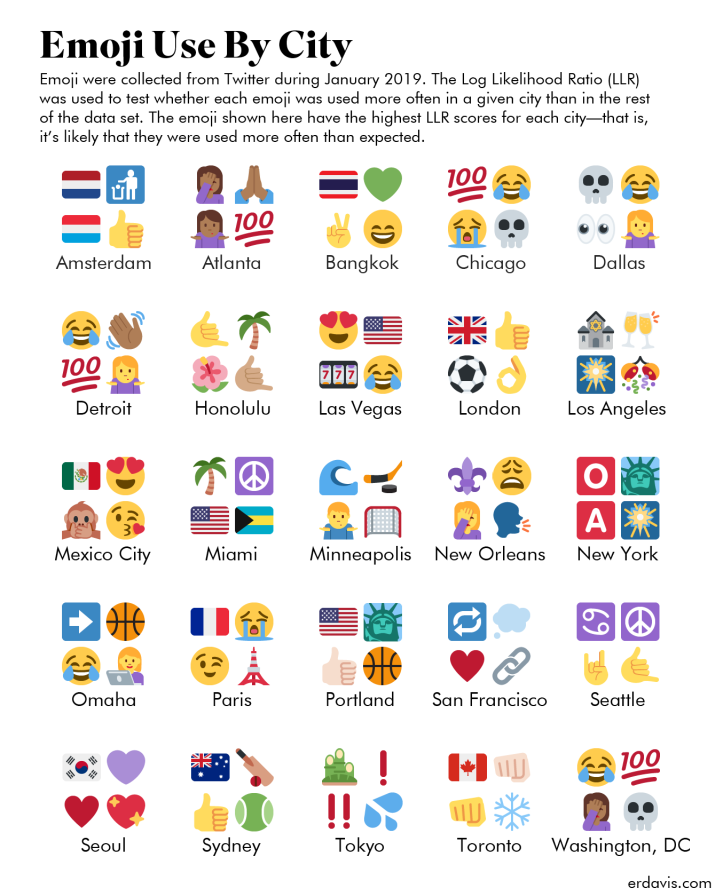
Once the data was finally gathered, I could come up with a plan to find which emojis were more strongly associated with which cities. The basic tool to reach for here is often TF-IDF, but I found its results to be unsatisfactory. If an emoji were used in all cities, it would be totally discarded from consideration by TF-IDF. However, most popular emojis were used in all cities; the universe of emojis is much smaller than the universe of English words.
Instead, I found Log-Likelihood to provide much more meaningful results. It has a nice balance of the logical (🗽 in New York) and the unexpected (👩💻 in Omaha). You can also tell I collected data over the New Year, especially when you look at LA!
I would like to continue to collect data, as this is just represents 3 weeks in January. I’m also looking into skin tone modifiers in emoji, which I’ll hopefully have wrapped up soon!
